The Audio Volume plasmoid has always seemed a bit too heavy and complicated for the common use case of a single input device and a single output device, or apps playing audio but not also recording audio. This patch presents a simplified UI for those use cases.
Details
Details
- Reviewers
drosca - Group Reviewers
Plasma VDG - Commits
- R115:86038b5b8c80: Simplify display when there's only a single input device and a single output…
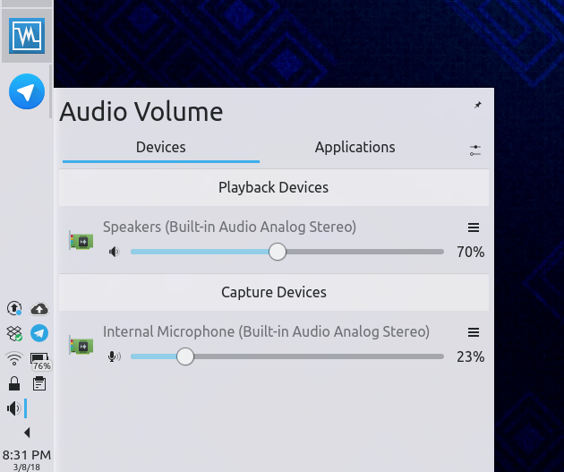
Before, Devices tab, single devices:
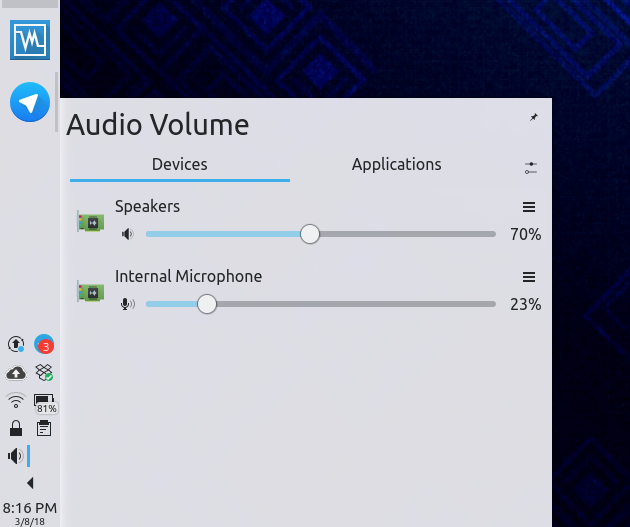
After, Devices tab, single devices:
After, Applications tab, only playback streams:

As I lack the hardware to test the multi-device use case, testing by others would be appreciated.
Diff Detail
Diff Detail
- Repository
- R115 Plasma Audio Volume Applet
- Branch
- simplify-single-device-ui (branched from master)
- Lint
No Linters Available - Unit
No Unit Test Coverage
Comment Actions
Hmmm. So if there was 2 sinks (eg: 3.5mm jack + HDMI) and 1 mic (3.5mm jack) it'd show the sink header, but not the source header? Labelling all 3 as a sink?
Might want to create a bool simpleMode: sinkView.count + sourceView.count <= 2 that is used everywhere in main.qml. Or sinkView.count == 1 && sourceView.count == 1.
Comment Actions
Hmm, I'm seeing that wherever in main.qml I define simpleMode, it doesn't seem to actually get set. Maybe the listView delegates aren't yet initialized or something?
Comment Actions
I remember having trouble binding to stuff in the ___Representation in the main.qml too, but don't remember the specifics. Why not just define it in the ColumnLayout { id: devicesView } since it's not really needed elsewhere. onlyOne: devicesView.simpleMode, visible: !devicesView.simpleMode.
Comment Actions
Only show the simple mode when there's exactly one input device and exactly one output device
| applet/contents/ui/main.qml | ||
|---|---|---|
| 420 | 2 speakers + 1 mic won't show the mic header since it's only visible if there's 2 mics. | |
Comment Actions
i like it in principle. could it be less obviout tough which is the output and which is the input?
i know there are the speaker and microphone icons, but they are small and secondary.. maybe in this case the soundcard icon should be dropped and the speaker/microphone take its place? or maybe swapped in general, and have a bigger speaker and the soundcard just a tiny think at its corner... if needed at all, i find it not too important information
Comment Actions
Yeah, I agree with you, and I'm not too happy with the icons either. I was planning to address that in a follow-up patch, since they're still odd in many contexts when the full layout is used.
Comment Actions
There is still one case where this may not be wanted: when you have two cards and first have only sink and second source.
Also this doesn't apply to Applications tab, why?
| applet/contents/ui/DeviceListItem.qml | ||
|---|---|---|
| 39 ↗ | (On Diff #29054) | Why do you change opacity? It makes it inconsistent with applications tab. |
Comment Actions
Can you help me understand why this might be unwanted in that circumstance? You'd still have only one input and one output, no?
Also this doesn't apply to Applications tab, why?
If you want, I can do the same there too. But I opted not to since the Applications tab is a more advanced UI and will only more rarely have a single playback stream and a single capture stream.
Comment Actions
In case where both cards support both input/output, but it was disabled by selecting according profile, I think it is still useful to know from which card it comes.
If you want, I can do the same there too. But I opted not to since the Applications tab is a more advanced UI and will only more rarely have a single playback stream and a single capture stream.
Here I would like to hide the header when there are only apps playing audio, not recording. This should be the most common case.
Comment Actions
If that's a hard requirement for this patch, I might need some help with it.
If you want, I can do the same there too. But I opted not to since the Applications tab is a more advanced UI and will only more rarely have a single playback stream and a single capture stream.
Here I would like to hide the header when there are only apps playing audio, not recording. This should be the most common case.
OK, I can do that.
| applet/contents/ui/DeviceListItem.qml | ||
|---|---|---|
| 39 ↗ | (On Diff #29054) | Check out the screenshot. If I hadn't conditionally changed the opacity here, then in the Simple Mode, the header text would look very light, instead of being fully opaque.= the way it should be. |
Comment Actions
Also implement Simple Mode for the App tab, when there are only apps playing or recording, but not both