Without the button background, it's difficult to realize that it's a button.
Details
Details
Diff Detail
Diff Detail
- Repository
- R878 Latte Dock
- Branch
- master
- Lint
No Linters Available - Unit
No Unit Test Coverage - Build Status
Buildable 10462 Build 10480: arc lint + arc unit
Comment Actions
I am not sure...
I think would prefer a hovering mechanism, a rectangle with transparency e.g. 0.5 when this option is hovered
Comment Actions
How would the user know it's a button to hover it?
He's unlikely to know that's a button until he hovers over it randomly.
| containment/package/contents/ui/editmode/HeaderSettings.qml | ||
|---|---|---|
| 87 | this should be : backgroundColor: containsMouse? colorizerManager.buttonHoverColor : "transparent" and how does it look when the button in activated ? | |
Comment Actions
Hey @trmdi rooty's not participating in KDE at this point so he won't be able to do the review.
Just so I don't stop by without giving a contribution: I like the idea of making it more obvious that it's a button. Maybe you could reach a compromise here and have the background at quite a low opacity when not hovered over, perhaps have this sort of an effect: https://youtu.be/hR_AV1bCS5g?t=12
Comment Actions
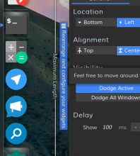
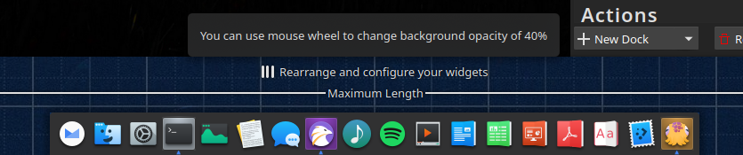
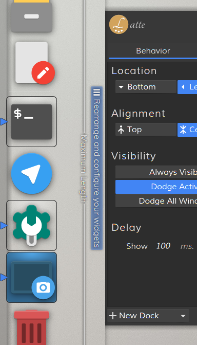
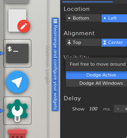
Following the comments I have updated a bit the Rearrange button, these are some results with the new approach:
normal:
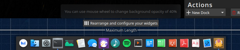
hovered:
normal:

hovered:
