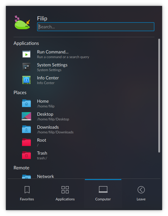
A lot of space on the left and right of each KickoffItem was wasted, so I've reduced the margins. This improves the readability of long application titles and descriptions. I've also changed the margin units from gritUnit to smallSpacing for KickoffItem and KickoffHighlight, which slightly reduced the margins of KickoffHighlight.
Details
Details
- Reviewers
ngraham hein - Group Reviewers
Plasma VDG - Commits
- R119:51f7912368e6: [Kickoff] Reduce the margins of KickoffItem, KickoffHighlight and use…
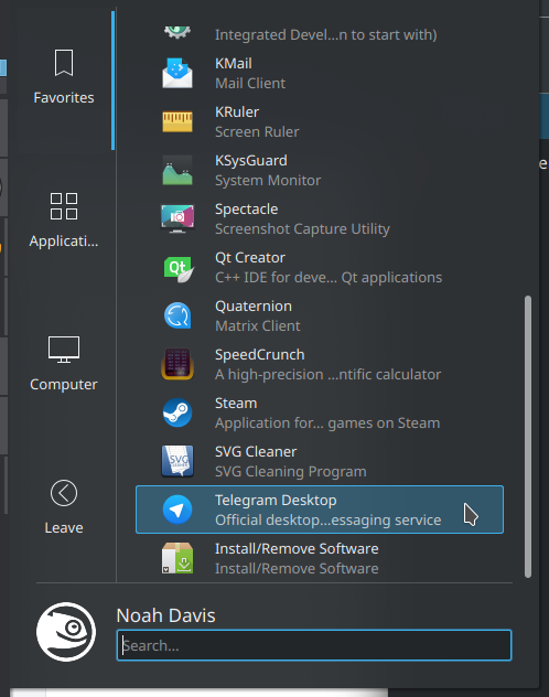
Before
Category:
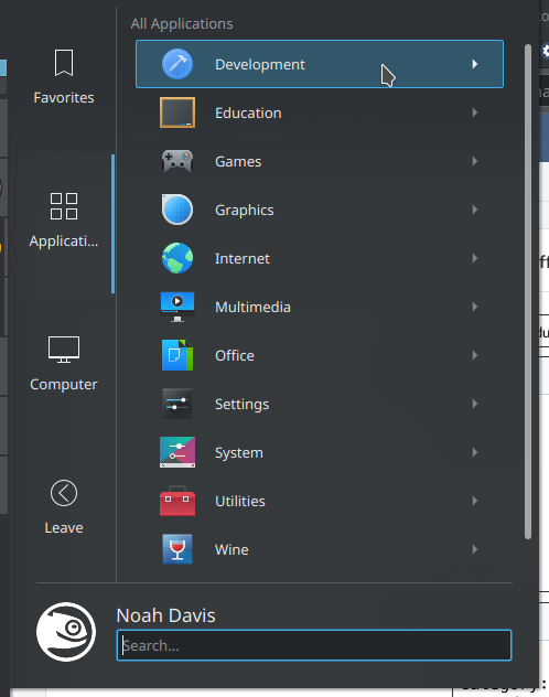
Long description:
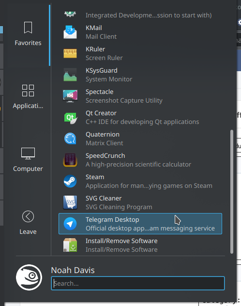
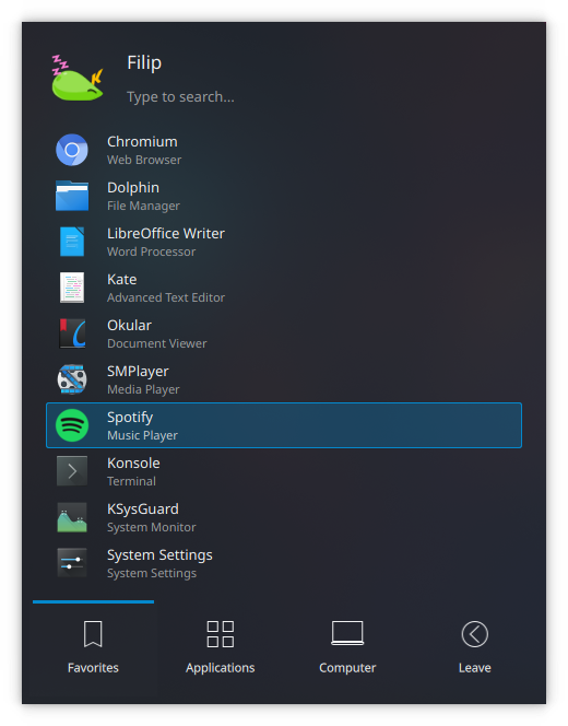
After
Category:
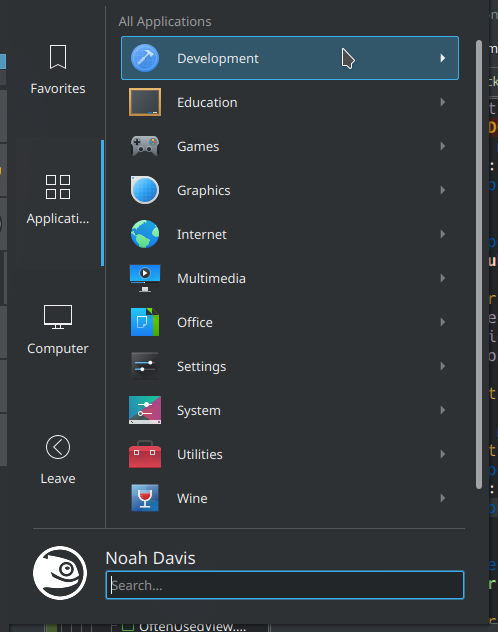
Long description:
Diff Detail
Diff Detail
- Repository
- R119 Plasma Desktop
- Branch
- KickoffItem-margins (branched from master)
- Lint
No Linters Available - Unit
No Unit Test Coverage - Build Status
Buildable 9830 Build 9848: arc lint + arc unit
Comment Actions
Looks a lot better, +1.
Please check whether there is subpixel placement of either the fonts or the selection rectangle with some other fonts (because gridUnit is being multiplied by a non-integer). I know it doesn't make sense but @flipwise and I have had to modify our patches too many times to count because of this.
The font that might be most sensitive to this: Lato at 11 pt
Comment Actions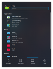
I actually like the left margin because it contributes to visual hierarchy when headings are present:
As for long descriptions, how often would you say it occurs that you have one? From my experience, a lot of horizontal space is still just left empty in Kickoff with only minor exceptions(entries). Although I am guessing you raised the font sizes in your case so that's why the issues is a bit more prominent?
Comment Actions
+1 conceptually. Since Kickoff has its own side margins, these additional margins in the items themselves are just unnecessary. I think there's already enough indentation with category headers:
Please fix the code issues I've highlighted and then let's do more testing and get it done. :)
| applets/kickoff/package/contents/ui/KickoffItem.qml | ||
|---|---|---|
| 102 | Don't multiply by non-integer values. units.gridUnit * 1.5 is 27, so to get roughly this value without hardcoding anything, you could use units.smallSpacing * 7 (28). | |
| 155 | Ditto | |
Comment Actions
You should test this in all four orientations.
And if you retake the screenshots please arrange them as follows:
Category - before
after
Long description - before
after
It's really hard to appreciate the changes otherwise.
Comment Actions

I tried to see how they would look with no margins and rather than simply filling the entire area where the item highlight is supposed to be, they extended past it. This doesn't seem like it should happen, which might indicate that something has been wrong in Kickoff for a long time, but I'm not sure why this is happening.
Comment Actions
Another thing is the ratio between the left/right margins and the top/bottom margins varies with font size, so maybe Kickoff really does need some fixing up.
The height is units.smallSpacing * 2, plus the icon or title+subtile height, depending on which one is the highest. It should always be the needed height with a smallSpacing margin on both sides if that math is correct. This means that the fact that margins are needed to keep the icons an text within the highlight must be the cause of the inconsistency.
Comment Actions
I haven't tested this with many different fonts, but the current version of this patch works well for Noto Sans at 10, 11 and 12 pts.
Comment Actions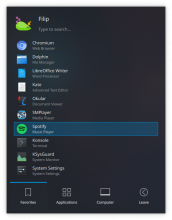
This makes Kickoff even a bit more more left-centered = looking like it's wasting horizontal space. That's why I prefer the way it was before, but I tested the patch and everything seems symmetric at least.
It seems that in the screenshots the "Small" font is set to be bigger than normal. With default font sizes Kickoff can end up looking like this (ignore the lack of few other patches):
That's a lot of unused horizontal space, while the benefits of reduced padding are only for apps with really long descriptions (which are minority) or for people using a bigger font size for "Small" text.
If everyone else is on board I won't object though.
Comment Actions
It is wasting horizontal space, no matter how the margins are done, but at least with less side margin the horizontal space can be used for long descriptions. This is a problem with the overall design of Kickoff.
Regarding the small text size, I did forget to set it back to default when doing these screenshots.
Comment Actions
I agree that this makes it feel more left-heavy. However I still think this patch is an improvement because the artificial margins we're getting rid of don't really solve that problem either. Instead they feel arbitrary, because they are.
Ultimately I think the only way to substantially improve this situation is to do T9042. But in the short term we could probably consider making the whole thing narrower, more like Kicker. Kickoff doesn't really benefit from the increased width in its current form.