Better pop-up palette thumbnails
Closed, ResolvedPublic

Description

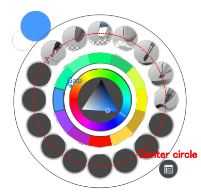
Currently thumbnails of painttop presets assigned to the "favorites" ring appear in a slice of a circle. Since this slice even rotates, this is inconsistent, unpredictable, it wastes a lot of the square thumbnail area and the safe area is a small irregular polygon between the center and the top-left corner. It is often hard to tell which preset is shown. These issues are outlined in the following picture:

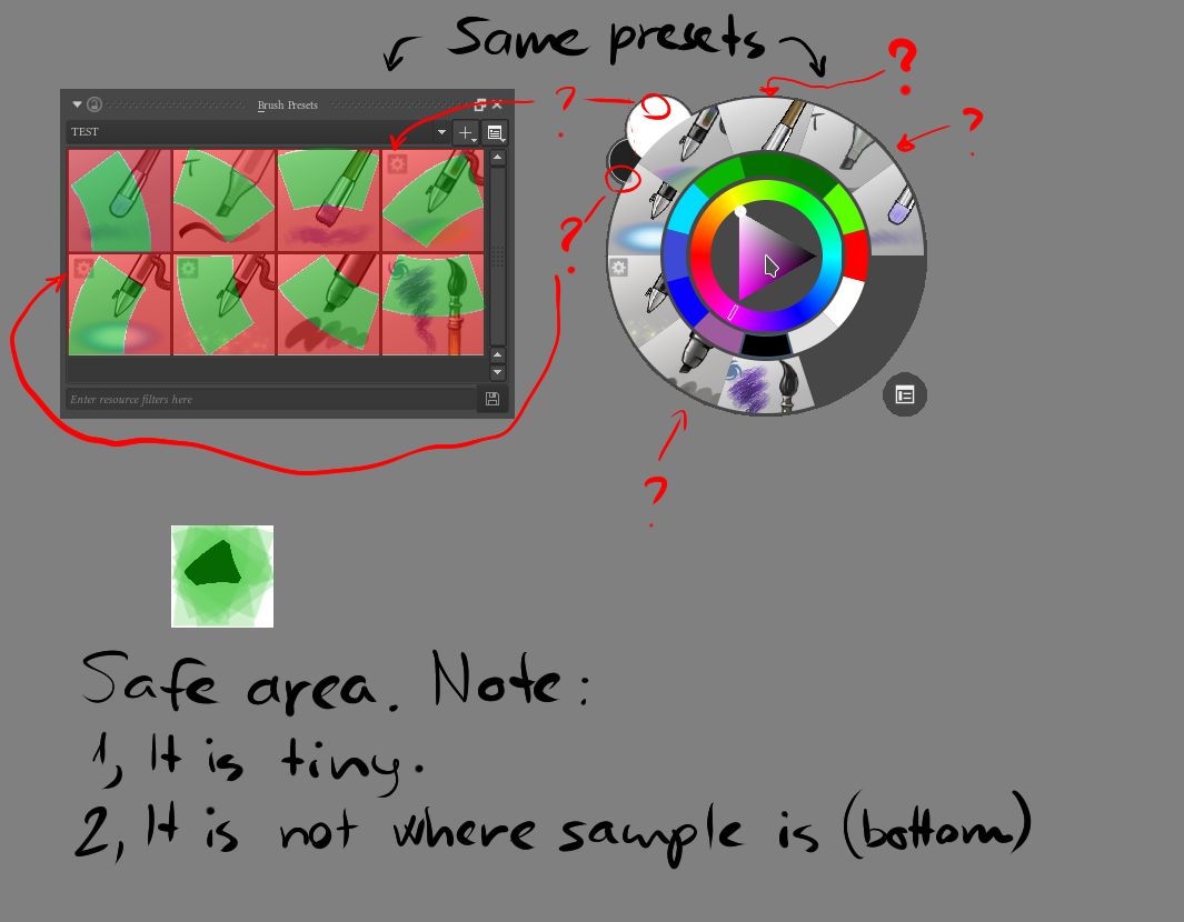
Given this actually impacts usability, I believe it can be considered an issue rather than a wish.

My proposal for a much better solution is using circular thumbnails, similar to a revolver's drum. A circle is simple, consistent, predictable, unaffected by rotation, provides a large safe area and in my opinion even looks nice and clean. It is also not too complicated to calculate.

I created the following mockup to showcase this solution:

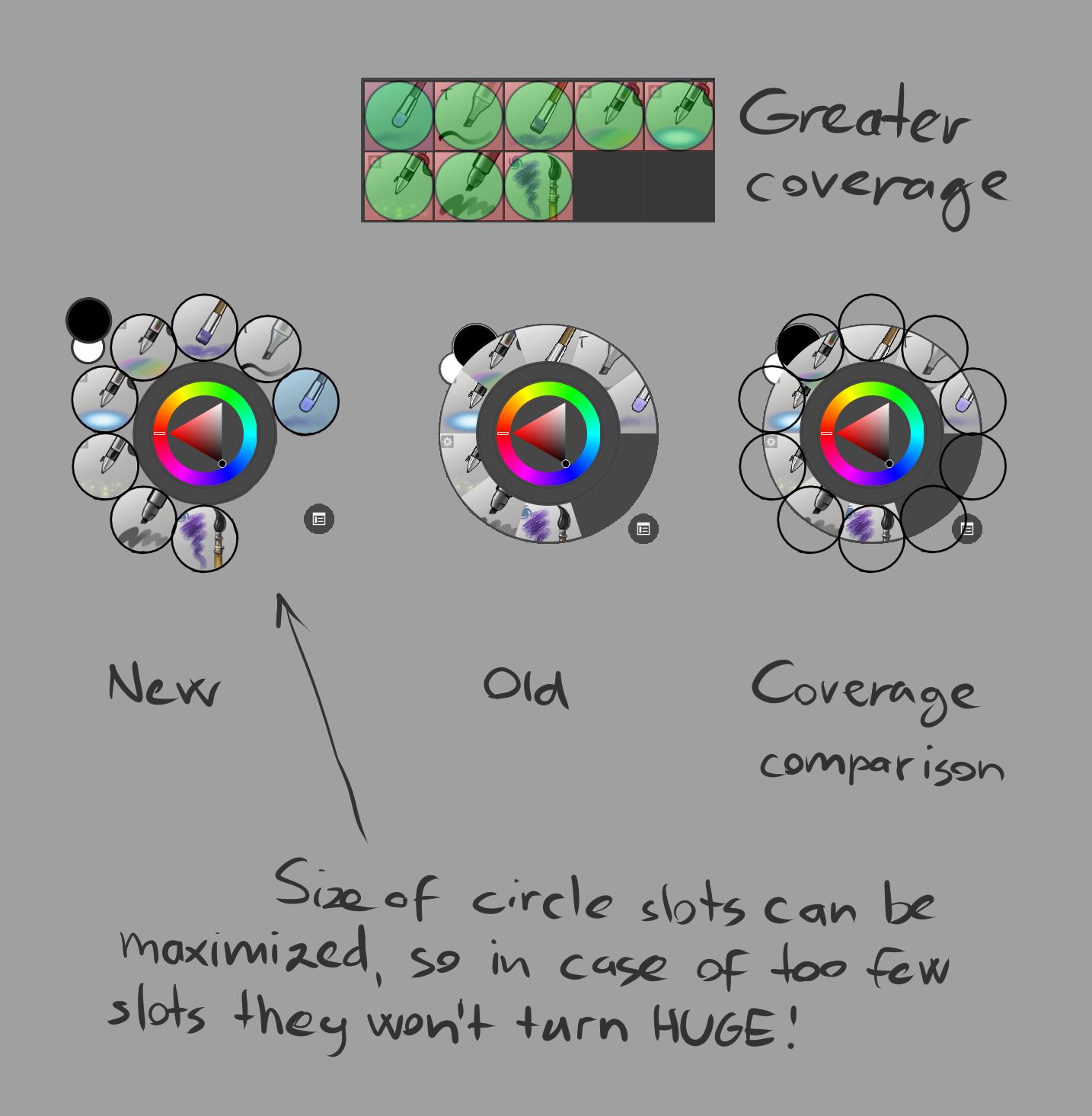
The change in the number of slots can be handled in a few ways in order to avoid huge thumbnails with the number of slots set to few:

  • Setting a minimum to the number of slots. Unused slots may disappear leaving an empty space without slot size change, or display an empty slot.
  • Maximizing the size of the slots will stop them from becoming too large. In case of too few slots they can be added next to each other in a circular direction, or distributed evenly around.

As the number of slots increase over a certain number, they can become smaller to accommodate the space around the circle, or optionally a second set could appear in an outer circle after a point. Size of the pop-up palette is not a big concern since it only displays on the screen when it is actually used, so it doesn't take away user space.

Storm created this task.Jan 31 2016, 12:05 AM
Restricted Application added a subscriber: woltherav. · View Herald TranscriptJan 31 2016, 12:05 AM

Sorry, Phabricator was buggy: Clicking either Create Task or Cancel seemed to do nothing, and I reloaded page after clicking a few times, upon which I realized it actually created a new ticket every time despite seemingly doing nothing...

langkamp claimed this task.Jan 31 2016, 1:10 AM
woltherav closed this task as Resolved.Feb 6 2016, 5:48 PM
tokiedian removed a subscriber: tokiedian.

I suggest a kind of tweaks of the pop-up palette... I think the current palette looks a bit strange.

tokiedian reopened this task as Open.Feb 26 2016, 3:22 PM
tokiedian added a subscriber: langkamp.
tokiedian removed a subscriber: langkamp.
tokiedian added a subscriber: tokiedian.

I was talking with @Storm and we were thinking it might also be good to have some visual indicator on the order of the brushes and recent colors. Right now it is difficult to tell where the recent colors start and end. And also what order the brush presets are generated in. Do they get generated clockwise or counter-clockwise for example.

The colors are sorted using the HSV color model so there is no particular order there. The presets are appear alphabetically sorted counterclockwise.

scottpetrovic added a comment.EditedMar 31 2016, 7:30 PM

thanks @langkamp for the info. For now, maybe I can experiment with two things if you don't have time.

  1. make a circle background to contain all of the presets.
  2. Add an angle gradient to the circle in #1. Similar to this rotated 180 degrees (http://i.stack.imgur.com/69yyg.png). This can help indicate that the presets are being populated in a counter-clockwise motion. I don't want the gradient to be annoying, it needs to be pretty subtle.

that'd be not too difficult, how about:

  • Take the amount of presets visible
  • 1/amount of presets visible
  • nth circle-outline color = 1*nth preset grayscale?

It'd be a nice start at the least...

Storm added a comment.Mar 31 2016, 9:15 PM

My problem is: I can't tell the order my last used colors were used, which can be important:

  • For ex. when I paint with very similar colors, and I want to go back to the color I used before the one I'm using now... which one was it? If I didn't paint with 100% opacity, that exact color may not exist on the canvas for picking again.

I suggested that using common sense it would be best if colors were listed in the order they were used, clock-wise, from the top aka 12 o'clock. Why? Because that's how the numbers go on clock dials, and so that order is something our brain already knows and feels comfortable width.

I then suggested that for consistency, brush presets should also start from 12 o'clock clockwise.

IMO starting to place colors and presets on the right of an imaginary 12 o'clock line already makes it much more intuitive and logical and easier for our brain to understand and get used to, even if there is no visual indication.

However it would help more, especially for those lazy to RTFM (and we know that means most people. :P ) if there was a visual indication of the 12 o'clock line, and the direction (to the right aka clockwise).

A gradient as scott suggested could be a clean and simple indication indeed. My only complaint against that would be is that I really love how I can see through in between the circles, from a design perspective - it just looks neat. Of course, usability is more important that looks. My idea for a compromise would be that the background only reaches as far as the center-line of presets, so we an see it in between presets and colors, that would double as "white"space/gap like tokiedian suggested, but outside the center-line of presets it would still be transparent. The palette would look like a flower, which is nice.

@Storm that might work.

For the background circle, I mostly just didn't like the little holes that poke on the inside. There is too much stuff going on with that area. I am not sure how hard it is to do the color history stuff yet. If I do this, I will probably start on the presets, then try to maybe figure out the color history stuff.

scottpetrovic added a comment.EditedApr 2 2016, 3:38 AM

I tried having the background circle just take up the inside part by the little holes, but it was really hard to tell the order for the brushes that way with the gradient. I made it go to the edge so the gradient was a little more evident. I can't figure out how to scale all of the presets down right now to give each one spacing like @tokiedian design, but not sure how important that is. The pop-up palette is actually going to be getting more powerful in the future with more features, so I kind of want to keep it in a container to make it easier to separate the different areas.

When the presets are filled, it is still a bit hard to tell if the direction is clockwise or counter-clockwise. It might need a little arrow pointing in the direction to help. That might need some improvements. It is better now to at least know it is starting at the top.

I rotated all of the brush presets so it starts at the top and goes counter-clockwise.

This is what I have so far on my dev box.

I need to spend some time looking at the color history area. It would probably have more value if it is lined up vertically like @Storm suggests.

scottpetrovic edited projects, added Krita: Next Features; removed Krita: Abyss.
scottpetrovic added a subscriber: langkamp.
woltherav closed this task as Resolved.Feb 28 2017, 11:59 AM

Resolved, I think.