OSD improvements
Closed, ResolvedPublic

Description

The most common problem that people have is "the OSD gets in the way when I change the volume while playing a video".
There were already two different solutions proposed, which lead to dicussions about the same topic in two different threads (D20569,D14949), though neither lead to consensus.

Therefore I'd like to bundle the discussions with this Phab task and to summerize the arguments and options.

Please feel free to change or update the task description!

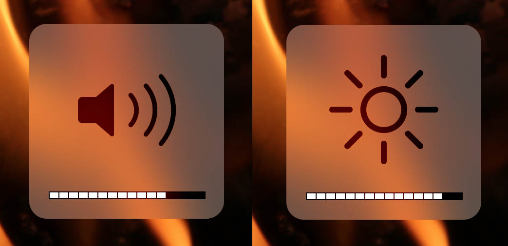
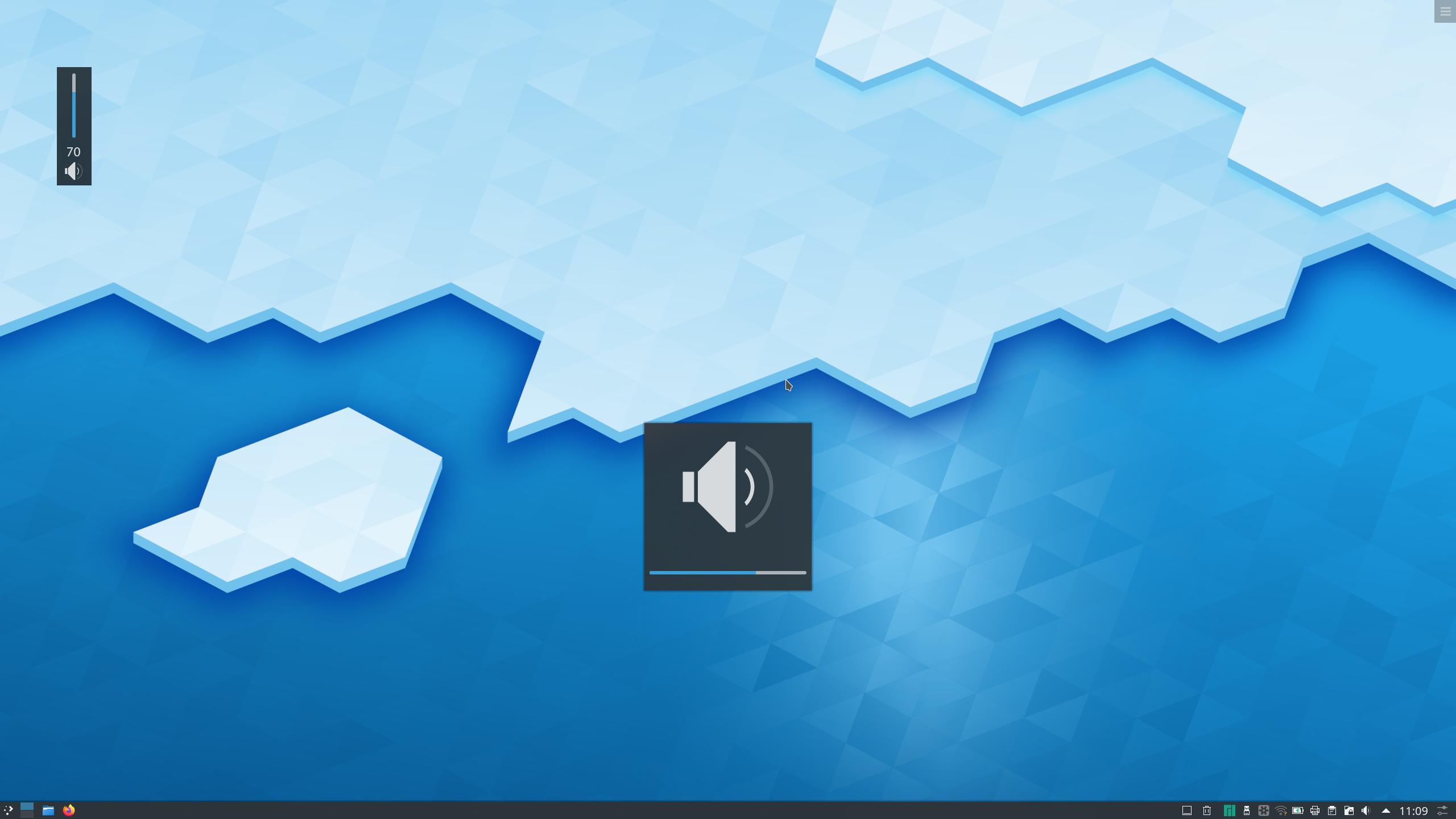
Current situation: Big centered OSD
For volume, brightness, Bluetooth, keyboard layout, virtual keyboard, microphone, ...

  • Easy to spot
  • Visual distinctiveness to other systems
  • Covers the content beneath it. Especially distracting for full screen apps like video players.

Variant 1: Compact OSD (horizontal)
Patch: https://phabricator.kde.org/D20569

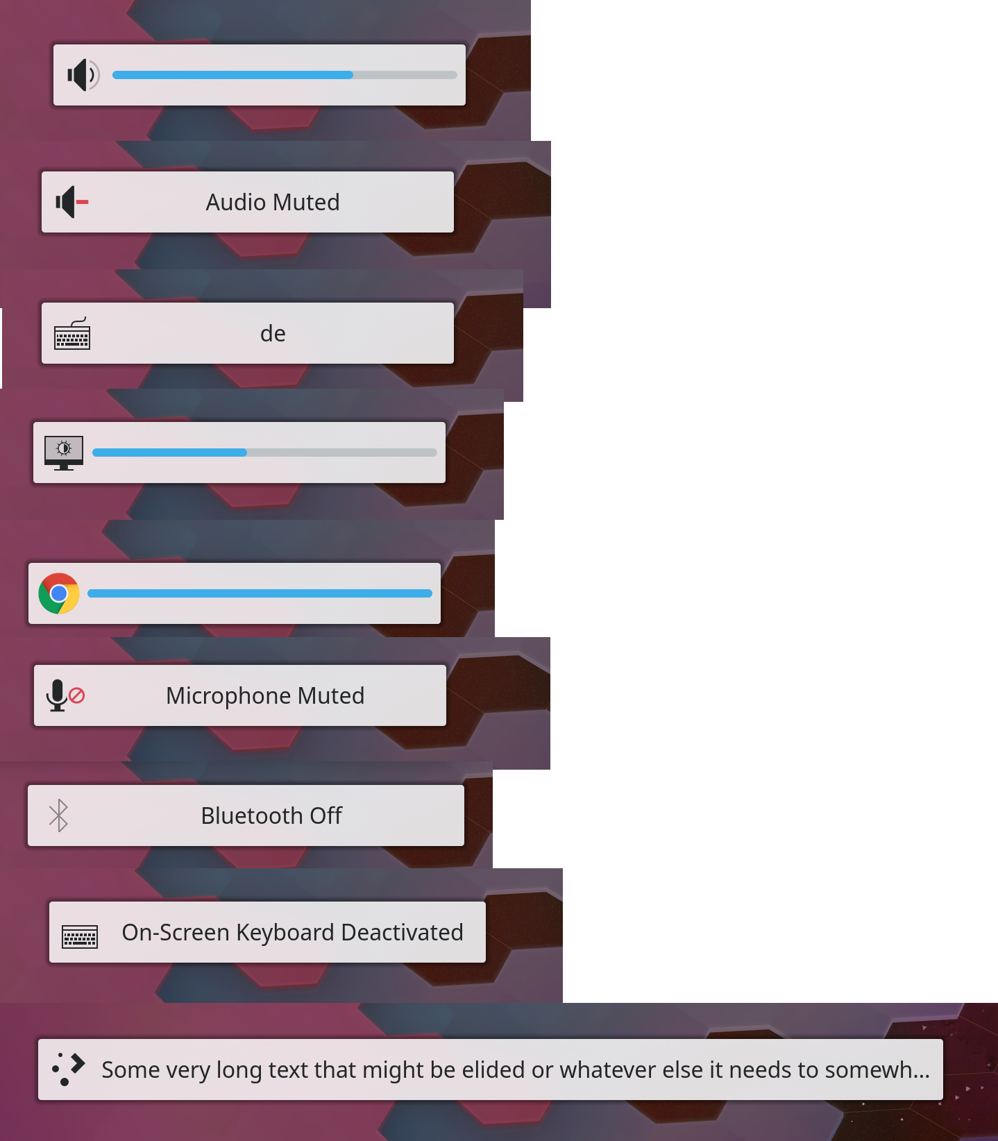
  • can grow, if necccessary, to accomodate translations

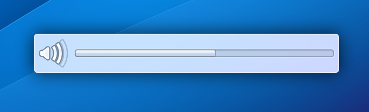
Variant 2: Compact OSD (vertical) only for brightness and volume

  • Would be displayed in the upper left corner
  • Does only really work for volume and brightness, which is however the main concern

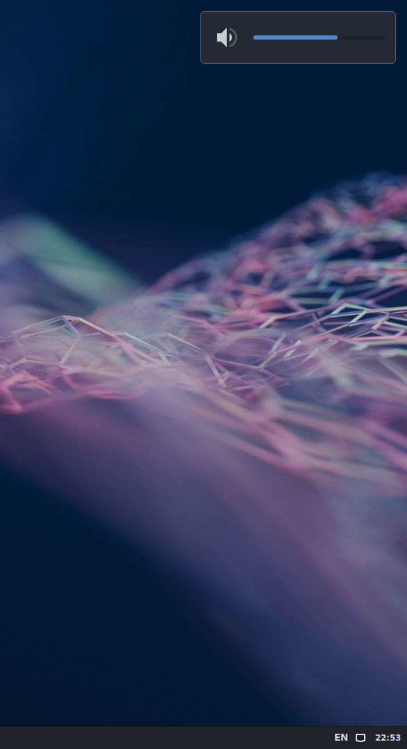
Variant 3: OSD as Notification


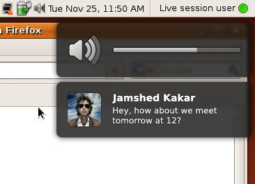
Suggested at https://phabricator.kde.org/D20569#450454
It was once used in the Unity desktop: https://wiki.ubuntu.com/NotifyOSD#Treatment_of_hotkeys


Variant 4 (optional): Display compact OSD version in full screen apps
Suggestion at https://phabricator.kde.org/D14949#580132

By default? Configurable?


Variant 5 (addition): Compact OSD only for volume and brightness

  • Only make the volume and brightness indicator compact, omit the rest
  • + Variant 4?

Variant 6 (addition): Hide OSD in full screen apps
Patch: https://phabricator.kde.org/D14949

  • solves the issue quiet drastically
  • no visual indication at all

How should the new OSD variant be deployed?

  • There seems to be a consensus that changing the Look'n'Feel packages is not justified
  • Force the new style?
  • Make it configurable?
    • The current only option to display OSD are found at Workspace → Workspace Behavior → General Behavior → «Display visual feedback for status change»
      • There's however lot's of space at this page for finer graduate settings of the OSD behaviour

BUG: 344393
BUG: 372665

alexde created this task.Dec 23 2019, 3:27 PM
ghost34 added a subscriber: ghost34.EditedDec 23 2019, 5:52 PM

I like how looks a Volume and Brightness indicators in MacOS, it's has a dividing lines (blocks), if i'm not mistaken 1 block has a 5% of volume or brightness level.

Thanks for the detailed summary, @alexde!

In T12419#214874, @KonqiDragon wrote:

I like how looks a Volume and Brightness indicators in MacOS, it's has a dividing lines (blocks), if i'm not mistaken 1 block has a 5% of volume or brightness level.

That's basically the current style (ours uses a slider instead of blocks, but that's not a big difference). The problem we're trying to solve with is that some people complain about the large square OSD style because changing the volume while watching a full-screen video results in the OSD briefly obscuring the center of the video. macOS suffers from the same problem with their large square OSD, so it is a legitimate concern.

Though I like the status quo for aesthetics, I find myself gravitating towards variant 1 as my favorite solution to the problem described here. The biggest drawback with this style is that it can obscure subtitles in full-screen videos if it's positioned too high up. But if it's positioned quite close to the bottom of the screen, maybe that concern can be alleviated?

alexde updated the task description. (Show Details)Dec 23 2019, 7:54 PM
ghost34 added a comment.EditedDec 23 2019, 8:57 PM

Thanks for the detailed summary, @alexde!

In T12419#214874, @KonqiDragon wrote:

I like how looks a Volume and Brightness indicators in MacOS, it's has a dividing lines (blocks), if i'm not mistaken 1 block has a 5% of volume or brightness level.

That's basically the current style (ours uses a slider instead of blocks, but that's not a big difference). The problem we're trying to solve with is that some people complain about the large square OSD style because changing the volume while watching a full-screen video results in the OSD briefly obscuring the center of the video. macOS suffers from the same problem with their large square OSD, so it is a legitimate concern.

Though I like the status quo for aesthetics, I find myself gravitating towards variant 1 as my favorite solution to the problem described here. The biggest drawback with this style is that it can obscure subtitles in full-screen videos if it's positioned too high up. But if it's positioned quite close to the bottom of the screen, maybe that concern can be alleviated?

Maybe use a Variant 3? In XFCE volume indicator is similar to Variant 3. Also i'd want to see the % when a change volume, it is possible?

ngraham closed this task as Resolved.May 14 2021, 8:43 PM
ngraham moved this task from Backlog/Planned to Done on the VDG board.
ngraham claimed this task.

We landed these skinny OSDs into Plasma 5.20 and people seem quite happy with them.