Don't make Titles 20% transparent either
Summary:
If it didn't make sense to have Headings be 20% transparent because nearby or child textual content would be darker (see D10899), then it really doesn't make sense to have Titles be 20% transparent, because then all the text is darker than the titles, which is really odd.
As with D10899, this brings Plasma in line with Kirigami, where the large titles are already 100% opaque.
Test Plan:
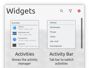
Widget Explorer title, before:
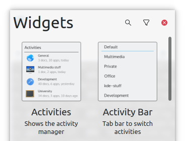
Widget Explorer title, after:
As with D10899, it's a very subtle change, so I don't expect anyone to consciously notice. But people's unconscious brains will probably say , "wow, text looks sharper and more readable now!", though they won't be able to articulate why.
Reviewers: Plasma, mart
Reviewed By: Plasma, mart
Subscribers: Frameworks
Tags: Frameworks
Differential Revision: https://phabricator.kde.org/D10902