Don't make Titles 20% transparent either
ClosedPublic

Authored by ngraham on Feb 27 2018, 7:43 PM.

Details

Summary

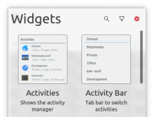
If it didn't make sense to have Headings be 20% transparent because nearby or child textual content would be darker (see D10899), then it really doesn't make sense to have Titles be 20% transparent, because then all the text is darker than the titles, which is really odd.

As with D10899, this brings Plasma in line with Kirigami, where the large titles are already 100% opaque.
Test Plan

Widget Explorer title, before:

Widget Explorer title, after:

As with D10899, it's a very subtle change, so I don't expect anyone to consciously notice. But people's unconscious brains will probably say , "wow, text looks sharper and more readable now!", though they won't be able to articulate why.

Diff Detail

Repository
R242 Plasma Framework (Library)
Lint
Automatic diff as part of commit; lint not applicable.
Unit
Automatic diff as part of commit; unit tests not applicable.
ngraham created this revision.Feb 27 2018, 7:43 PM
Restricted Application added a project: Frameworks. · View Herald TranscriptFeb 27 2018, 7:43 PM
Restricted Application added a subscriber: Frameworks. · View Herald Transcript
ngraham requested review of this revision.Feb 27 2018, 7:43 PM
ngraham edited the test plan for this revision. (Show Details)Feb 27 2018, 7:44 PM
ngraham edited the summary of this revision. (Show Details)
ngraham edited the summary of this revision. (Show Details)Feb 27 2018, 7:48 PM
ngraham edited the summary of this revision. (Show Details)Feb 27 2018, 8:11 PM
ngraham edited the test plan for this revision. (Show Details)Feb 27 2018, 9:01 PM
mart accepted this revision.Feb 28 2018, 2:43 PM
This revision is now accepted and ready to land.Feb 28 2018, 2:43 PM
This revision was automatically updated to reflect the committed changes.