Turn on frames around dock widgets by default
AbandonedPublic

Authored by ngraham on Sep 23 2017, 7:17 PM.

Details

Reviewers
None
Group Reviewers
Breeze
VDG
Summary

BUG: 384999

Draw borders around dock widgets by default, which resolves some usability issues and supports the addition of additional default-visible dock panels in the future, e.g. https://phabricator.kde.org/D7700 -- when the future Tags panel is added and made visible by default, the usability issues resulting from having no frames will become much more obvious and user-facing. This fixes that in advance.

Test Plan

Tested in KDE Neon.

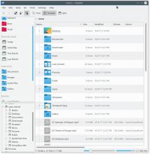
Here's Dolphin's main window with multiple vertical panels with the current default setting:


Notice how content in each panel is cut off at the splitter without any kind of visual cue that there's one there. It looks like a glitch, and an average wouldn't know that it's resizable unless they happened to mouse over it.

Here's Dolphin's main window with multiple vertical panels with the patch:


Now you can clearly see that there's a splitter separating the content views, and it looks resizable.

Diff Detail

Repository
R31 Breeze
Lint
Lint Skipped
Unit
Unit Tests Skipped
ngraham created this revision.Sep 23 2017, 7:17 PM
Restricted Application added a project: Plasma. · View Herald TranscriptSep 23 2017, 7:17 PM
Restricted Application added a subscriber: plasma-devel. · View Herald Transcript

-1 on the side panel frame

This was explicitly done to remove the amount of frames you have. I went through great lengths to achieve an identical look in Plasma applet config dialogs...

I can remove the side panel change from this patch so we can focus on the usability issues resulting from having Dock frames disabled.

ngraham updated this revision to Diff 19839.Sep 23 2017, 8:52 PM
ngraham retitled this revision from Turn on frames around dock widgets and side panels by default to Turn on frames around dock widgets by default.
ngraham edited the summary of this revision. (Show Details)
ngraham edited the test plan for this revision. (Show Details)
ngraham edited the test plan for this revision. (Show Details)Sep 23 2017, 8:59 PM
ngraham edited the summary of this revision. (Show Details)Sep 23 2017, 9:40 PM

-1 for the current version as well.
We've had those frames before. The benefit of locking docks is no frame (for me that is the benefit).

ngraham added a comment.EditedSep 23 2017, 11:09 PM

Without frames the splitter is invisible, which is a clear usability issue. It also presents an aesthetic issue since when content on either side of the splitter is cut off, it looks like a visual glitch:

I can't support a change to Dolphin's default layout that has two adjacent panels without sorting out the invisible separator issue. If this isn't the right way to do it, then so be it, but we will need to resolve it.

I understand that Breeze is a minimalistic theme, but we shouldn't be so minimalistic as to cause usability issues. Sometimes borders and frames are important to communicate boundaries between separate things.

Watch this: https://www.youtube.com/watch?v=T0Jj4lUm_p8
Apple really has done a marvelous job in making tags useful!

Anyhow, we can learn a couple things from there implementation of the sidebar.

  1. It doesn't scroll "per panel", it scrolls for the whole sidebar! I'd suggest implementing that for Dolphin as well.
  2. Because of point 1, there is no need to display a separator because, well, everything is visible.
  3. Every "panel" has a visible title (like places has now).

To elaborate some more on point 1. Yes, that will pose an issue with people adding in a folder tree and opening a folder with a _lot_ of sub folders. That means a lot of scrolling in the panel.
I don't think that is really much of an issue.. But even if it is, a panel can still choose to have a max height and show a scrollbar if it exceeds it's limits.

ngraham added a comment.EditedSep 24 2017, 1:14 AM

As a 24 year Mac refugee and former Apple engineer, I agree with you that Finder's Tags implementation is excellent, and I think we should copy it. But the macOS Finder approach (everything scrollable in the same sidebar) is what was rejected in https://phabricator.kde.org/D7700. But getting there by putting all the Panels inside a scrollview with titles always visible is an idea I would fully support.

ngraham planned changes to this revision.Oct 6 2017, 10:16 PM

I'll see if I can re-work the patch to add separators when frames are off, rather than turning on all frames by default.

ngraham abandoned this revision.Oct 30 2017, 2:28 AM

Too hard, can't figure it out. Maybe I'll revisit this at another time.

abetts added a subscriber: abetts.Oct 30 2017, 3:47 AM

I would even go as far as doing this:

The shadow seems a bit gratuitous to me, but I have to say I do like the extra borders and the nice explicit separator between Panels.

The shadow seems a bit gratuitous to me, but I have to say I do like the extra borders and the nice explicit separator between Panels.

Maybe another idea, instead of shadows is changing the colors between those containers. After all the bottom portion is a list like the one on the right. The background could be whiter.

jensreuterberg added a subscriber: jensreuterberg.EditedOct 30 2017, 8:03 AM

I would avoid the shadows and frames personally - it would be better to focus on better spacing between the two areas and a clearer font usage to define them. Like Broulik mentions it was removed more or less by active choice.

A subtle line when something is truncated would also make sense (just having a single line at the bottom of the truncated list)