Based on D2314.
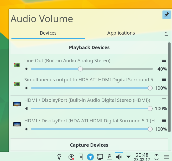
Additionally adds a button to open context menu and always shows ports in the menu (greyed out if only one available).
Based on D2314.
Additionally adds a button to open context menu and always shows ports in the menu (greyed out if only one available).
| Lint Skipped |
| Unit Tests Skipped |
| applet/contents/ui/ListItemBase.qml | ||
|---|---|---|
| 137 ↗ | (On Diff #11725) | Use Layout.preferredHeight instead of maximumHeight. |
| 148 ↗ | (On Diff #11725) | parent.opacity: mouseArea.containsMouse ? 0.8 : 1.0 |
| 264 ↗ | (On Diff #11725) | I know it was like that in the original code, but please rewrite it to use directly the properties (Muted in this case) instead of accessing it through PulseObject. |
| 283 ↗ | (On Diff #11725) | Please move literal to right side of comparison: PulseObject.ports.length > 0 or even in this case you can just write PulseObject.ports.length. But actually make it Ports.length as said in previous comment. |
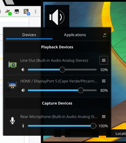
| 316 ↗ | (On Diff #11725) | If we now have a button for showing this menu, I think we can completely remove the right click context menu. |
Looks like the icon is really small in plasmoidviewer?
Just wondering why you used a IconItem+MouseArea pattern for the button instead of PlasmaComponents.ToolButton?
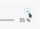
The positioning of the button is a really great idea.
| applet/contents/ui/ListItemBase.qml | ||
|---|---|---|
| 283 ↗ | (On Diff #11725) | Definitely go for the explicit var > 0 as the latter could be read as "if this variable exists". That's usually used as a JS minimisation trick. |
Using scaling factor 2 on 4K. Have no idea why it looks this way for you.
Just wondering why you used a IconItem+MouseArea pattern for the button instead of PlasmaComponents.ToolButton?
Was copy-paste of another one. But in general I don't like the frame on mouse over for a ToolButton. If you want the ToolButton though, we can talk about it.
| applet/contents/ui/ListItemBase.qml | ||
|---|---|---|
| 283 ↗ | (On Diff #11725) |
I like to read my inequalities from lower value to higher one. Easier to read the code this way. Besides style is there something else speaking against that? What @Zren said?
Please explain what you mean by this. |
| applet/contents/ui/ListItemBase.qml | ||
|---|---|---|
| 283 ↗ | (On Diff #11725) | I prefer if (Ports.length > 0) since that's how you'd read it in English. You wouldn't ask "is 0 less than the number of ports". |
| applet/contents/ui/ListItemBase.qml | ||
|---|---|---|
| 135 ↗ | (On Diff #11725) | As @Zren pointed out, please change it to ToolButton. This is actually a button, so there is no reason to make it IconItem + MouseArea. Also as it is now, it breaks accessibility. |
| 283 ↗ | (On Diff #11725) | Also, at least in plasma code, (var > 2) is used everywhere, so please change it. |
| applet/contents/ui/ListItemBase.qml | ||
|---|---|---|
| 135 ↗ | (On Diff #11725) | How does it break accessibility? |
| applet/contents/ui/ListItemBase.qml | ||
|---|---|---|
| 135 ↗ | (On Diff #11725) | You would need to manually set Accessible.role to Accessible.Button and other properties, but that's not really the main issue I have with that. This is clickable button, so it should be (and look like) button Item, for the consistency sake. |
| applet/contents/ui/ListItemBase.qml | ||
|---|---|---|
| 135 ↗ | (On Diff #11725) |
etc etc |
| 145 ↗ | (On Diff #11725) | Don't mess with the opacity, use the active property on IconItem which will have KIconLoader use the correct hover state (you could have configured it to tint the icon instead etc) |
| 273 ↗ | (On Diff #11725) | Please add some context for translators |
I'm using the default DPI of 96. PlasmaExtras.Heading { level: 5 } is what's controlling the RowLayout height.
Level 5 is just the theme.defaultFont.pointSize https://github.com/KDE/plasma-framework/blob/master/src/declarativeimports/plasmaextracomponents/qml/Heading.qml#L64
Which is pointSize=10 for me qml: onPointSizeChanged 10
Which is calculated as pixelSize=13 qml: onPixelSizeChanged 13 at 96 dpi
In practice, the IconItem ends up 15px tall, since you use Layout.maximumHeight: parent.height * 0.85
PlasmaCore.IconItem.onMaximumHeightChanged Layout.maximumHeight=15.299999999999999 height=15.649999999999999
Using 100% height gives an 18px tall icon
Using ToolButton like so had a height of 30px, which causes a lot of whitespace.
PlasmaComponents.ToolButton {
    iconName: "application-menu"
    onClicked: contextMenu.show(x, y + height)
    onHeightChanged: console.log('onHeightChanged', height)
}
Using Layout.maximumHeight: parent.height on the ToolButton will make it 18px tall, but will also make the icon tiny by default (because it keeps the padding). We can bypass this by anchoring a child IconItem.
We should probably look at ToolButtonStyle.qml to make sure we apply all the right effects to the icon. All I see is that we need to set action: parent.hovered and the colorGroup.
PlasmaComponents.ToolButton {
    Layout.maximumHeight: parent.height
    onClicked: contextMenu.show(x, y + height)

    PlasmaCore.IconItem {
        anchors.fill: parent
        source: "application-menu"

        // From ToolButtonStyle.qml
        active: parent.hovered
        colorGroup: parent.hovered || !parent.flat ? PlasmaCore.Theme.ButtonColorGroup : PlasmaCore.ColorScope.colorGroup
    }
}
After D4827 has landed, I'm finally able to update this Diff without crying into my pillow every evening (Yeah, maybe I'm exaggerating, but the former ToolButton design was an emotional topic for me! Everytime I saw its hovered state, I died a little inside...).
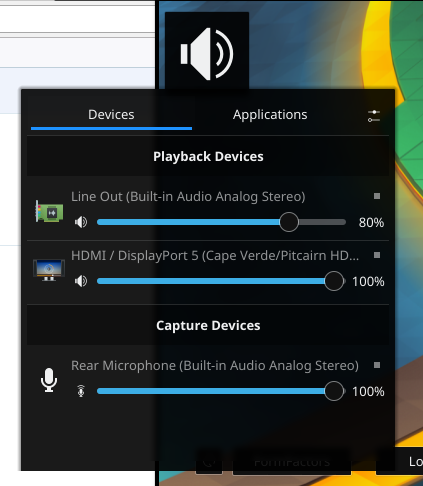
Looks quite complicated in the end. I would like to avoid that. Can you test my current work around? It just uses the slider height for the ToolButton size. Works quite well on my system and makes sense because we already use this size (with a small margin) for the mute button.
I mentioned earlier:
Using Layout.maximumHeight: parent.height on the ToolButton will make it 18px tall, but will also make the icon tiny by default (because it keeps the padding). We can bypass this by anchoring a child IconItem.
You need to anchor an IconItem on top of the button like in my last example, or write a completely new ToolButtonStyle that doesn't have the padding.
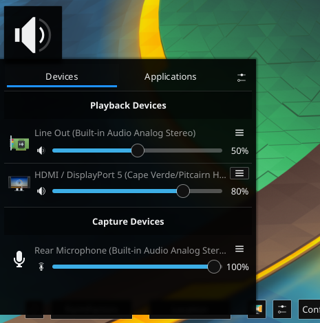
Did you try the last revision? It looks quite fine for me. The buger menu icon has roughly the same size as the volume indicator icon.
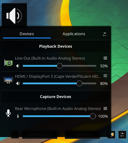
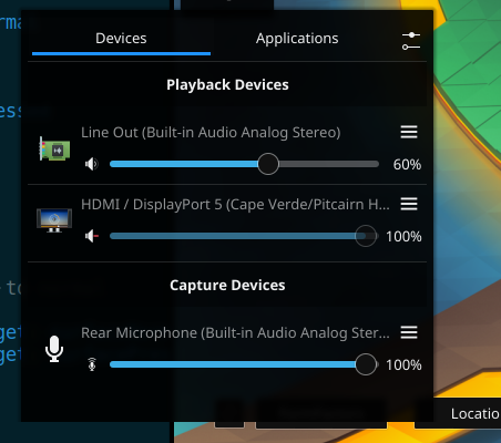
I did, there wasn't any change from when I tested it with Layout.maximumHeight, because there's padding around the icon. Huh, I didn't post a screenshot, here:

The height of the icon is based off the implicitHeight of the invisible label, which is controlled by the control.font. However, adding font.pixelSize: slider.height did nothing so Iunno how to manipulate that. It's why I've used the pattern I mentioned in my widget.
I didn't realize the mute button is also using the IconItem { MouseArea { anchor.fill: parent } } pattern. Hum. Logging the onHeightChanged prints this:
qml: volumeIcon.height 24.740000000000002
qml: volumeIcon.height 19.987499999999997
qml: volumeIcon.height 20.2
qml: contextMenuButton.height 45
qml: contextMenuButton.height 24
There's no easy way to log what the icon's height inside the contextMenuButton is, but I print screened and counted the pixels. There's 7 pixels around the icon. So that means the icon is only 10px (probably the default font height?).

Looks fine now. We should add more actions later as for streams there is just single action "mute" in menu.
@Zren You need to use latest plasma-framework as there are changes in ToolButton.
Ah! Sorry bout that, /usr/lib/x86_64-linux-gnu/qt5/qml/QtQuick/Controls/Styles/Plasma/ToolButtonStyle.qml is different from what it shows in git.
I copied the git source to that file, and while there was a bit of complaining about the stringlist => string bit, it now looks like this:
No problem! Great that it works for you now as well. Will push in just a moment. :)
Looks fine now. We should add more actions later as for streams there is just single action "mute" in menu.
When you've done this maybe you want to remove the mute option again from the context menu, since the user can mute the device/stream without opening the context menu by clicking on the volume indicator icon. The entry clutters the context menu for items with many entries in it.
Oh crap. I just realized the stringlist => string error caused the svg not to load at all. Which means it wouldn't detect the margins from the svg. Essentially causing it to not add any "padding". If I copy "use anchors instead of fillHeight …" which is the only other new commit, it's still too small.
Does the "toolbutton-hover" svg have no padding? Might need someone else with 1x DPI with updated repos to test this.
Since it looks ok for @drosca and me I'll commit it for now. Maybe we can fix your issue afterwards, or maybe you need to update something else to current master head (compiling via kdesrc-build is of course the most secure way of doing it).
Yes, today it's on my system too small as well (as @Zren described it already earlier). I'll investigate what's the reason and try to fix it in a new diff.
EDIT: Is a tooltip really necessary? A burger menu (when it has the right size) is pretty self explanatory and for example the burger menus on the desktop and in Dolphin also don't have any tooltip.