This improves the rendering when the task manager is oriented vertically. Before this change the taskbar had to be made too wide so that the task buttons show both icon and text. With the present change, the preferred icon size can be chosen via task bar configuration dialog so that text is shown also in narrower vertical task bars.
Details
Details
- Place the task bar vertically
- Adjust the task bar width e.g. so that the tray icons appear in rows of three
- Open some windows a Dolphin window so that there is at least one task open in the task bar
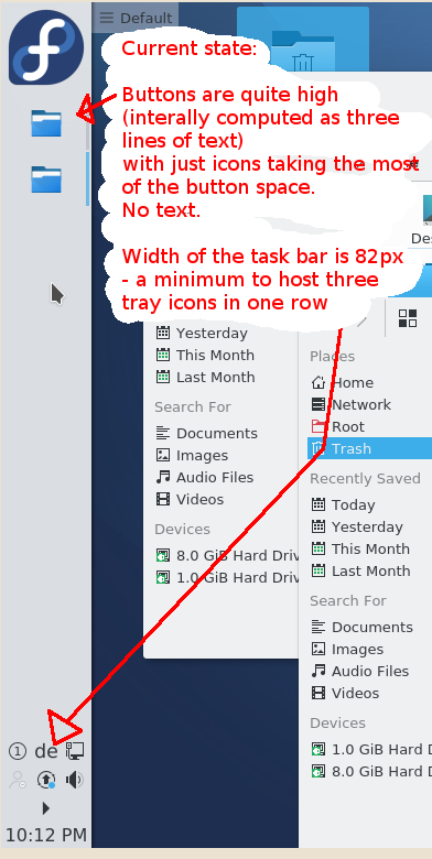
Before: The task buttons show only icons that stretch through the most of the button width. There is no text in the task button
After:
- Task Manager contect menu > Task Manager Settings... > Lower the icon size to Small Medium Hit OK
- The task buttons are showing a bit smaller icons and there is some text shown there too.
Diff Detail
Diff Detail
- Lint
Lint Skipped - Unit
Unit Tests Skipped
Comment Actions
I'm sorry, but I'm not inclined to accept this patch - I think this is over-configurability. It might make more sense to do this in a fork on the KDE Store for people who want a combo of extremely narrow panels and a column of multi-line text.
Comment Actions
I agree, adding options for everything and the kitchen sink is not the way to go.
| applets/taskmanager/package/contents/ui/ConfigGeneral.qml | ||
|---|---|---|
| 105 | gridUnit is not a character but just the size of an M, you can't directly relate that to a number of characters. | |
Comment Actions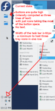
Hi Eike und Kai Uwe,
Thanks for your feedback. This is my first submission here, although I am a loyal user of KDE since 2001. Please be patient with me. I may have fully inappropriate expectations and I may be violating your processes and rules. I'll be glad to hear your well-intentioned advices.
I am ready to accept your disagreement about the way I took to reach my goal. I am open to discuss the means and I am not particularly bound to the two config options that you call "over-configurability".
What matters to me is the goal to be able to get the vertical task manager buttons rendered with a piece of text without needing to stretch it over ~80 pixels.
This is what we have now: When the width of the task bar is 82px (a minimum to host three tray icons in one row), the Task buttons are quite high (~45px, interally computed as three lines of text) with icons taking the most of the button space and there is no space for the text left.
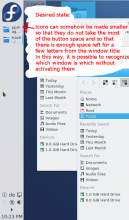
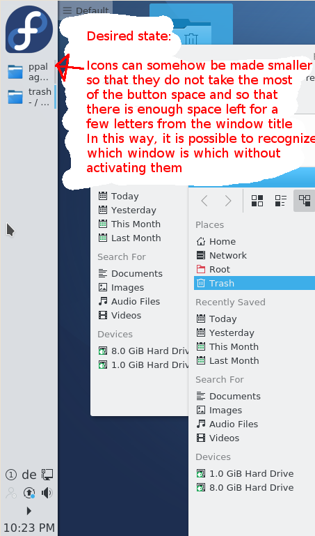
In the desired state, the Icons can somehow be made smaller so that they do not take the most of the button space and so that there is enough space left for a few letters from the window title.
In this way, it is possible to recognize which window is which without activating them.
Note, that the desired state is something that we always had in a horizontal task manager. I mean that even if there are many Task buttons in a horizontal manager, even that many that the buttons get as narrow as ~80px, it is still possible to make the task manager to render the buttons with both icons and text. This is because the height of the task bar imposes a natural upper boundary for the task button height and eo ipso for the icon height *and* width. Hence if I want text in narrow buttons I can simply decrease the height of the whole task bar, that makes the icons smaller and prepares more space for text. Unfortunately, there is no such indirect way to force smaller icons in a vertical task bar.
Through adopting the present goal, we will just add the capability we have in the horizontal task manager to the vertical task manager.
Note also that the vertical tool manager used to work as described in the desired state till KDE 3.5. This might be taken as solving an old regression.
I hope the sketched goal is worthwhile and that we can discuss how to reach it without "over-configuration". My original proposal (call it (A)) is just one possibility.
You are probably much more experienced in not over-configuring things and will thus be so kind to propose other ways how to make the buttons in vertical managers to show some text?
Comment Actions
The problem is that there's no universal agreement among users as to what they want to see in your example case. Many users who set up a narrow vertical panel want labels to collapse away, and lowering the threshold (which btw was already done for 5.9 - that magic number was 5 instead of 7 until recently) breaks their existing setup.
It's easy and reasonable to point out that, given that Icons-only Task Manager exists and is bundled by default these days, the regular Task Manager should try harder to keep showing labels, as users who only want icons can, well, use ITM. The problem is that the use case for ITM is muddier than that though, for historical reasons - aside from collapsing labels, ITM also comes with a number of long-established behavior changes; it really implements the "dock pattern" while regular TM does not. This keeps some users on TM but still want label-less buttons on a vertical panel.
This is a big hairy knot we need to untangle to make progress, and ideally without taking the lazy way out of adding a checkbox for all the things. And again there's also a certain opportunity space for third-party aftermarket customization via the Store, the bundled widgets don't necessarily need to support every whim.
So, there's a bunch of options, and all of them kind of suck:
a) Change defaults in TM to maximize text in vert orientation (less tall buttons, lower collapse threshold), ask users whose setup this breaks to use ITM, make things they don't like about ITM confiurable or tell them to suck it up and see how that goes over
b) Add some sort of abstract Less/More text slider or combo box config option, shown only in vert mode
c) Instead of text make that option about Taller/Shorter buttons, or icon size, or something
d) ...
Comment Actions
Hallo Eike,
Yes, as long as we do not (I guess we do not) have any reliable data about user preferences, it is hard to assess the impact of any hard-coded rendering constant change. A move either way will inevitably make somebody upset. I think that making a setting configurable (taking the original constant as a default) is the safest way to increase the overall number of satisfied users. So far, I always perceived KDE as superior to all other desktops when it comes to configuring things towards one's own taste (and that's exactly why my ~3 attempts to switch to Gnome failed :)
On the other hand, I can see what new config options mean for testing and maintenace. The more options the more complexity, the more "bug surface", the more testing, the harder to maintain, the harder to reason about.
Therefore, I share your concerns about introducing too many new config options and I hope we will be able to find a solution acceptable for all sides.
About your ideas:
a) Change defaults in TM to maximize text in vert orientation (less tall buttons, lower collapse threshold), ask users whose setup this breaks to use ITM, make things they don't like about ITM confiurable or tell them to suck it up and see how that goes over
I do not find this one good. As I said, the impact is hard to quantify, it will break the experience for users who found the present solution good. Hardcoding important settings is not in the spirit of KDE.
b) Add some sort of abstract Less/More text slider or combo box config option, shown only in vert mode
I am not sure if I am able to imagine how the position of such an abstract slider would translate to the real values for icon size, button height, minimum chars per line and the number of text lines. I'd perhaps be able to tell my opinion if you add more details how such a slider is supposed to work.
c) Instead of text make that option about Taller/Shorter buttons, or icon size, or something
This sounds as a reasonable compromis to me. I think I'll try to implement this if you do not mind. I think I'll start with an icon size pref combo ("small", "smallMedium", "medium", "large", "huge", "enormous") and will see if it looks good to me.
Comment Actions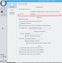
New or noteworthy about the second iteration:
(1) It implements the proposal c) of Eike.
(2) There is is just one "Icon size" control in the configuration dialog, instead of two controls in the previous iteration.
(2) The "Icon size" combo and its label are visible only if the task manager is positioned vertically
(3) The "Icon size" preference is effective only for vertical task managers. It basically limits the size the icon is allowed to stretch to. See the changes in preferredMaxHeight() function.
(4) The "5 literal" meaning the number of 'm' characters whose joint width must be available in the task button label so that the button text is rendered at all was refactored to minimumMColumns() function in layout.js. minimumMColumns() returns 5 for horizontal layouts and 3 for vertical layouts.
(5) The present proposal does not change the behavior of horizontal task manager in any way.
(6) The present proposal reaches the goal of making it possible to show some text in a vertical task manager through choosing a smaller icon size in the configuration. OTOH, users interested in icon-only layouts may reach their aim by selecting larger icons or narrower vertical task manager.
Is the present proposal acceptable?
Comment Actions
I'm starting to like it, but it's a little bit scary. The thing is that we don't want to alter behavior in existing user setups, which is mostly narrow vertical panels that don't get text. I fear that with default settings, due to lowering the threshold to 5 from 3, they'll suddenly get text and need to go into settings to mess with the icon size to displace the text. We need to take care existing user setups aren't disrupted.
Another thing: Check out the Folder View (plasma-desktop.git/containments/desktop/...) settings UI, and replace the combo box with the slider from there. We try to avoid showing the names of the icon size categories in UI for extensibility/future-proofness reasons.
Comment Actions
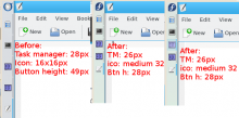
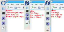
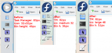
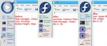
I see what you mean and I checked how it looks like before and after the change for Task manager withs of one (~28px), two (~56px), three (~82px) and four (~116px) tray icons.
Doing that, I found that I had a small bug there in Task.qml s/minimumMColumns()/LayoutManager.minimumMColumns()/ and that the results look better if the minimumMColumns() function returns 4 for vertical layouts. Both changes are there in the current third diff.
Please have a look at the comparison in the pictures:
One tray icon:
Two tray icons:
Three tray icons
Four tray icons:
Note that in the present diff, I propose the default iconSize "large" which is shown in the right most column of the comparisons. With this default, the users get exactly the same text visibility behavior as we had before the change: No text is shown for 1,2 and 3 tray icons and there is some text shown for 4 tray icons.
I admit that with default "large", the icons are rendered a bit bigger, but OTOH, the overall button height stays very similar: for 2,3 and 4 tray icons, the button is just 3 pixel taller. (49px vs. 52px) In the new version, the icon simply fills more space of the button. I personally find the right-most column looking better than the original left-most.
I the narrowest case (one tray icon), there is no way to make the buttons as tall they were originally. Again, I personally find the proposed rendering better than the current one.
Please comment, if the new rendering is acceptable.
Another thing: Check out the Folder View (plasma-desktop.git/containments/desktop/...) settings UI, and replace the combo box with the slider from there. We try to avoid showing the names of the icon size categories in UI for extensibility/future-proofness reasons.
OK, no problem, I can try that in the next iteration once we agree on the rendering of the Task manager.
Comment Actions
The comparisons (thanks for going to the length to make them) look OK, at least for "let's go with this and check for feedback". Let's go ahead!
Comment Actions
The comparisons (thanks for going to the length to make them) look OK, at least for "let's go with this and check for feedback". Let's go ahead!
Nice to heard that :)
I am updating the diff so that the configuration dialog contains a slider rather than a combo. This is what it looks like:
Any comments?
Comment Actions
Thanks. What is the next step, actually? Is there more feedback to be expected here or somewhere else?
Comment Actions
Patch looks good. Do you have a developer account to commit it or should I do it for you?
Comment Actions
Patch looks good.
Thanks for the review and for the assistance!
Do you have a developer account to commit it or should I do it for you?
Yes, please do it for me.
Comment Actions
One more request, would you mind rebasing it against current master? (Doesn't apply cleanly currently.)
Comment Actions
One more request, would you mind rebasing it against current master? (Doesn't apply cleanly currently.)
I rebased and updated the diff, but I had no to time to run the rebased code. I hope that you or somebody else will do.