The look of Breeze menu titles has always slightly bothered me since they have the same
visual style and weighting as items, so they look clickable even though they aren't, and
they don't really do a very good job of separating sections, as seems to be their purpose.
This patch my my attempt to remedy the situation by making them look more "title-like"
and have greater visual distinctiveness from the items above and below them.
Details
Details
- Reviewers
niccolove ndavis - Group Reviewers
VDG Breeze - Commits
- R31:9b5fd370921f: [QStyle] Make menu titles look less like menu items
Plasma Task Manager item context menu, before:

Plasma Task Manager context menu, after:

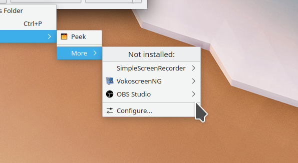
KMoreTools menu, before:

KMoreTools menu, after:
Diff Detail
Diff Detail
- Repository
- R31 Breeze
- Branch
- menu-title-looks-less-like-a-menu-item (branched from master)
- Lint
No Linters Available - Unit
No Unit Test Coverage - Build Status
Buildable 27025 Build 27043: arc lint + arc unit
Comment Actions
Not a fan of making it hard to read. I agree that it makes it more obvious it's not clickable but we deliberately changed many places that used disabled menu items as sections to use proper sections for readability.
Comment Actions
That's true.
Do you think we should try to mimic the Kirigami ListSectionHeader appearance then?
Comment Actions
Big +1 to the idea, but this shouldn't use darker() because that won't look right in Breeze Dark.