The configuration UI is somewhat clumsy, some better arrangement suggestion would be welcome.
There are still more options on the radar, such as showing the "broken-line" character also
optionally indented (now is shown left with line numbers) and others.
Details
- Reviewers
- None
- Group Reviewers
VDG
Diff Detail
- Repository
- R39 KTextEditor
- Branch
- dynwrap-marker
- Lint
No Linters Available - Unit
No Unit Test Coverage - Build Status
Buildable 22507 Build 22525: arc lint + arc unit
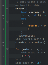
This is an example with right fill of 3 characters, left fill off, with indentation lines (note that they spend all visual lines of the dynamically wrapped line).
Note: extra space (right fill) is not computed correctly if tabs are used for line indentation.
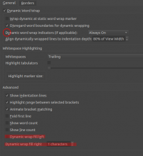
This is the current dialogue, with two new options at the bottom (the circle had horizontal spring before an unrelated option, I think it was there by accident...?!).
No offense meant, but even with the screenshots I still have no idea what this is about :)
Can you add a before/after screenshot so we can see the visual difference?
Also, the "fill left" and "fill right" wording is new, and not intuitively understandable for me.
Can we do better?
No offense meant, but even with the screenshots I still have no idea what this is about :)
Good point, I somehow missed to explain the rationale for the change. :) If you are familiar with vim, this would be the breakindent and breakindentopt settings (that was my patch from 2007 which did not make it into vim until a few years back).
Can you add a before/after screenshot so we can see the visual difference?
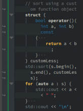
I will use this example from std::sort documentation which is not the most convoluted code (those changes are the most useful for deeply nested code).
This is the original rendering (with narrow window to make the point) and D27238 applied (breaking line anywhere rather than at whitespace-only):
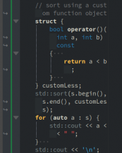
Note how indentation blocks, manifest from empty space left, and also vertical indentation lines, are visually damaged by the dynamic wrap fill (I call this left fill, it is left of the indentation level). Dynamic wrap is something related to presentation only, not to overall code logic (indentation), and is line-local; so the option to enable/disable this fill is to make it possible to remove this globally-prominent visual cue about something very much local. This is without the left fill (note how indentation lines now also extend vertically):
Now, the line being wrapped does have some importance and it should be shown somewhere. It is shown already by the arrow in the left margin, but that is way too far from the break, even left from folding markers (global logic) (I understand the wrap markers are there probably from the age when dynamic wrapping did not respect indentation and it was a sin to write code beyond col 80 ;) ).
So the "right fill" is right of the indentation level on subsequent visual lines and gives visual cue about the line being wrapped; like this (2 characters wide, that is adjustable):
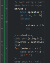
Of course, there are many options how to mark the break where it occurs, this one was just the easiest one. Onec can clutter configuration more and think of options like moving the arrow in the left margin to the line beginning, like this (this is just GIMP, not in the code)
but I think it is better to start with something relatively simple.
It is possible to enable both left and right fill (not sure why anybody would want that, but I was not sure even for the original (left) fill):
Also, the "fill left" and "fill right" wording is new, and not intuitively understandable for me.
That is a new "terminology" I am free to adjust. Left is simply left of indentation level, right is on the right.
Hope this explains somewhat.
Ok, I now fully got this, thanks for the explanation. And indeed without any left fill visual feedback is missing.
What I wonder is how much of this needs to be configurable. We could also just make the left fill of 4 default or so.
In any case, I think we should go forward with this patch. @cullmann your opinion?
Note to myself: should handle the case when width percentage disallows the indent, then indentation liens should not be drawn... e.g. here:
Fix indentation lines shown spuriously when horizontal space was unsufficient for indent fill

