Details
- Reviewers
ngraham - Group Reviewers
VDG KDE Connect
Diff Detail
- Repository
- R266 Breeze Icons
- Branch
- KDEconnect (branched from master)
- Lint
No Linters Available - Unit
No Unit Test Coverage - Build Status
Buildable 22171 Build 22189: arc lint + arc unit
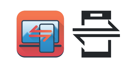
Hey, thanks for working on this!
A "brand" re-design is something that we could really use. One of the things that I would like to change from the current icon/logo, though (and that this new one doesn't change), is the fact that there is a mobile phone in it.
You can use KDE Connect between two computers, or between two phones (although it's not the main development focus at the moment). So I think a more generic icon that embodies "syncing" without any specific device would suit us better, IMO. Plus I find a bit weird to have a phone app whose icon is... a phone.
hmm I don't think that It is a problem because both devices the app can run on are depicted
Hmm. I'm not into the color icon. These combinations of colors and shapes just seem very foreign to Breeze. If KDE Connect wants to change its icon branding, maybe they should have some elements that are a bit more abstract/stylized than the current color icon? I currently don't have many suggestions, but I'll try to come up with more to say later.