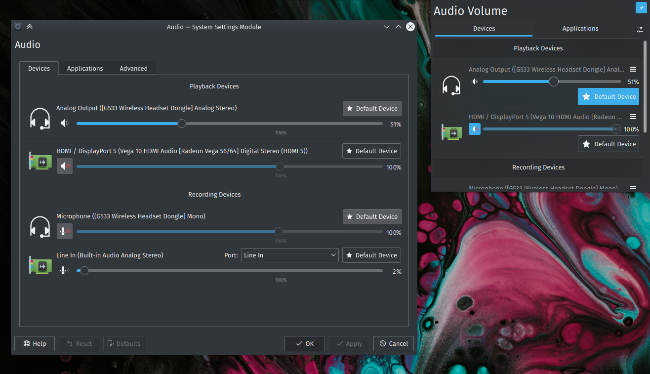
I was looking through changes in plasma-pa and noticed, that the KCM looks very different in contrast to the applet.
Details
Details
- Reviewers
ngraham GB_2 - Group Reviewers
Plasma VDG - Commits
- R115:608e9e6fe793: Make KCM look more like applet
Checked for mute button function on all occasions (sinks, sources, applications playing, applications recording). Checked if volume slider works as expected.
Diff Detail
Diff Detail
- Repository
- R115 Plasma Audio Volume Applet
- Branch
- feat-applet-ux
- Lint
No Linters Available - Unit
No Unit Test Coverage - Build Status
Buildable 17060 Build 17078: arc lint + arc unit
| src/kcm/package/contents/ui/Applications.qml | ||
|---|---|---|
| 87 ↗ | (On Diff #66908) | please don't remove the i18nd you'll break translations if the kcm is loaded within the applet |
| src/kcm/package/contents/ui/MuteButton.qml | ||
|---|---|---|
| 32 | I actually think this is the wrong way of doing tooltips here. The applet does it with PlasmaComponents. How can I create a tooltip with QCC? | |
| src/kcm/package/contents/ui/Applications.qml | ||
|---|---|---|
| 49 | I don't think the addition of the word "Streams" adds useful information here. | |
| 90 | ditto | |
| src/kcm/package/contents/ui/MuteButton.qml | ||
| 23–24 | If you're going to change this (and +1 for it), make it say import QtQuick.Controls 2.5 as QQC2 and then add the QQC2.<whatever> namespace | |
| 32 | Using the attached ToolTip property is just fine here for QQC2 items. | |
| src/kcm/package/contents/ui/MuteButton.qml | ||
|---|---|---|
| 26 ↗ | (On Diff #66783) | Now that this thing is moved next to the volume slider, I feel like it should be a ToolButton, like in the applet. |
Comment Actions
Use QQC2 ToolButton instead of Button for Mute. Add stepping to volume slider, similar to applet.
| src/kcm/package/contents/ui/DeviceListItem.qml | ||
|---|---|---|
| 54 ↗ | (On Diff #66783) | While we're at it, let's also make this say "Port:" |
| src/kcm/package/contents/ui/VolumeSlider.qml | ||
| 44 ↗ | (On Diff #66783) | Hmm, I don't like how this makes tickmarks appear. If you need to round the value, you can do that in onMoved: { blabla; }, or just round the value of the label itself. |
| src/kcm/package/contents/ui/VolumeSlider.qml | ||
|---|---|---|
| 44 ↗ | (On Diff #66783) | I have removed this now as I can't replicate the same behavior as the applet. Added a TODO for the future |
Comment Actions
Nice.
Now that I compare the two, one remaining difference is that each item's icon differs in location in the applet vs the KCM. In the Applet, it's larger and to the left of everything else; whereas in the KCM the icon is small and in the same row as the title.
| src/kcm/package/contents/ui/MuteButton.qml | ||
|---|---|---|
| 32 | That is something that needs to be fixed in the QQC2 desktop style, so it is unrelated to this. | |
Comment Actions
I'd also align the mute button with the slider, like in the applet.
| src/kcm/package/contents/ui/DeviceListItem.qml | ||
|---|---|---|
| 97 ↗ | (On Diff #66783) | "Default Device" |

Comment Actions
Nice work. Landed on master so we have plenty of time to polish it up in follow-up patches. Speaking of that, I have a suggestions for unifying the UI even more: for multi-port devices, show the port chooser combobox instead of the name of the current port, in both the KCM and the applet. There's guaranteed to be enough room (we'd be replacing a string with the same string in a combobox). Then remove the "Ports" items in the applet's hamburger menu.
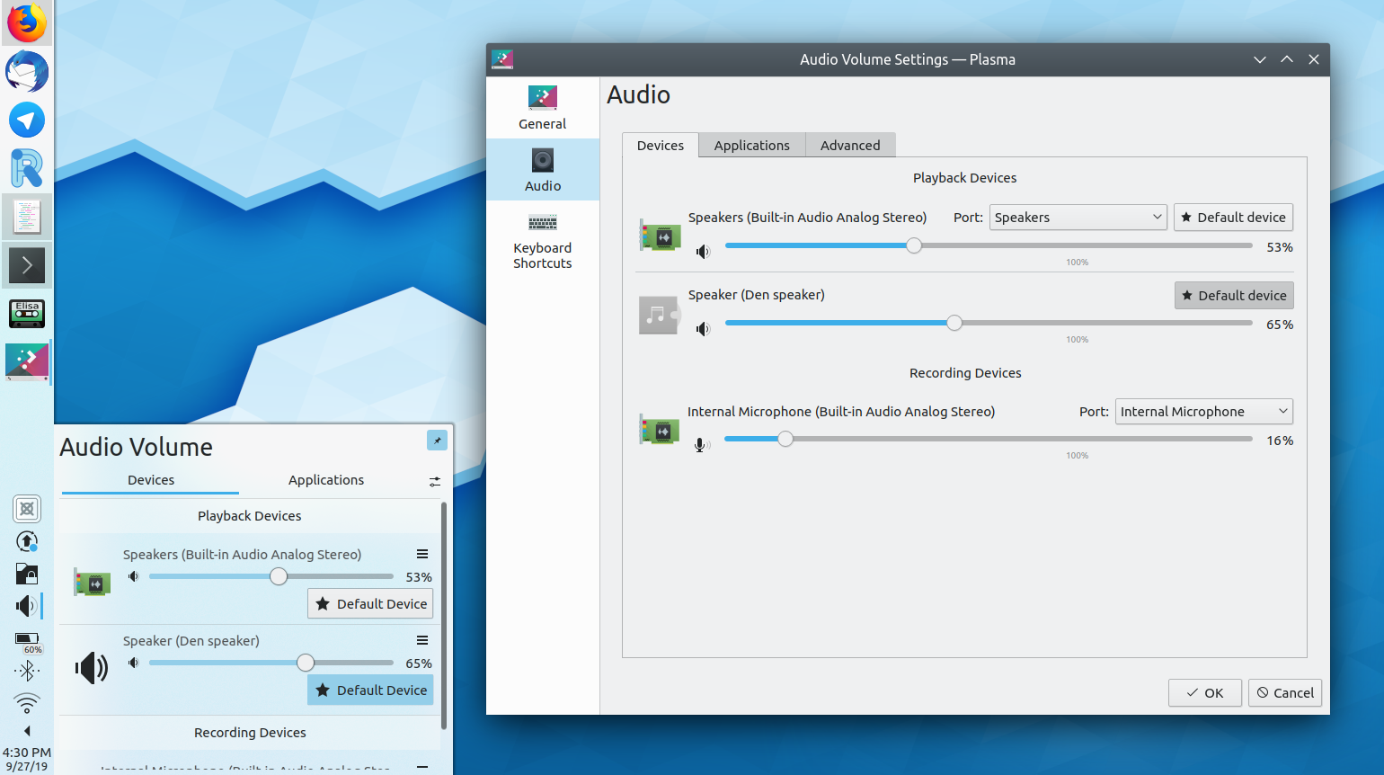
Oh and I just noticed a regression I didn't see before landing the patch, sorry. :/ The icons no longer match between the KCM and the applet when I add an external bluetooth device:
Comment Actions
The applet uses a utility function in icon.js. It would be easy to fix that. But there would be one implementation detail I would need to know. As both the applet and the kcm have an icon.js can we somehow share this code between them, so we don't have duplicate code. Like some kind of "common" directory to put the icon.js into and load it from there? Or should we just symlink the file from one place to another?