Add view-pages-* icons, as needed in Okular for page layout selection
ClosedPublic

Authored by davidhurka on Jul 21 2019, 5:30 PM.

Details

Summary

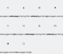
This is my try to add the icons I requested in D21196#484674.

The icons are: view-pages-[single|facing|facing-first-centered|overview], as they are needed for the View Layout menu; and view-pages-continuous, as it is needed for the Continuous view option (which might be moved into the View Layout menu).

view-pages-single is a symlink to snap-page, because it’s the same icon.

Additionally, snap-pages is flipped vertically, to fit the new convention with the paper fold in the top right corner.

BUG: 409082
Test Plan


Diff Detail

Repository
R266 Breeze Icons
Branch
add-icons-for-pagelayouts
Lint
No Linters Available
Unit
No Unit Test Coverage
Build Status
Buildable 14333
Build 14351: arc lint + arc unit
davidhurka created this revision.Jul 21 2019, 5:30 PM
Restricted Application added a project: Frameworks. · View Herald TranscriptJul 21 2019, 5:30 PM
Restricted Application added a subscriber: kde-frameworks-devel. · View Herald Transcript
davidhurka requested review of this revision.Jul 21 2019, 5:30 PM

I’m not sure whether I did everything correctly. If I did, this is too complicated.

The guidelines in the community wiki and the HIG are missing:

  • What are the borders good for?
  • What icon sizes are needed? (I choosed 16, 22, 24, because theese have the most icons.)
  • What is 24px good for? Isn’t it just 22px with 1px additional border?

And there are just workflow tips, is the actual workflow for adding icons described somewhere?

One more problem: scour breaks up the colors of the path elements, if they are more than 2. It moves the fill attribute in a group, but then the color attributes seem to override it, so the stylesheet is ignored.

davidhurka edited the test plan for this revision. (Show Details)Jul 21 2019, 5:38 PM
davidhurka added a subscriber: Okular.
ngraham added a reviewer: ndavis.EditedJul 21 2019, 10:30 PM

Very impressive for your first icons!

The 16px version is used in menus. The 22px version is used in toolbar buttons. 24px is unnecessary; it's only used by some 3rd-party apps I think. The ones that are already in there at that size are legacy and maybe we should just delete them? 32px is used for category icons and should be colorized. In general there isn't a reason to create monochrome 24x or 32px icons (and the few places where we are actually using 32px monochrome icons should be changed IMO; see T10165). When in doubt, if it's a monochrome action icon, you can safely make 16px and 22px versions and call it a day.

This definitely needs some cleanup in the documentation, for sure.

In terms of the icons themselves, they look good! I have a visual change request though: could you put the page curl on the top rather than on the bottom. That's the general style that most Breeze document icons use, and it would be good to use that. Basically just vertically flipping the icons should be sufficient.

ndavis requested changes to this revision.EditedJul 22 2019, 1:29 AM

Nice work!

I know a lot of monochrome icons currently use the bottom right position for the folded corner, but I think we should start using the top right. The bottom right clashes with our convention of putting additional symbols in the bottom right and all of our color icons use the top right for the corner fold.

There are some additional changes I would like to see.

Naming scheme:
Since this is changing the view, the naming scheme should be something like view-pages-* rather than pagelayout-*

pagelayout-single:
This should be a relative symlink to snap-page.svg since they're the same icon.

pagelayout-facing:
The 16px version is good, but the larger versions don't use up enough of the available canvas. In general, aim to use 100% of the allowed vertical space (16px in height with 3px top/bottom margins for 22px) unless that would force you to squish the symbols in an unattractive way.

pagelayout-facing-first-centered:
The top page should be centered to reflect how the view mode works. I think the top page shouldn't be cut off, but that means you'll need to shrink the size of the pages overall. This will be particularly difficult for the 16px version. If you can't get the 16px version to look right with a 2px margin on the top and bottom, I'll accept it with a 1px margin even though that goes against the HIG.


I don't think it's necessary to do 24px versions of these icons, but there's no harm in doing them. It's just more work.

This revision now requires changes to proceed.Jul 22 2019, 1:29 AM

Nice work!

I know a lot of monochrome icons currently use the bottom right position for the folded corner, but I think we should start using the top right. The bottom right clashes with our convention of putting additional symbols in the bottom right and all of our color icons use the top right for the corner fold.

Makes sense, so I’m flipping snap-page now. Is that written down somewhere?

Previously I thought a fold on the top is for documents, and a fold on the bottom for pages. Icons like file-new have a fold on the top, icons like insert-page-break have it at the bottom.

There are some additional changes I would like to see.

Naming scheme:
Since this is changing the view, the naming scheme should be something like view-pages-* rather than pagelayout-*

Because it’s changing the layout of pages, not a layout in a page, yes?

pagelayout-single:
This should be a relative symlink to snap-page.svg since they're the same icon.

Ok.

pagelayout-facing:
The 16px version is good, but the larger versions don't use up enough of the available canvas. In general, aim to use 100% of the allowed vertical space (16px in height with 3px top/bottom margins for 22px) unless that would force you to squish the symbols in an unattractive way.

I have increased the height by 1px for the 22px icon.

pagelayout-facing-first-centered:
The top page should be centered to reflect how the view mode works. I think the top page shouldn't be cut off, but that means you'll need to shrink the size of the pages overall. This will be particularly difficult for the 16px version. If you can't get the 16px version to look right with a 2px margin on the top and bottom, I'll accept it with a 1px margin even though that goes against the HIG.

I can’t follow you here. Centering the first page is a feature / technical detail of Okular, but it indicates that the first page is somehow special, like the cover page of a book. But your document could be a single chapter of the book as well, so the first page is just a regular odd-numbered page. That page should be aligned right.

Now my 16px icon looks like a bunch of arrows, not so fine...


I don't think it's necessary to do 24px versions of these icons, but there's no harm in doing them. It's just more work.

Removed them.

davidhurka updated this revision to Diff 62293.Jul 22 2019, 1:39 PM
  • Remove 24px icons
  • Flip snap-page icons vertically, so the corner fold is at the top-right
  • Make pagelayout-single link to snap-page
  • Flip pagelayout-* icons, except pagelayout-single
davidhurka updated this revision to Diff 62294.Jul 22 2019, 1:44 PM
  • Rename pagelayout-* to view-pages-*

What is the icons-dark directory good for? The icons in there are mostly just the same as in icons.

And I’m a bit concerned that scour-icon removes the id="currentColorScheme" attribute from the stylesheet. How do I avoid that?

I'll give the latest changes a proper review in a little while.

What is the icons-dark directory good for? The icons in there are mostly just the same as in icons.

Non-Qt apps, since they don't work with our stylesheets. Hopefully an XDG standard for coloring symbolic/monochrome icons will fix that and then we can drop icons-dark.

And I’m a bit concerned that scour-icon removes the id="currentColorScheme" attribute from the stylesheet. How do I avoid that?

Hm, you could try removing --enable-id-stripping and --shorten-ids from the command. If anything from this page confuses you or doesn't work, be sure to post in the Discussion section. Writing documentation isn't a strength of mine, but it's something that has to be done.

davidhurka added a comment.EditedJul 22 2019, 2:35 PM

I'll give the latest changes a proper review in a little while.

What is the icons-dark directory good for? The icons in there are mostly just the same as in icons.

Non-Qt apps, since they don't work with our stylesheets. Hopefully an XDG standard for coloring symbolic/monochrome icons will fix that and then we can drop icons-dark.

But it is just a redundancy. Can’t there be a script, which copies icons to icons-dark and changes the colors, when compiling the icons?

If anything from this page confuses you or doesn't work, be sure to post in the Discussion section. Writing documentation isn't a strength of mine, but it's something that has to be done.

Done.

davidhurka added a comment.EditedJul 22 2019, 3:01 PM

Nice work!

I know a lot of monochrome icons currently use the bottom right position for the folded corner, but I think we should start using the top right. The bottom right clashes with our convention of putting additional symbols in the bottom right and all of our color icons use the top right for the corner fold.

Other icons with fold in the bottom I could find:

  • document-duplicate
  • document-revert-symbolic[-rtl]
  • kt-restore-defaults
  • password-copy
  • viewpdf
  • xml-node-duplicate
  • user-desktop-symbolic
  • document-multiple
  • folder-documents[-symbolic]
  • emblem-documents-symbolic
  • acrobat
  • activity-fork
  • background-tool
  • insert-page-break

Most icons indeed have the fold at the top, especially Mimetypes icons look great. :)

I'll give the latest changes a proper review in a little while.

What is the icons-dark directory good for? The icons in there are mostly just the same as in icons.

Non-Qt apps, since they don't work with our stylesheets. Hopefully an XDG standard for coloring symbolic/monochrome icons will fix that and then we can drop icons-dark.

But it is just a redundancy. Can’t there be a script, which copies icons to icons-dark and changes the colors, when compiling the icons?

Oh that sounds like a lovely idea!!!

Makes sense, so I’m flipping snap-page now. Is that written down somewhere?

Nope, it was recently decided, but I've had that in the back of my mind for a while.

Previously I thought a fold on the top is for documents, and a fold on the bottom for pages. Icons like file-new have a fold on the top, icons like insert-page-break have it at the bottom.

I think it doesn't have anything to do with whether the icon is for pages or documents, it's just that the document-new icon was created more recently with a different style. It might be useful to have a distinction between pages and documents, but a different position for the fold isn't enough and I'm not sure how to make the difference obvious.

Naming Scheme:
[...]

Because it’s changing the layout of pages, not a layout in a page, yes?

Mainly just to be consistent with existing icon naming schemes, but that's another possible reason that I didn't think of.

pagelayout-facing:
[...]

I have increased the height by 1px for the 22px icon.

It still looks pretty squished. Here's what I was thinking of:

pagelayout-facing-first-centered:
[...]

I can’t follow you here. Centering the first page is a feature / technical detail of Okular, but it indicates that the first page is somehow special, like the cover page of a book. But your document could be a single chapter of the book as well, so the first page is just a regular odd-numbered page. That page should be aligned right.

Since it's an icon for Okular and the feature is called "Facing Pages (Center First Page), I don't understand what the problem is with making the top symbol centered.

Here's what I had in mind:

But it is just a redundancy. Can’t there be a script, which copies icons to icons-dark and changes the colors, when compiling the icons?

For most icons, probably.

Other icons with fold in the bottom I could find:

  • document-duplicate
  • document-revert-symbolic[-rtl]
  • kt-restore-defaults
  • password-copy
  • viewpdf
  • xml-node-duplicate
  • user-desktop-symbolic
  • document-multiple
  • folder-documents[-symbolic]
  • emblem-documents-symbolic

    Most icons indeed have the fold at the top, especially Mimetypes icons look great. :)

Thanks! In case you're not sure, you don't need to change any of those in this patch.

I can’t follow you here. Centering the first page is a feature / technical detail of Okular, but it indicates that the first page is somehow special, like the cover page of a book. But your document could be a single chapter of the book as well, so the first page is just a regular odd-numbered page. That page should be aligned right.

Since it's an icon for Okular and the feature is called "Facing Pages (Center First Page), I don't understand what the problem is with making the top symbol centered.

Here's what I had in mind:

Just thinking about RTL layout, centering the top symbol is probably better. Fold will still be on the right, because all the other icons already have it on the right...

davidhurka edited the test plan for this revision. (Show Details)Jul 22 2019, 5:06 PM
davidhurka retitled this revision from Add icons for pagelayout options, as needed in Okular to Add view-pages-* icons, as needed in Okular for page layout selection.Jul 22 2019, 5:08 PM
davidhurka edited the summary of this revision. (Show Details)
davidhurka updated this revision to Diff 62332.Jul 22 2019, 5:10 PM
  • Adapt view-pages-facing and -facing-first-centered to use ndavis' suggested files

By the way, the suggested stylesheet in https://community.kde.org/Guidelines_and_HOWTOs/Icon_Workflow_Tips#Breeze does not follow https://hig.kde.org/style/icon.html as far as I can understand it.

  • Why does the stylesheet need a background?
  • How are the color scheme properties in the stylesheet mapped to the reduced breeze palette in the HIG? (I think neutral or Beware Orange do not clearly map.)

If this is ok now, I still have to add the lost id="current-color-scheme".

These versions look great to me now. :)

By the way, the suggested stylesheet in https://community.kde.org/Guidelines_and_HOWTOs/Icon_Workflow_Tips#Breeze does not follow https://hig.kde.org/style/icon.html as far as I can understand it.

I just changed the stylesheet in the workflow tips today. I need to update the HIG to match it.

  • Why does the stylesheet need a background?

You only need to add the classes that you will use. If you want to use the window background color, you can use the Background class.

  • How are the color scheme properties in the stylesheet mapped to the reduced breeze palette in the HIG? (I think neutral or Beware Orange do not clearly map.)

Beware Orange is just the name of a color (it's an arbitrary name). NeutralText is a class that maps to the Neutral Text color in your system colorscheme. The color of Neutral Text just happens to be Beware Orange with the Breeze colorscheme, but you could make it purple by changing the colorscheme. Since Breeze uses Beware Orange, that color must be the default color in the stylesheet so that the icon color looks like Breeze in non-Qt apps.

If you find any more flaws in the HIG, report an issue at https://invent.kde.org/websites/hig-kde-org/issues or fork, patch and merge request to submit a patch for that repo.

  • Why does the stylesheet need a background?

You only need to add the classes that you will use. If you want to use the window background color, you can use the Background class.

Making the parts with background color transparent would be better, right? That would even work on systems which don’t access the stylesheet.

  • How are the color scheme properties in the stylesheet mapped to the reduced breeze palette in the HIG? (I think neutral or Beware Orange do not clearly map.)

Beware Orange is just the name of a color (it's an arbitrary name). NeutralText is a class that maps to the Neutral Text color in your system colorscheme. The color of Neutral Text just happens to be Beware Orange with the Breeze colorscheme, but you could make it purple by changing the colorscheme. Since Breeze uses Beware Orange, that color must be the default color in the stylesheet so that the icon color looks like Breeze in non-Qt apps.

So this means, changing the Neutral Text property on your system will modify the Beware Orange parts of breeze icons, yes? That’s what I meant with mapping.

I could imagine adding this to the HIG: A table with the reduced breeze color palette, the color names, the corresponding color scheme entries, and the existing description to the color. (So only add the color scheme entry.)

If you find any more flaws in the HIG, report an issue at https://invent.kde.org/websites/hig-kde-org/issues

Concerning margins: https://invent.kde.org/websites/hig-kde-org/issues/12

or fork, patch and merge request to submit a patch for that repo.

Not today, have to leave the wall plug now... :)

Making the parts with background color transparent would be better, right? That would even work on systems which don’t access the stylesheet.

Not necessarily. In Breeze, the normal window Background is #eff0f1, the ViewBackground is #fcfcfc and the selection background is #3daee9. If you use the Background class, you will have #eff0f1, whether the SVG is on top of a normal window background or not. This is more useful for Plasma themes than icons, but they're both made with SVGs and can use the same color classes.

So this means, changing the Neutral Text property on your system will modify the Beware Orange parts of breeze icons, yes? That’s what I meant with mapping.

I could imagine adding this to the HIG: A table with the reduced breeze color palette, the color names, the corresponding color scheme entries, and the existing description to the color. (So only add the color scheme entry.)

Yeah, showing a clearer relationship between color classes and default colors would be good.

or fork, patch and merge request to submit a patch for that repo.

Not today, have to leave the wall plug now... :)

Understandable.

davidhurka updated this revision to Diff 62411.Jul 23 2019, 3:22 PM
  • Fix id=current-color-scheme attributes which were removed by scour-icon.

I assume that fill="currentColor" also doesn’t work as expected, fixing that now...

davidhurka updated this revision to Diff 62415.Jul 23 2019, 3:46 PM
  • Remove color attributes, which were added by scour-icon

What does fill:currentColor mean, by the way?

ngraham accepted this revision.Jul 23 2019, 4:16 PM

LGTM now. Very nice work.

@ndavis, are you happy too?

What does fill:currentColor mean, by the way?

The current color is determined by the color class. There has to be a fill, so we set it to currentColor.

icons-dark/actions/24/snap-page.svg
3 ↗(On Diff #62332)

This is still missing an ID

icons/actions/24/snap-page.svg
3 ↗(On Diff #62332)

This is still missing an ID

davidhurka updated this revision to Diff 62602.EditedJul 26 2019, 1:04 PM
  • Add missing id=currentColorScheme to 24px versions of snap-page

These snap-page.svg files weren’t in 16px nor 22px, so I forgot them when I replaced type="text/css" with type="text/css" id="currentColorScheme" in all files. Thanks for watching out.

The current color is determined by the color class.

So currentColor is a property of any CSS class? Got it.

davidhurka updated this revision to Diff 62603.Jul 26 2019, 1:14 PM
  • Add missing .ColorScheme-Text { to 24px versions of snap-page.svg

And then the class name was missing, together with the opening brace: .ColorScheme-Text {. This is not a comfortable workflow...

Would it make sense to parse the SVG files and collect the path elements in QPainterPaths, to put them in a new SVG file with the correct color scheme CSS stuff?

davidhurka marked 2 inline comments as done.Jul 26 2019, 1:14 PM
ndavis accepted this revision.Jul 26 2019, 1:48 PM

Looks ready to land!

  • Add missing .ColorScheme-Text { to 24px versions of snap-page.svg

    And then the class name was missing, together with the opening brace: .ColorScheme-Text {. This is not a comfortable workflow...

It could be a lot better, I've just gotten used to it and the confusion from learning it for the first time is gone. Ideally, we'd have a CSS file that all the SVGs link to instead of embedding stylesheets, or maybe we'd do something else that I don't know about. I tried doing the former and couldn't figure out how to make it work.

Would it make sense to parse the SVG files and collect the path elements in QPainterPaths, to put them in a new SVG file with the correct color scheme CSS stuff?

TBH, I don't know what you're talking about. I don't actually know Qt that well.

This revision is now accepted and ready to land.Jul 26 2019, 1:48 PM

Thanks very much! So now we can expect to see an Okular patch, right? :)

This revision was automatically updated to reflect the committed changes.