This tries to use fontSizeMode but in conjunction with QtRendering to achieve better number alignment.
Since this is more "part of an icon" than "proper text" using QtRendering is acceptable.
Details
Details
- Reviewers
ngraham - Group Reviewers
Plasma VDG - Commits
- R120:8f1daa56f9e8: Better notification number alignment
Looks fine here but please everyone test since depending on font, size, whatever the results vary wildly.
Diff Detail
Diff Detail
- Repository
- R120 Plasma Workspace
- Lint
Lint Skipped - Unit
Unit Tests Skipped

Comment Actions
Here is a video showing unread notification numbers up to 21 with this patch. The font settings that affect the unread notification number (general) are at the default settings.
Comment Actions
When there are 2 or digits, maybe the circle can expand to become pill-shaped so it can accommodate the increased width? Or maybe the font size should decrease?
Comment Actions
The patch makes the position of the numbers more consistent, but it's still slightly to the left of center.
| applets/notifications/package/contents/ui/CompactRepresentation.qml | ||
|---|---|---|
| 116 ↗ | (On Diff #58658) | This doesn't match your description |
| applets/notifications/package/contents/ui/CompactRepresentation.qml | ||
|---|---|---|
| 116 ↗ | (On Diff #58658) | Ha, no wonder nothing changed. |
Comment Actions


The numbers seem to be slightly smaller and fit in the circle slightly better, but they're still off to the left a bit, just as much as in the video I posted above.
For example, here are the numbers 1, 3, 10, and 21.
slightly left
slightly left
as good as possible
slightly left
Comment Actions
Just an idea: run "kcharselect", type "circled digit" resp. "circled number". For values <= 20, unicode has pre-rendered glyphs.

Comment Actions
Could we increase the size of the circle in the Plasma theme to make any slight mis-alignment less noticeable?
Comment Actions
It might look out of place next to all the other icons which are always 16px high at most (on a 22px canvas). However, I think the misalignment might be less obvious if we filled in the circle and used the Background color for the numbers.
Comment Actions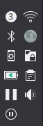
Eh, changing the background to solid didn't help (I did include the changes from this patch) and it looks somewhat out of place next to the other icons.
Comment Actions
That might be the best looking solution though: allowing the theme to transform it based on a certain property (in this case number of digits and width)