

| No Linters Available |
| No Unit Test Coverage |
| Buildable 9950 | |
| Build 9968: arc lint + arc unit |
That "1" is too blurry. Did you use the font tool or did you draw it with the pen or rectangle tools?
Since this is "numlock" Wouldn't it make more sense to put a "1" inside of a lock or next to a lock?
I used the font tool in Inkscape and pasted the 1 in the input-caps-on.svg I found in my local directory. Then I used the "export to PNG" option and attached it to the summary. The SVG isn't blurry if you open it in Inkscape.
Since this is "numlock" Wouldn't it make more sense to put a "1" inside of a lock or next to a lock?
That's true! I will see what I can do tomorrow.
You need to make the icons on 16x16px and 22x22px canvases. If you use a grid with 1 line every pixel, it will be easier to make icons look sharp. When you make shapes of any kind, even latin characters or numbers, it's best to use the Line, Rectangle and Ellipse tools. If you use strokes, they need to be converted into paths when you're done with the icon.
Hi, I created some icons a week ago, just didn't post them as @arvidhansson was already on the task.
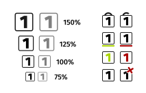
They are not polished as you can see from the screenshot. The left version symbolizes a lock, while the right one, which I like more, symbolizes a keyboard key.

I like the one on the right more. Our locks don't look like the once on the left.
Normally, our strikethroughs (the red diagonal line) go from the top left to the bottom right, similar to the No symbol.
Yes, the cross is a bit twisted as with a 45° angle it crosses right through the '1' and makes it not that readable.

Nice! This icons are really good!
I like the one on the right more. Our locks don't look like the once on the left.
Normally, our strikethroughs (the red diagonal line) go from the top left to the bottom right, similar to the No symbol.
Well, I think you (Taskf) know what to do, just tell us if you need a hand.
Thanks.
Well, I think you (Taskf) know what to do, just tell us if you need a hand.
Well, first I need an info which version you prefer, then I would polish them and make Breeze/dark versions in 16px and 22px if I'm not mistaken.
Afterwards, I'm not sure what to do. I guess, commit them via git. I will ask in #kde-vdg then, ok?
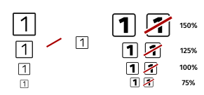
Here is another try with rounded corners to mimik a keyboard key. To me the stroke is not that a of problem if it goes the other direction, as it feels more natural. Right handed people would probably stroke something that way than it is done with traffic signs or is it something else I need to consider?

There is one issue I'm not sure about. The user might feel pressured to check something if the symbol is stroked as it fells like "something is wrong". In that case I would suggest just using the ON version and make it 50% transparent in OFF mode.
Hmm, still I somehow like the stroked version, while I wouldn't recommend using it this particular case. Even the transparent version can easily be controlled the disabled state of this icon object. Currently, I think it would be good to add both icons to Breeze iconset, just in case there is another use case for it some day. I added all the other mockups I did just to let you know.
Try to follow the Breeze icon style as much as possible. These locks look distinctly different from other Breeze lock icons, and the colors and shapes are different too. The goal is to blend in with other Breeze-style icons, not to stand.
This can be done in the system tray widget instead of making a separate icon for off. Ever notice how the notifications icon is grey when it's not active?
Yes, both icon may be the best alternative, is it just me or is the transparent icon more like grey?
Sorry, I don't understand, never had noticed anything special with the notifications.
Top icon is for notifications (partly transparent), bottom icon is for Redshift (100% opacity)

It's not just you, but that's how partly transparent black on a white background is supposed to look.
The rounded corners and bold 1 are not very breeze like, so I don't think so, unless he changes his design. Unless you still plan to do the icon yourself, you should probably hand off responsibility for the patch to someone else.
Sorry for the confusion, as I'm new to this I really need help and aren't able to do this alone, just just wanted to bring some attention to this and learn how to work with KDE. Thanks for all help, should we now use t-ask's first icon(the right one) or something else?
No problem, it's just unfortunate that you picked an issue where other people already had their own ideas planned. If there weren't more than 1 design to look at, it would be easier for me to work with you 1-on-1. Why don't you try making an icon for an app you like that doesn't already have an icon in Breeze Icons? Not Firefox, Thunderbird or proprietary software (although there might be some exceptions). If you have questions, bring them up in the VDG chat.
Okay, I don't think I should work with this anymore, just wantet to fix this bug: https://bugs.kde.org/show_bug.cgi?id=391134. Please complete this yourself.
As I'm quite busy right now I will upload my current SVG version. I did add a very simple more Breeze styled icon (which I think is not the best fit to identify it as a NUM button).
Maybe someone else has the time to alter this one. If it's not urgent, let me know the changes you like to see and I will modify this version later on - can take up to 3 weeks.