User Details
- User Since
- Oct 1 2018, 12:30 PM (289 w, 2 d)
- Availability
- Available
Oct 12 2020
I just want to add an alternative mockup for the sidebar and the app installation list. Some widgets may not be possible - I'm not sure.
Apr 8 2019
As I'm quite busy right now I will upload my current SVG version. I did add a very simple more Breeze styled icon (which I think is not the best fit to identify it as a NUM button).
Mar 23 2019
Hmm, still I somehow like the stroked version, while I wouldn't recommend using it this particular case. Even the transparent version can easily be controlled the disabled state of this icon object. Currently, I think it would be good to add both icons to Breeze iconset, just in case there is another use case for it some day. I added all the other mockups I did just to let you know.
There is one issue I'm not sure about. The user might feel pressured to check something if the symbol is stroked as it fells like "something is wrong". In that case I would suggest just using the ON version and make it 50% transparent in OFF mode.
Here is another try with rounded corners to mimik a keyboard key. To me the stroke is not that a of problem if it goes the other direction, as it feels more natural. Right handed people would probably stroke something that way than it is done with traffic signs or is it something else I need to consider?

Mar 22 2019
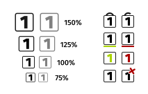
Yes, the cross is a bit twisted as with a 45° angle it crosses right through the '1' and makes it not that readable.

Hi, I created some icons a week ago, just didn't post them as @arvidhansson was already on the task.