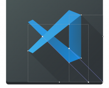
Add the code-oss icons follow the breeze and breeze-dark style
Details
- Reviewers
ndavis - Group Reviewers
VDG - Commits
- R266:54a20776ffb4: Add code-oss icon
Latte Dock Preview:
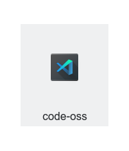
Icons Preview:
Light:
Dark:
Diff Detail
- Repository
- R266 Breeze Icons
- Branch
- code-oss (branched from master)
- Lint
No Linters Available - Unit
No Unit Test Coverage - Build Status
Buildable 8934 Build 8952: arc lint + arc unit
code-oss-dark.svg
Is this the correct name? I assume the app itself isn't named "code-oss-dark", right? Also screenshots are appreciated, as is filling in the test plan. :)
https://community.kde.org/Infrastructure/Phabricator#Include_some_screenshots
There are commands/aliases here for how to take quick screenshots https://invent.kde.org/ndavis/hig-kde-org/wikis/Icon-Workflow
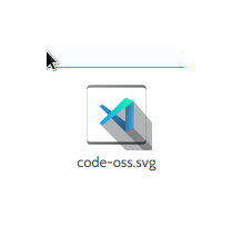
I ran montage-breeze and I got
which looks really nice.
However, is there some reason that it looks different from a Dolphin generated thumbnail?
EDIT: And yes the dark version should have the same name as the regular version (code-oss.svg).
I have the same problem but this icon working well and can be display normaly on my firebrowser.
Weird. In Inkscape, the logo looks like raster graphics, but in Dolphin and Gwenview it looks like vector graphics. Something is seriously screwed up in this SVG. Did you use Inkscape? Can you explain what process you used to make this icon?
I don't think so. The Code-OSS flatpak and the VS Code RPM use code.png, so I think the name needs to be code.svg for light and dark Breeze icons. It would be a good idea to test if using icon themes actually works though, because code.png installs to /usr/share/code/resources/app/resources/linux/code.png and /usr/share/pixmaps/code.png instead of hicolor.
I use the Gravit Designer (https://designer.io/) to design this icon, not the inkscape, but I think I can redraw it by inkscape.
For the filename, because I'm using archlinux and the icon name is code-oss.svg on /usr/share/pixmaps.
Please do. KDE software is only made with free and open source software. If you need help with Inkscape, let us know. We would be glad to help.
For the filename, because I'm using archlinux and the icon name is code-oss.svg on /usr/share/pixmaps.
In that case, run ln -sr code-oss.svg code.svg in the same directory as code-oss.svg to made a symlink so that the icon works for Arch Linux and any other distro.
- Merge branch 'master' into code-oss
- Updating D19324: Add code-oss icon #
- Enter a brief description of the changes included in this update.
- The first line is used as subject, next lines as comment. #
- If you intended to create a new revision, use:
- $ arc diff --create
Redraw by inkscape.
- Merge branch 'master' into code-oss
- Updating D19324: Add code-oss icon #
- Enter a brief description of the changes included in this update.
- The first line is used as subject, next lines as comment. #
- If you intended to create a new revision, use:
- $ arc diff --create
fixed color details.
Much better. Now for some questions and suggestions.
Why does the icon use green on the top of the logo? The light theme version doesn't look bad, but isn't the official logo all blue? In general, we try to preserve the original branding.
Why is the dark theme version greener than the light theme? Normally we try to make color icons the same for light and dark themes.
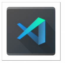
The parts of the logo in this icon are layered differently from the official logo: https://user-images.githubusercontent.com/49339/32078472-5053adea-baa7-11e7-9034-519002f12ac7.png
The right edge of the right side of the logo is a bit too dark relative to the inner edge.
It would be good to turn those shadows into gradients with 00000000 as the color for the bottom right of the shadow. The darker shadow should expand to cover the whole area to the bottom left of the right side of the logo. Here's what I mean:
Here's the SVG if you want to take a closer look at what I was doing. You don't have to do what I do if you would prefer to do something else.
If you're having trouble finding the right blues to make the logo look 3D, try using the shadows to separate the layers like I did in the screenshots above.
I'll have more to say later.
- Merge branch 'master' into code-oss
- Updating D19324: Add code-oss icon #
- Enter a brief description of the changes included in this update.
- The first line is used as subject, next lines as comment. #
- If you intended to create a new revision, use:
- $ arc diff --create
Try to fix the layer and shadows.
I see you've kept the green on the light theme version instead of using the same icon for both versions. Is there a reason for this or do you just prefer it?
This looks just about ready to land on the master branch, there are just a few more things you need to do.
| icons-dark/apps/48/code.svg | ||
|---|---|---|
| 904 | Delete this invisible rectangle. | |
| icons/apps/48/code.svg | ||
| 885 | Delete this invisible rectangle. | |
You also need to optimize the icon. You can do that by using one of the three SVG optimizers on this page: https://invent.kde.org/ndavis/hig-kde-org/wikis/Icon-Workflow#svg-optimization
I should add that to the HIG at some point in the future.
Just I like it as a modern design style and also avoiding some problems for the similarity of official icon, but if you mind that I can remove it.
I think that even though the green accent looks nice, the icons should be the same for light and dark themes. As for similarity to the official icon, I don't think that's a problem. Usually, destroying the original branding is the problem when it comes to adapting icons to fit a theme.
- Merge branch 'master' into code-oss
- Updating D19324: Add code-oss icon #
- Enter a brief description of the changes included in this update.
- The first line is used as subject, next lines as comment. #
- If you intended to create a new revision, use:
- $ arc diff --create
Replace the green accent and optimize the svg
- Merge branch 'master' into code-oss
- Updating D19324: Add code-oss icon #
- Enter a brief description of the changes included in this update.
- The first line is used as subject, next lines as comment. #
- If you intended to create a new revision, use:
- $ arc diff --create
Optimize svg
Great. Now you just need to get rid of the invisible rectangle. You can do that quickly with sed -i 's|<rect x="9.5367e-8" y="284.3" width="12.7" height="12.7" fill="none" opacity=".35"/>||' code.svg. After you've done that, I can accept and land this.
BTW, you're meant to put the comment for the diff update at the top, but it's not a huge deal. That's why you keep getting this text in all of your update comments:
  - Merge branch 'master' into code-oss

# Updating D19324: Add code-oss icon
#
# Enter a brief description of the changes included in this update.
# The first line is used as subject, next lines as comment.
#
# If you intended to create a new revision, use:
#  $ arc diff --create
The stuff to the left of the # characters is ignored if you put the comment at the top.
This is my first time to contribute plasma/kde project, I feel sorry for my mistakes and thanks for your help.
You're doing great, and the icons look amazing, most of this is just icing on the cake :D
No need to feel sorry, I'm just trying to help you learn how our systems work. Congratulations on your first contribution to KDE!
One last thing, you need to use your real name as your Git user name in order for this patch to pass an automated audit.
This page explain how to do that if you need a guide: https://help.github.com/en/articles/setting-your-username-in-git
