Usability feature for users to customize the custmize the color on finding, as noted by some users, it was the same color as the review->highlights.
Bug:237014
| Okular |
Usability feature for users to customize the custmize the color on finding, as noted by some users, it was the same color as the review->highlights.
Bug:237014
| No Linters Available |
| No Unit Test Coverage |
| Buildable 7073 | |
| Build 7091: arc lint + arc unit |
I don't think it's a good idea, we now have the border around search results so they are more distinguishable from higlights.
I'm okay in discarding it.
But shouldn't we just give them the option? I can put the settings in the preferences toolbar or something.
If you move it to the config dialog i guess it may make sense to have if it's not very intrusive.
You forgot about presentationsearchbar.cpp
And if you really want to let change this yellow, you may also let people want to change the blue when searching on the thumbnail?
As you may notice I'm really not sold on this extra configuration option :D
Someone else has opinions on this?
| conf/okular.kcfg | ||
|---|---|---|
| 310 | Let it be the same color it was, i.e. qRgb( 255, 255, 64 | |
| ui/searchlineedit.cpp | ||
| 92 | why does setting the color start a new search? | |
I'm not really sold either. No other app has this setting. It seems like one of the major reasons why we have a color scheme and color chooser system is precisely so individual apps don't have to implement features like these themselves.
I'm sure we can come up with a cleverer way to fix 237014 besides simply adding another configuration option. It's not as bad as it used to be since the search highlight now has a box around it. But maybe the bug here is that we're not using a color from the color scheme for highlighting search results. Kate uses the "Selection Background" color to highlight search results and it works okay. Can we not do this in Okular because it could conflict with the actual selection color because you can have text selected and search results highlighted at the same time? What if we used the "Selection Background" color but tinted it differently for each one?
Or maybe we could use a different shade of yellow for the highlight annotation's default yellow color?
There's some people asking for it on bugzilla, to change the search highlight color, but as Nate said, no other reader does this.
384267 Also mentions this of "Selection Background", but would it change highlight color too or only the string that I'm searching?
| ui/searchlineedit.cpp | ||
|---|---|---|
| 92 | So the rect changes color. I think that continueSearch would be better. | |
https://i.imgur.com/LxkB2q3.png <- yes we have lots of different highlights, text selection, regular search, and "filter thumbnail" search. The color schemes are not prepared for so much colors.
I think this is okay for graphic areas, while the color scheme is good for generic GUI elements (text areas without graphics).
Yes, but it also uses "View Background", while the background color of a PDF file can be different.
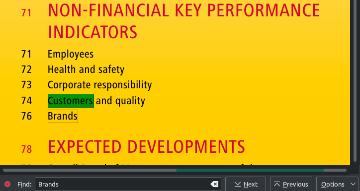
Picture with search (find bar, thumbnails panel) in PDF from https://www.dpdhl.com/content/dam/dpdhl/en/media-center/investors/documents/annual-reports/DPDHL_2017_Annual_Report.pdf
How about just inverting the color?