Show Desktop Toolbox Icon/Svg next to checkbox in the config
Needs ReviewPublic

Authored by Zren on Jan 2 2019, 4:04 PM.

Details

Reviewers
None
Group Reviewers
Plasma
VDG
Summary

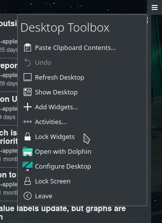
Even when a user scours the system settings + desktop config looking how to disable this button, the user will have no indication this feature is called the "Desktop Toolbox". The button itself will show the current activity when not placed in a corner (eg: "Default" activity). When you click the menu, it does not have a "Desktop Toolbox" label either.


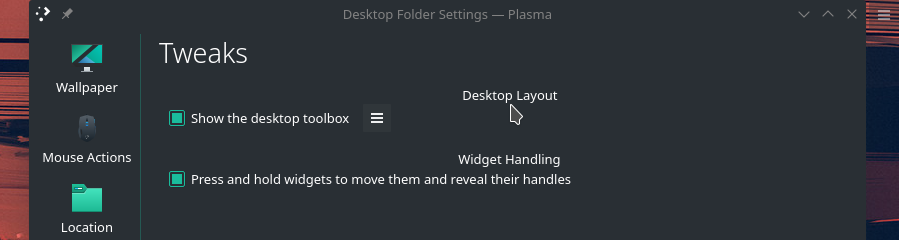
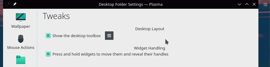
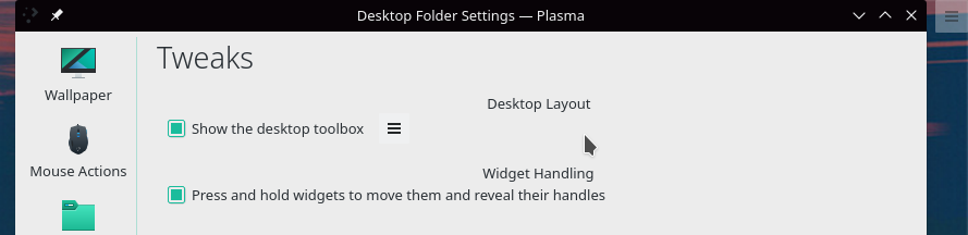
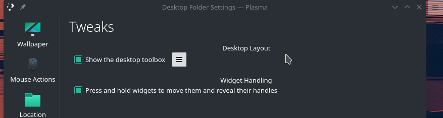
So I suggest that we show the icon next to the checkbox. Here's what it looks like with all 4 combinations of Breeze Light/Dark Color Theme + Desktop Theme.

Test Plan
  • Copy /usr/share/plasma/plasmoids/org.kde.desktopcontainment to ~/.local/share/plasma/plasmoids/
  • Edit contents/ui/ConfigTweaks.qml
  • Reopen the Desktop Settings > Tweaks (no restart of plasma is needed since the config window is destroyed and reloaded each time it's opened).
  • Delete ~/.local/share/plasma/plasmoids/org.kde.desktopcontainment/ when you're finished testing.

Diff Detail

Repository
R119 Plasma Desktop
Lint
Lint Skipped
Unit
Unit Tests Skipped
Zren created this revision.Jan 2 2019, 4:04 PM
Restricted Application added a project: Plasma. · View Herald TranscriptJan 2 2019, 4:04 PM
Restricted Application added a subscriber: plasma-devel. · View Herald Transcript
Zren requested review of this revision.Jan 2 2019, 4:04 PM
GB_2 added a project: VDG.
ngraham added a subscriber: ngraham.Jan 2 2019, 7:53 PM

I totally agree with the problem statement, but not necessarily with the proposed solution. :) Let me propose another approach for making this clearer.

Right now, the desktop toolbox is a square with a hamburger icon when it's in the corner. When you drag it anywhere else, it becomes rectangular and gains the useless text "Default."

Instead, how about we make it always display the text "Desktop Toolbox"? That would frankly make its purpose more obvious too, and with its name visible, the checkbox in this settings window will be much more connected in the user's mind with the actual thing itself.

Thoughts?

If showing the current activity name is important, we could have it show "Desktop Toolbox" when displaying the default activitym and when displaying any other activity, it could say something like "Desktop Toolbox | <activity name> Activity"

Zren added a comment.Jan 2 2019, 9:30 PM

That still requires the user to drag a button, which isn't exactly obvious or a normal behaviour, just to discover what it is. It doesn't look like a desktop widget, not that the user would recognize it as one, as KDE by default does not display any desktop widgets the user can compare it with.

The name "Desktop Toolbox" doesn't really describe it properly either. It's a button that opens a context menu. "Toolbox" usually refers to GIMP's "tool selection panel" where you have several buttons in a grid. The Panel has a "toolbox" to adjust the height of the panel.

An alternative solution would be to put a heading in the context menu.

Here's a quick mockup by editing /usr/share/plasma/packages/org.kde.desktoptoolbox/contents/ui/ by treating modelData.enabled = false as a "heading".

Here's another mockup using PlasmaExtras.Heading instead.

In D17921#385507, @Zren wrote:

That still requires the user to drag a button,

Actually my proposal is to always show the text on the button, so you wouldn't need to drag it to see the text.

In D17921#385507, @Zren wrote:

as KDE by default does not display any desktop widgets the user can compare it with.

Perhaps we should... :)

In D17921#385507, @Zren wrote:

If we don't put the title in the button itself, I think this works. I'd still be in favor of showing it on the button itself though.

broulik added a subscriber: broulik.Jan 9 2019, 8:57 AM

Actually my proposal is to always show the text on the button, so you wouldn't need to drag it to see the text.

And then people will complain even more about this "useless button" being "even bigger" by default now

Actually my proposal is to always show the text on the button, so you wouldn't need to drag it to see the text.

And then people will complain even more about this "useless button" being "even bigger" by default now

Well, they might not complain so much if it was more obvious what it was, and they then had an easier time figuring out how to remove it.