This patch improves the layout, formatting, and wording of the Folder View widget's Icons and Locations pages to better follow the HIG (especially https://hig.kde.org/patterns/content/form.html). In the process, it adopts Kirigami.FormLayout.
Details
Details
- Reviewers
hein mart - Group Reviewers
Plasma VDG - Commits
- R119:6a4f4cc31ebc: [Folder View] Improve layout, formatting, and wording of Icons and Locations…
Icons page, Desktop, before:
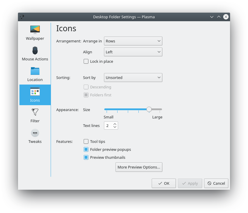
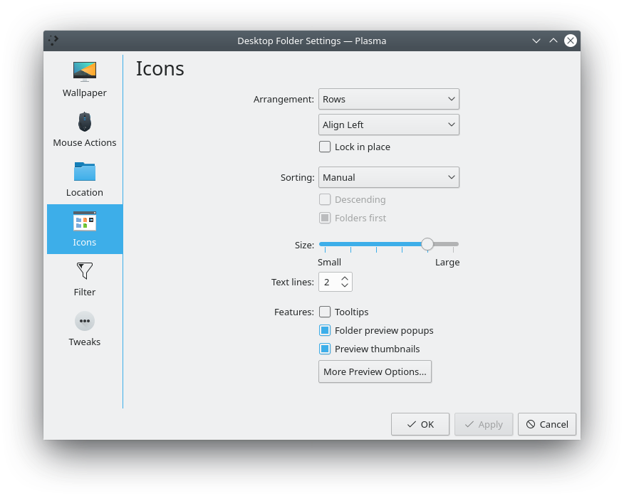
Icons page, Desktop, after:
Icons page, Panel widget, before:
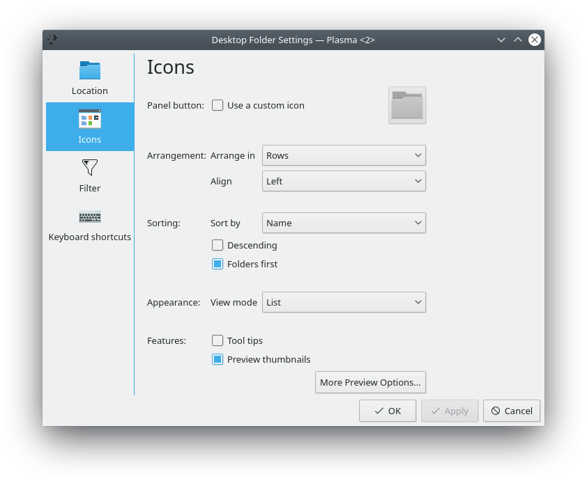
Icons page, Panel widget, after:
Locations page, before:
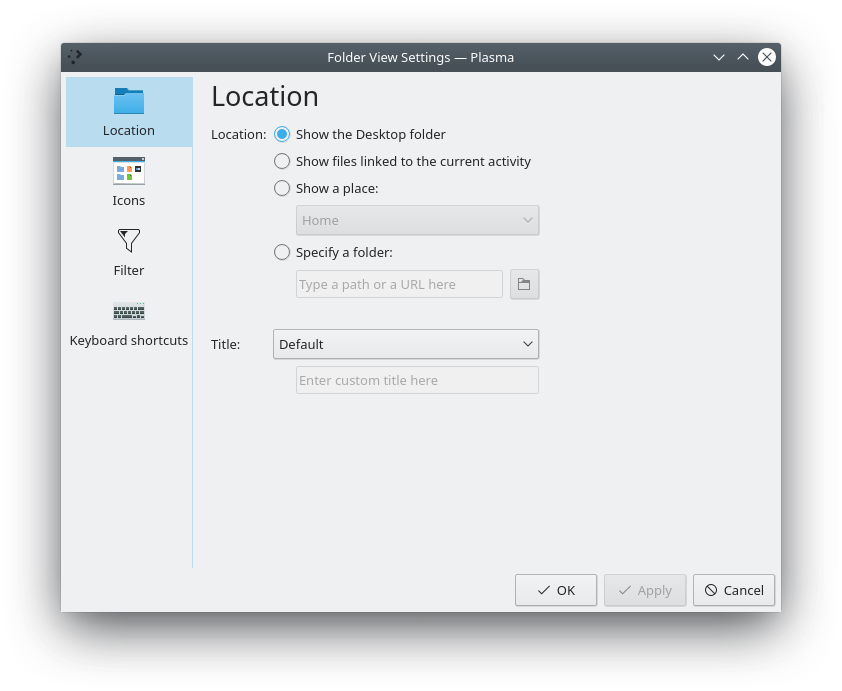
Locations page, after:

Diff Detail
Diff Detail
- Repository
- R119 Plasma Desktop
- Branch
- icons-page-tweaks (branched from master)
- Lint
No Linters Available - Unit
No Unit Test Coverage - Build Status
Buildable 3965 Build 3983: arc lint + arc unit
This comment was removed by ngraham.
Comment Actions
Note: I know the width: 500 is a horrible hack that is certainly the wrong way to do this, but I couldn't figure out how else to get the Labels' width to be long enough so that Layout.alignment: Qt.AlignRight worked. Layout.fillWidth: true had no effect. I look forward to learning the correct way to handle this situation. :)
Comment Actions
That looks much better!
Any reason why the "Text lines" parameter in the Icon panel is not aligned with the rest of the form ?
Comment Actions
Kirigami FormLayout is a really nice control to work with. I'm a big fan. This port was easy peasy and I can't wait to do more of these!
The double Kirigami.Separator items are to approximate what's wanted for https://bugs.kde.org/show_bug.cgi?id=399959, but this is probably an incorrect usage of them as-is. Would like to get @mart's opinion on the best way to add some whitespace to a Kirigami FormLayout.
Comment Actions
Instead of ghetto DIY spacers, maybe we can use purpose-built vertical spacers: D16330: Add a spacer item
| containments/desktop/package/contents/ui/ConfigIcons.qml | ||
|---|---|---|
| 145 ↗ | (On Diff #43712) | those should be just Item { then, we'll see how things in formlayout have to be fixed to reach the desired spacing/result |
Comment Actions
@mart I've implemented your suggestions. To my eyes, the vertical spacing isn't enough. Compare the current version:
...With the previous one I had before:
But that's pretty minor and would need to be changed (if you agree) elsewhere.