KMessageWidget: use theme instead of hardcoded colours
Needs ReviewPublic

Authored by rjvbb on Jul 5 2018, 9:32 AM.

Details

Reviewers
None
Group Reviewers
Frameworks
VDG
Summary

This is a split-off of my D13777 WIP project (for lack of a better word).

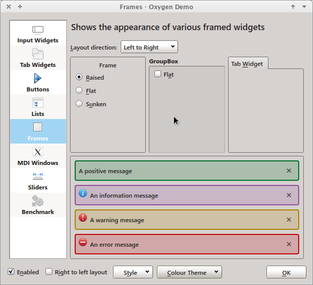
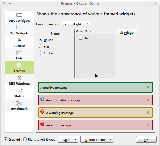
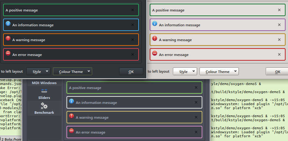
KMessageWidget used to use the highlight colour for informational messages and hardcoded colours for the other 3 types. This was never ideal but acceptable because a user-defined colour was used for the most common message type and commonly accepted colours for the other types (orange for warnings, red for errors).

This patch changes that: all colours are obtained from the current theme, if possible. It also reverts to using the highlight colour as a fallback for information messages.

To obtain the theme colours a utility class KThemeSettings is introduced that provides a QSettings-based interface to the colour definitions in theme files or the global settings store:

  • if an application used the KColorSchemeManager it will have a KDE_COLOR_SCHEME_PATH property pointing to the actual theme definition file; colours will thus be read from there
  • if the property is not set, the class will attempt to get the definitions from the global settings store
  • if that fails too, a fallback QColor value will be returned.

The ctor takes a group argument for convenience, allowing to open the group of interest directly with all existence checking and error handling done inside the class.
The readRGB() method is named to indicate the fact it returns an RGB triplet via a QColor instance.

Test Plan

Works as intended.
I know it was suggested that the convenience class be committed separately. That will be easy enough but I see no point in reviewing separately from its initial application.

All colours are obtained from the theme preferentially, even the text and window background colours. This is for consistency but also because I've seen rare glitches where the background colour would "lag" in open KMessageWidget instances when changing the theme at runtime.

There's been a rumour that the kdeglobals store might disappear. If and when that happens this code will have to be adapted but I don't see a reason to stop using the file now already.

Diff Detail

Lint
Lint Skipped
Unit
Unit Tests Skipped
Build Status
Buildable 616
Build 628: arc lint + arc unit
rjvbb created this revision.Jul 5 2018, 9:32 AM
Restricted Application added a subscriber: kde-frameworks-devel. · View Herald TranscriptJul 5 2018, 9:32 AM
rjvbb requested review of this revision.Jul 5 2018, 9:32 AM
rjvbb added a comment.Jul 5 2018, 9:38 AM

A few snapshots obtained with runtime theme changes (see also D13881)

Breeze:

Breeze Dark:

Oxygen:

My own theme based on the palette used by Mac OS X (coloured backgrounds are inappropriate here):

I like the idea

src/kmessagewidget.cpp
172

Not using the widget's palette was intentional for Konsole or something I recall?

176

*colors

178

*If
*colors

200

Stray semi-colon

src/kthemesettings.cpp
29

Is this explicit check really neccessary? It should set a palette on qApp in frameworkintegratio or KColorSchemeManager`

31

This doesn't cascade to system-wide settings

33

return early?

36

Coding style, space before brace

41

Maybe also add a

bool KThemeSettings::isValid() const
{
    return m_settings != nullptr;
}
77

This contains(key) check looks unneccessary:

If the setting doesn't exist, returns defaultValue.

so you get an invalid QVariant which will give you an empty QStringList

src/kthemesettings_p.h
25

Forward-declare, include in cpp

26

Move to cpp

27

Forward-declare, include in cpp

86

readRgb

89

Use QScopedPointer to avoid having to manually delete

rjvbb marked 15 inline comments as done.Jul 5 2018, 1:50 PM
rjvbb added inline comments.
src/kthemesettings.cpp
31

I aligned to what KConfig actually does: it only considers the kdeglobals file in the writable generic config location. I haven't seen any evidence of cascading further up (searching for kdeglobals in the code).

src/kthemesettings_p.h
27

Not possible when using a QScopedPointer ;)

86

Semantically RGB is not a word but an abbreviation (so I think I used the proper camelCase) but you're right that Qt uses Rgb.

rjvbb updated this revision to Diff 37188.Jul 5 2018, 1:51 PM
rjvbb marked 3 inline comments as done.
rjvbb edited the summary of this revision. (Show Details)
rjvbb edited the test plan for this revision. (Show Details)

Patch updated as requested.

rjvbb set the repository for this revision to R236 KWidgetsAddons.Jul 5 2018, 1:51 PM
aacid added a subscriber: aacid.Jul 5 2018, 2:23 PM

I know the class is not exported, but having it be "const correct" is always nice :)

src/kthemesettings_p.h
67

const?

72

const?

77

const?

rjvbb updated this revision to Diff 37194.Jul 5 2018, 3:35 PM

constifies KThemeSettings.

rjvbb set the repository for this revision to R236 KWidgetsAddons.Jul 5 2018, 3:35 PM
rjvbb marked 6 inline comments as done.Jul 11 2018, 12:39 PM

Ping?

This patch works as advertised, and does not imposes any visual regressions when using the Breeze color scheme.

And yet, when trying it out with non-default color schemes, I can't help but wonder what we're actually accomplishing here. While the Positive color message looks sane enough with all of the standard non-default color schemes that we ship with, the warning, negative, and informational message colors are all over the map, and a lot of them totally lose the intended meaning of the default colors. It becomes impossible to tell at-a-glance whether the message is good or bad or neutral by looking at its color, which is the whole point of using colors here. Here are some combinations that I think don't work at all:

Informational message, Oxygen:

Informational Message, Steel:

Informational message, Wonton Soup:

Informational message, Honeycomb:

Informational message, Norway:

Negative Message, Steel:

Negative Message, Wonton Soup:

Warning message: Honeycomb:

It's very easy for me to imagine 3rd-party color schemes and user-created color schemes producing equally nonsensical and impossible-to-parse color combinations.

On one hand, that's their choice, right? But on the other hand, what do we gain from all this? What do the users gain?

Since Kirigami already uses colors from the theme, I guess we need to follow suit here to maintain consistency. But especially for informational messages, the message's background color seems just totally wrong for quite a lot of color schemes.

rjvbb added a comment.EditedJul 16 2018, 1:36 PM

This is what approach 1 looks like with (clockwise) Breeze Dark, Oxygen and Wonton Soup:

Positive messages don't have an icon here because currently only the Breeze icon set has a "positive" icon. The absence doesn't disturb me here and may even be good if my assumption is correct that this kind of message should draw less attention than information messages.

An actual (information) message in an actual context (using Breeze and my own colour scheme):

Try as I might, I don't see how it could get any better from a design approach that favours non-intrusive interfaces (based on 10yo fond memories of Tufte's books). The slightly lighter or darker "normal" background with coloured border draws attention and helps giving urgency to the display but limits visual clutter compared to a coloured background. Text in the regular colour on the (almost) standard background means the message reads just as easily as any other text.
Edit: I'm assuming that KMessageWidget is primarily aimed for giving "situated" feedback and not the first choice to deliver messages that require the user to take immediate action.

Evidently one can obtain the same effect and more with approach 2 but the image above is obtained with only small modifications of the current patch.

I think the problem here is that while themes have dedicated Positive, Negative, and Neutral colors, for the Informational color we just re-use the active or highlight color from the theme, which may not always be appropriate for use as a background for informational KMessageWidgets. With a lot of themes, this color winds up looking like the negative color or just being really weird.