Display document count labels in View, Browse, and Full Screen modes
ClosedPublic

Authored by huoni on Apr 18 2018, 5:41 AM.

Details

Summary

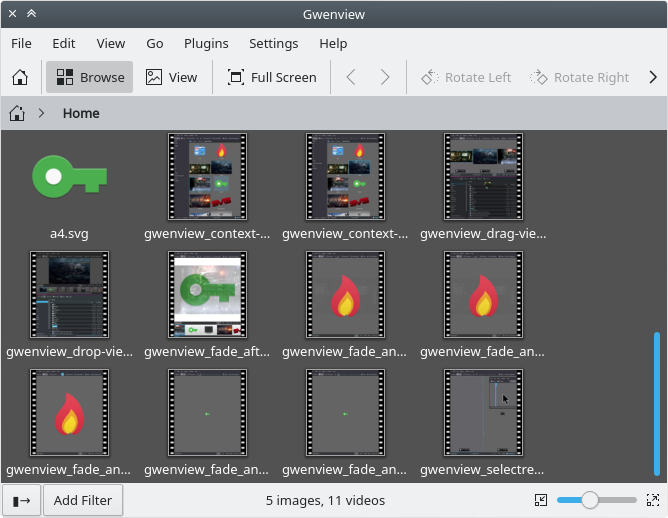
Browse mode: The existing total count is now split into images
and videos, e.g. "5 images, 3 videos". When 2 or more documents (that
is, images or videos) are selected, the label changes to display how
many are selected and their total size. E.g. "4 of 10 selected (3.4
MiB).

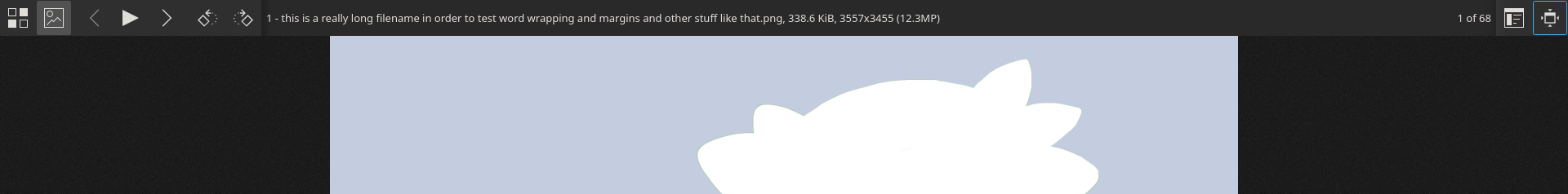
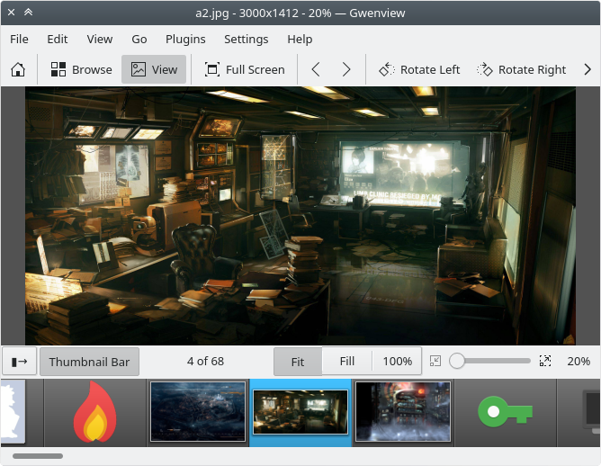
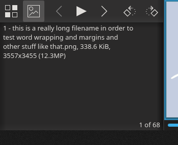
View mode: A new label in the status bar, showing the current
document index, and total in the folder, e.g. "32 of 753". This label is
hidden in Lighttable mode, and elided if there's no room for it.

Full Screen mode: Similar to View, the current index and
total count is displayed. This is in the format "32 of 753", and is
anchored to the bottom right of the information panel.

Each mode calculates these values independently. This is because for
View and Full Screen, the thumbnail bar model has already
filtered out any item that isn't viewable, therefore it's easy to simply
get the current index and total items. In Browse, folders and
archives are displayed, so there needs to be extra logic that filters
them out appropriately.

BUG: 203042
FIXED-IN: 18.08.0

Browse:

Browse (with selection):

View:

View (compare):

Full Screen:

Full Screen (large thumbnails):

Full Screen (thumbnail bar disabled):

Test Plan

Browse:

  • Only images and videos should be counted (directories and archives ignored).
  • Label should change to "Selected..." when 2 or more images/videos selected

View:

  • Count/index should match the thumbnail view, i.e., only items in the thumbnail bar should be counted.
  • Changes to documents should be reflected in the index and total:
    • Renaming causing a change in sort order
    • Adding/deleting documents
  • Document count label should be hidden in Compare/Lighttable mode to allow room for the Synchronize checkbox

Full Screen View:

  • Same as View above, plus;
  • Enable/disable the thumbnail bar
  • Enable and resize the thumbnail bar
  • View images with long filesnames, and/or addition meta info enabled
  • In Compare/Lighttable mode, current document index should reflect the currently selected image

Diff Detail

Repository
R260 Gwenview
Lint
Automatic diff as part of commit; lint not applicable.
Unit
Automatic diff as part of commit; unit tests not applicable.
huoni requested review of this revision.Apr 18 2018, 5:41 AM
huoni created this revision.
huoni edited the summary of this revision. (Show Details)Apr 18 2018, 5:51 AM
huoni added a project: Gwenview.
huoni added a comment.Apr 18 2018, 5:59 AM

Point of discussion: Compare / Light table mode. In normal View mode, I simply hide the document count in order to make room for the Synchronize checkbox. But in Full Screen mode, this is unnecessary, so it's not hidden.
So do we leave it like this, even if there's inconsistency? Show the label in normal View mode and but hide if the window width too small? I feel like the count isn't super useful in this mode anyway, so I would be happy leaving it like it is.

app/browsemainpage.cpp
220

Here and a few other places, I am unsure of any convention regarding the context strings, so this might be overkill.
I've noticed a pattern of @label and similar contexts, but couldn't find documentation for this.

app/fullscreencontent.cpp
562

This seems a little clunky. I could perhaps calculate the character length of current + total, and split it into two lines based on that.
But as the comment says, word-wrapping doesn't work here, unless I'm missing something.

Cool. Some quick feedback and final tweaking for things we did not catch in the design phase:

  • Please don't forget about BUG: 203042 ;)
  • Browse mode:
    • I'd prefer "with the last part hidden if there are no videos" over "0 videos".
    • Adding filters works just fine.
  • View mode:
    • I know you seldomly show the sidebar in your screenshots, but it does exist after all… As I suggested in the bug regarding: "[O]nly display the label if there is enough space, i.e. based on the width of the label plus a (generous!) amount of whitespace on both sides.". Currently you are increasing the minimum width of Gwenview, and in some situations the label looks quite cramped as well.
    • Good choice for the light table! I'm totally with you, and would not change anything.
  • Fullscreen toolbar:
    • The linebreak for >1000 images is not all that great after trying it. I think we might as well go with a single line. Some time ago I did some experiments with the toolbar which would make it wider, so there would be less need for this optimization (not done yet, because I first want to bring the number of open Gwenview reviews down…).
    • "1 of 2" instead of "1/2" would look nicer and be more consistent. In this case I'd spend the little bit of extra space this requires, what do you think?
    • Aligning the filename to the top even fixes a couple of old issues.
    • Long filenames without spaces previously resulted in the toolbar getting wider. Now they are simply cut off. I think that's acceptable, as most image filenames are probably not that long.

Apart from some of those points, things are really working well and you seem to have thought about all possible cases!

app/browsemainpage.cpp
220

@muhlenpfordt Could you help out here with some tips?

Cool. Some quick feedback and final tweaking for things we did not catch in the design phase:

  • Please don't forget about BUG: 203042 ;)
  • Browse mode:
    • I'd prefer "with the last part hidden if there are no videos" over "0 videos".

Okay I'll do it similar to Dolphin - hide "0 images" or "0 videos", unless there are none of either, in which case show "0 images, 0 videos".

    • Adding filters works just fine.
  • View mode:
    • I know you seldomly show the sidebar in your screenshots, but it does exist after all… As I suggested in the bug regarding: "[O]nly display the label if there is enough space, i.e. based on the width of the label plus a (generous!) amount of whitespace on both sides.". Currently you are increasing the minimum width of Gwenview, and in some situations the label looks quite cramped as well.

Damn, forgot about the sidebar! Will hide/show based on space.

    • Good choice for the light table! I'm totally with you, and would not change anything.
  • Fullscreen toolbar:
    • The linebreak for >1000 images is not all that great after trying it. I think we might as well go with a single line. Some time ago I did some experiments with the toolbar which would make it wider, so there would be less need for this optimization (not done yet, because I first want to bring the number of open Gwenview reviews down…).
    • "1 of 2" instead of "1/2" would look nicer and be more consistent. In this case I'd spend the little bit of extra space this requires, what do you think?

Any extra width will cause more wrapping for the filename, because the labels are in a horizontal layout. I will try a vertical layout, which will mean the filename will only get one line's worth of space at minimum (default) thumbnail size. Perhaps we could increase the default size?

  • Aligning the filename to the top even fixes a couple of old issues.
  • Long filenames without spaces previously resulted in the toolbar getting wider. Now they are simply cut off. I think that's acceptable, as most image filenames are probably not that long.

Agreed, since the button toolbar doesn't gracefully expand. Perhaps we could add an ellipse in this case, although thinking about it, if I saw an ellipse, I would expect to be able to manually resize to show the full filename.

huoni edited the summary of this revision. (Show Details)Apr 18 2018, 11:45 PM
rkflx edited the summary of this revision. (Show Details)Apr 18 2018, 11:52 PM
  • Please don't forget about BUG: 203042 ;)

(Hint hint for your percentage patch, which I'll have to think about…)

Any extra width will cause more wrapping for the filename, because the labels are in a horizontal layout. I will try a vertical layout, which will mean the filename will only get one line's worth of space at minimum (default) thumbnail size.

It's not only about the filename, isn't it? You can choose to display all sorts of meta information there, spanning more than 5 lines in extreme cases. I don't think a single line will do. I don't think the linebreaks are too bad, my comment in the bug was more about the fact that despite so much whitespace you already needed two lines. I guess that's solved in the current version of your patch, so nothing to worry about IMO.

Perhaps we could increase the default size?

I'd leave it as-is for now, otherwise it would look weird in relation to the toolbar buttons.

Perhaps we could add an ellipse in this case

That would be ideal, but I'm not sure this can be solved so easily. Try whether KSqueezedTextLabel has options for that (but last time I worked on that, there were quite some issues with squeezing of multiline text…).

if I saw an ellipse, I would expect to be able to manually resize to show the full filename.

Don't make it too complicated ;)

Any extra width will cause more wrapping for the filename, because the labels are in a horizontal layout. I will try a vertical layout, which will mean the filename will only get one line's worth of space at minimum (default) thumbnail size.

It's not only about the filename, isn't it? You can choose to display all sorts of meta information there, spanning more than 5 lines in extreme cases. I don't think a single line will do. I don't think the linebreaks are too bad, my comment in the bug was more about the fact that despite so much whitespace you already needed two lines. I guess that's solved in the current version of your patch, so nothing to worry about IMO.

Indeed, I am using "filename" to refer to the whole label, including any meta info.
I still think there'll be a problem if we remove the count linebreak when >= 1000 and change it to "4 of 10" instead of "4/10" since that will increase the width, and any space above the count will be unusable by the filename/meta label.
But I'll do that and see what people think.

muhlenpfordt added inline comments.Apr 19 2018, 6:50 AM
app/browsemainpage.cpp
220

Just stumbled upon this a few days ago: KI18n -> Writing Good Contexts. There's a good overview of the context markers.
Maybe "@info:status" is this case?

huoni updated this revision to Diff 32621.Apr 20 2018, 5:55 AM
huoni edited the summary of this revision. (Show Details)
  • Add UI markers to i18nc contexts
  • Hide 0 image/video count unless 0 of both in Browse
  • Implement autohiding doc count label in View mode
huoni edited the summary of this revision. (Show Details)Apr 20 2018, 5:59 AM
huoni added inline comments.
app/browsemainpage.cpp
220

Thanks, just what I was looking for

rkflx added a comment.Apr 20 2018, 9:30 PM

Thanks for the update. "500 of 10000" on a single line in fullscreen mode does work quite well after all, I think. Glad you changed it!

One more thing about the fullscreen label: Before the patch it was centered vertically, now it is quite crammed to the top. I don't think we can change anything fundamental there, but perhaps we can tweak it a bit: For the default height, two lines of text are showing, but the bottom line is still positioned a bit above the image counter. If there was a way to manually align both, the top line would get a tiny bit more space to the top.

Your new auto-hiding widget is quite neat and I like your choice of spacing, but I've got a couple of comments:

  • I'd use it for Browse too.
  • Instead of adding mMinSizeHint and mText, could you try with QLabel::show(), QLabel::hide() and QFontMetrics::width() on QLabel::text()?
  • There's also this effect that going from "9 of 10" to "10 of 10" will hide the label, but I guess there is no elegant way to prevent this, and it will probably happen only rarely in regular window configurations.
rkflx added a comment.Apr 21 2018, 6:13 AM

There's also this effect that going from "9 of 10" to "10 of 10" will hide the label, but I guess there is no elegant way to prevent this, and it will probably happen only rarely in regular window configurations.

Here's one more idea: Instead of your custom label, we could use KSqueezedTextLabel like Dolphin and pretty much everyone else is doing. This way the label would not hide immediately, but show an ellipsis first. It's not as clean, but maybe more standard.

Not sure what I like best, and letting your work go to waste would also be a shame. Just putting it out there as an idea after pondering about it more, let me know what you think ;)

huoni updated this revision to Diff 32687.Apr 21 2018, 7:31 AM
huoni edited the summary of this revision. (Show Details)
  • Switch to KSqueezedTextLabel, and also use it in Browse mode
  • Adjust full screen label margins so that labels line up at min height
huoni added a comment.Apr 21 2018, 7:31 AM

One more thing about the fullscreen label: Before the patch it was centered vertically, now it is quite crammed to the top. I don't think we can change anything fundamental there, but perhaps we can tweak it a bit: For the default height, two lines of text are showing, but the bottom line is still positioned a bit above the image counter. If there was a way to manually align both, the top line would get a tiny bit more space to the top.

Turns out default only shows one line. The default is 75px, but the minimum size in the config widget is 88px. So it will be one line until you change the thumbnail size, and thereafter the minimum is two lines.
I've changed the margins so the lines line up at the minimum height (88px). I think we should change the default to this. Thoughts?

Your new auto-hiding widget is quite neat and I like your choice of spacing, but I've got a couple of comments:

  • I'd use it for Browse too.
  • Instead of adding mMinSizeHint and mText, could you try with QLabel::show(), QLabel::hide() and QFontMetrics::width() on QLabel::text()?

Using show and hide doesn't work, because when the label is hidden, it no longer receives resizeEvents, and therefore it can't determine if the space has increased enough to show itself again.
But we're using KSqueezedTextLabel now so it doesn't matter.

  • There's also this effect that going from "9 of 10" to "10 of 10" will hide the label, but I guess there is no elegant way to prevent this, and it will probably happen only rarely in regular window configurations.

No longer an issue with KSqueezedTextLabel.

There's also this effect that going from "9 of 10" to "10 of 10" will hide the label, but I guess there is no elegant way to prevent this, and it will probably happen only rarely in regular window configurations.

Here's one more idea: Instead of your custom label, we could use KSqueezedTextLabel like Dolphin and pretty much everyone else is doing. This way the label would not hide immediately, but show an ellipsis first. It's not as clean, but maybe more standard.

Not sure what I like best, and letting your work go to waste would also be a shame. Just putting it out there as an idea after pondering about it more, let me know what you think ;)

I'm just proud that I came up with the same core idea :)
I think I'd prefer hiding than eliding the text, however I think using existing code is better, and it solves the issue above. It also hints to the user there's more to be shown if they resize.

rkflx added a comment.Apr 21 2018, 7:50 AM

One more thing about the fullscreen label: Before the patch it was centered vertically, now it is quite crammed to the top. I don't think we can change anything fundamental there, but perhaps we can tweak it a bit: For the default height, two lines of text are showing, but the bottom line is still positioned a bit above the image counter. If there was a way to manually align both, the top line would get a tiny bit more space to the top.

Turns out default only shows one line. The default is 75px, but the minimum size in the config widget is 88px. So it will be one line until you change the thumbnail size, and thereafter the minimum is two lines.
I've changed the margins so the lines line up at the minimum height (88px). I think we should change the default to this. Thoughts?

Aha! I've noticed this too: rm ~/.config/gwenviewrc shows 1 line, wiggling the slider shows 2 lines even for the lowest setting. Sure, go ahead and change it (but make sure to test with other styles too).

Using show and hide doesn't work, because when the label is hidden, it no longer receives resizeEvents, and therefore it can't determine if the space has increased enough to show itself again.

Too bad. Anyway, KSqueezedTextLabel feels also quite natural, now that I tried it.

rkflx added a comment.Apr 21 2018, 7:55 AM

Switch to KSqueezedTextLabel, and also use it in Browse mode

Are you sure for Browse it is working? If I set a narrow window width and the press Ctrl+A, the label does not elide, but the window gets wider (might also be a different problem, did not look much into it).

rkflx added a comment.Apr 21 2018, 8:22 AM

Switch to KSqueezedTextLabel, and also use it in Browse mode

Are you sure for Browse it is working? If I set a narrow window width and the press Ctrl+A, the label does not elide, but the window gets wider (might also be a different problem, did not look much into it).

Ah, never mind: This is caused by the sidebar, your patch is probably fine.

huoni added a comment.Apr 21 2018, 8:25 AM

Aha! I've noticed this too: rm ~/.config/gwenviewrc shows 1 line, wiggling the slider shows 2 lines even for the lowest setting. Sure, go ahead and change it (but make sure to test with other styles too).

Hmm, different widget styles are a problem. But that seems to be an existing issue. The minimum thumbnail bar height is different depending on the style (it's set to mRightToolBar->sizeHint().height()).
Perhaps this needs a rework in a separate diff? 1) Make sure default and minimum sizes are the same (dynamically calculate default). 2) Ensure the minimum/default size shows exactly two lines.

Switch to KSqueezedTextLabel, and also use it in Browse mode

Are you sure for Browse it is working? If I set a narrow window width and the press Ctrl+A, the label does not elide, but the window gets wider (might also be a different problem, did not look much into it).

Ah, never mind: This is caused by the sidebar, your patch is probably fine.

Yeah, I think the main viewport has a minimum size, so enabling the sidebar causes a width increase.
I was able to test the eliding works in Browse, but I had to 'break' Gwenview's minimum size (I use a kwin tiling script). I wasn't able to get a label wide enough to actually cause eliding with normal use.

rkflx added a comment.Apr 21 2018, 8:34 AM

Aha! I've noticed this too: rm ~/.config/gwenviewrc shows 1 line, wiggling the slider shows 2 lines even for the lowest setting. Sure, go ahead and change it (but make sure to test with other styles too).

Hmm, different widget styles are a problem. But that seems to be an existing issue. The minimum thumbnail bar height is different depending on the style (it's set to mRightToolBar->sizeHint().height()).
Perhaps this needs a rework in a separate diff? 1) Make sure default and minimum sizes are the same (dynamically calculate default). 2) Ensure the minimum/default size shows exactly two lines.

Doing this in a separate patch sounds like a good plan. In general hardcoding sizes in the UI file is unfortunate, this should all be done by the layout itself. Or perhaps it just needs an adjust() after showing?

Yeah, I think the main viewport has a minimum size, so enabling the sidebar causes a width increase.
I was able to test the eliding works in Browse, but I had to 'break' Gwenview's minimum size (I use a kwin tiling script). I wasn't able to get a label wide enough to actually cause eliding with normal use.

That's easy: Just don't use View mode after restarting Gwenview, then you should be able to make the window quite narrow. (Sounds like a bug to me, but in the end we should think about setting a sensible minimum size for the complete application, to avoid resizing the window when navigating the UI. That's a bigger task, though.)

huoni added a comment.Apr 21 2018, 8:40 AM

Aha! I've noticed this too: rm ~/.config/gwenviewrc shows 1 line, wiggling the slider shows 2 lines even for the lowest setting. Sure, go ahead and change it (but make sure to test with other styles too).

Hmm, different widget styles are a problem. But that seems to be an existing issue. The minimum thumbnail bar height is different depending on the style (it's set to mRightToolBar->sizeHint().height()).
Perhaps this needs a rework in a separate diff? 1) Make sure default and minimum sizes are the same (dynamically calculate default). 2) Ensure the minimum/default size shows exactly two lines.

Doing this in a separate patch sounds like a good plan. In general hardcoding sizes in the UI file is unfortunate, this should all be done by the layout itself. Or perhaps it just needs an adjust() after showing?

Righto, I'll see what I can do in a separate patch.

Yeah, I think the main viewport has a minimum size, so enabling the sidebar causes a width increase.
I was able to test the eliding works in Browse, but I had to 'break' Gwenview's minimum size (I use a kwin tiling script). I wasn't able to get a label wide enough to actually cause eliding with normal use.

That's easy: Just don't use View mode after restarting Gwenview, then you should be able to make the window quite narrow. (Sounds like a bug to me, but in the end we should think about setting a sensible minimum size for the complete application, to avoid resizing the window when navigating the UI. That's a bigger task, though.)

D'oh! I had been launching straight into View.

rkflx requested changes to this revision.Apr 22 2018, 11:30 AM

Some smaller things, but looks good mostly.

In the end this endeavor turned into more than simply displaying "1/10" in the statusbar, but I think it was worth it!

app/browsemainpage.cpp
77

The unsuspecting reader might mix this up with what ContextManager provides regarding which items are selected.

Perhaps mSelectedDocumentsToCount, or something better?

124

Did not measure (bad way to start an argument, I know ;), but I could imagine getting into the stylesheet business might have some performance impact. How about this:

QMargins labelMargins = mDocumentCountLabel->contentsMargins();
labelMargins.setLeft(15);
labelMargins.setRight(15);
mDocumentCountLabel->setContentsMargins(labelMargins);
220

%2 total __number of__ documents?

235

I wonder whether this recursive thing will cause confusion for translators, as I believe they only see one string at a time.

What you are essential saying here is "This is a list of counters with labels, which in English is denoted by a comma.", so images is not really relevant.

Not sure how to better word this, though. Maybe you can come up with something?

285

Would not be needed anymore with contentsMargin.

app/fullscreencontent.cpp
322

I'd put spaces around |.

348

I don't immediately see what's that for?

352

Spaces.

app/viewmainpage.cpp
30

Not needed anymore.

288–291

Hm, I've seen this code before, scattered over ui and cpp files…

I'm on the fence here whether it would make sense to split this out into either a subclass or a function, or just keep it duplicated.

Do you think we might put a label on the start page one day?

This revision now requires changes to proceed.Apr 22 2018, 11:30 AM
huoni updated this revision to Diff 32862.Apr 23 2018, 1:32 AM
huoni marked 7 inline comments as done.
  • Use contents margins instead of stylesheets
  • Remove old include
  • Formatting
  • Variable rename
huoni added a comment.Apr 23 2018, 1:32 AM

Some smaller things, but looks good mostly.

In the end this endeavor turned into more than simply displaying "1/10" in the statusbar, but I think it was worth it!

Definitely worth it.

app/browsemainpage.cpp
77

mSelectedDocumentsToCount sounds like it might be converting them to a 'count'.

What do you think of mSelectedMediaItems?
Or:
mSelectedMediaFileItems
mCurrentlySelectedMediaItems
mSelectedDocumentList
mSelectedMediaItemList
mSelectedDocumentsForCounting
mSelectedMediaItemsForCounting

124

Much better than stylesheets!

235

Well, Dolphin does something similar (see here, starting line 507).

We could instead have something like @info:status image count, video count? I'm not sure what the best option is here.

app/fullscreencontent.cpp
348

We set this above:

mInformationContainer->setMaximumWidth(mToolBar->sizeHint().width());

so I set it back to its default value when the thumbnail bar is hidden so it expands properly.

It was the only way I could get mInformationLabel and mDocumentCountLabel to layout how I wanted, while not expanding the container beyond the toolbar's width.

app/viewmainpage.cpp
288–291

Well the alignment and the eliding are just configuring KSqueezedTextLabel, so if anything, that just means it probably doesn't have good defaults (unless left aligned, and dual ellipsis are used more).

The margin is probably something to add to KSqueezedTextLabel itself, rather than subclassing (overkill?), or putting in a function (would need to be in its own file).

I suppose we could subclass it for our own uses?

Do you think we might put a label on the start page one day?

Not for counting documents, and can't think of anything else useful to put there.

One i18nc adjustment left, then we should be good to go.

app/browsemainpage.cpp
77

What do you think of mSelectedMediaItems?

I like it, it makes it pretty clear that there are no directories or archives included.

235

Dolphin uses an example instead of repeating the variable name, which makes it less confusing in my book. So perhaps images, videos?

(BTW, you can link to blocks of code by dragging over the line numbers in Diffusion.)

app/fullscreencontent.cpp
348

Ah, I see, should have looked at what the if was about.

Your approach is fine, I think.

app/viewmainpage.cpp
288–291

it probably doesn't have good defaults

When I digged into KSqueezedTextLabel last year, it seemed like it was meant for eliding text in Konqueror's statusbar, where the defaults make sense to me.

I suppose we could subclass it for our own uses?

My thinking was to simply set some more appropriate defaults in the constructor of Gwenview's subclass, nothing more complicated…

Anyway, keeping it the way it is currently is just fine.

huoni updated this revision to Diff 32934.Apr 23 2018, 11:48 PM
  • Update i18nc context
rkflx accepted this revision.Apr 24 2018, 7:26 AM
This revision is now accepted and ready to land.Apr 24 2018, 7:26 AM
huoni added inline comments.Apr 25 2018, 6:48 AM
app/browsemainpage.cpp
199

I'll change this to match the variable name before committing.
I.e. updateSelectedMediaItems (probably not necessary to put the List on there).

rkflx added inline comments.Apr 25 2018, 7:12 AM
app/browsemainpage.cpp
199

Sure, make it perfect ;)

This revision was automatically updated to reflect the committed changes.