Add InlineMessage type and Gallery app example page
ClosedPublic

Authored by hein on Mar 24 2018, 9:33 PM.

Details

Summary

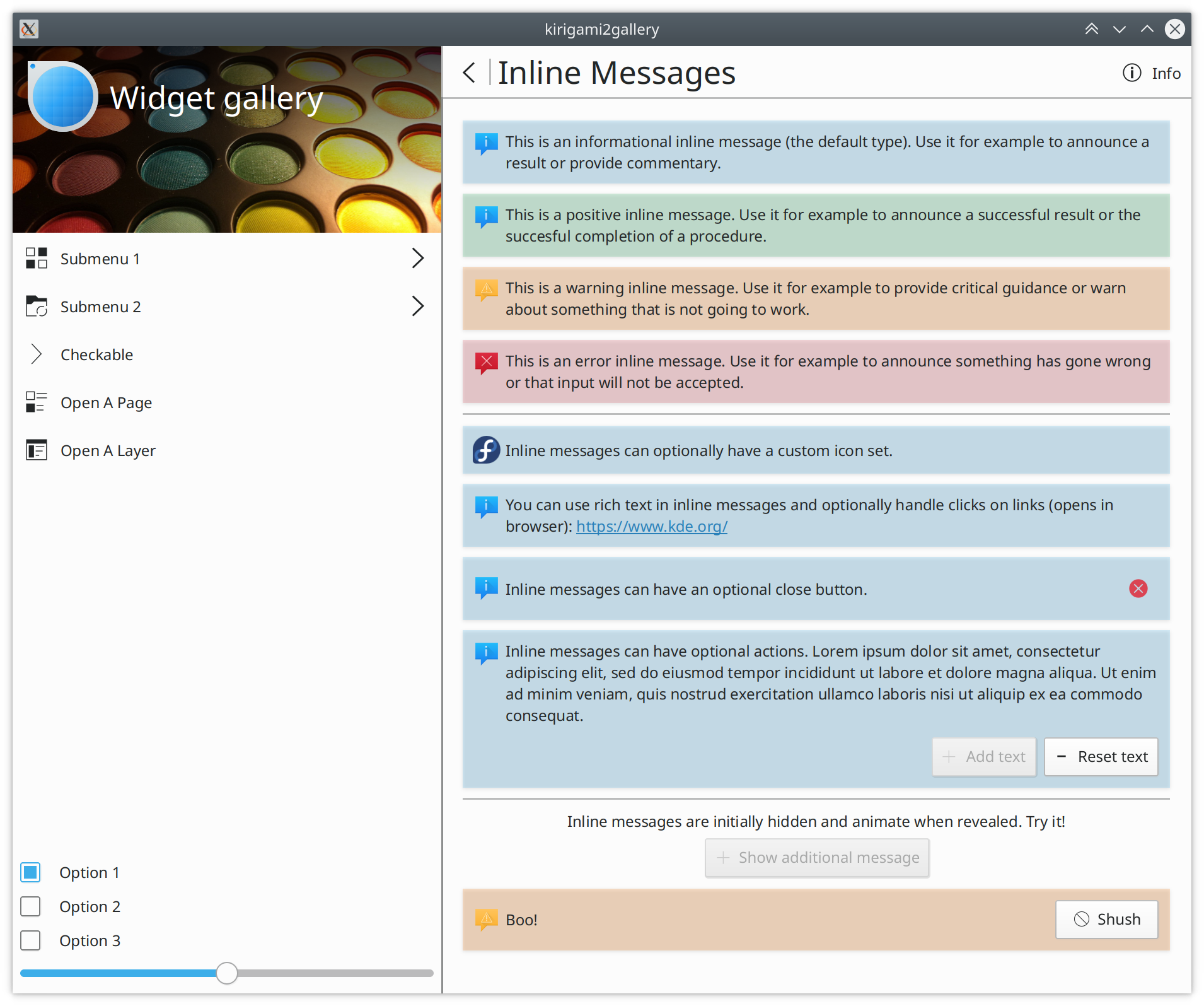
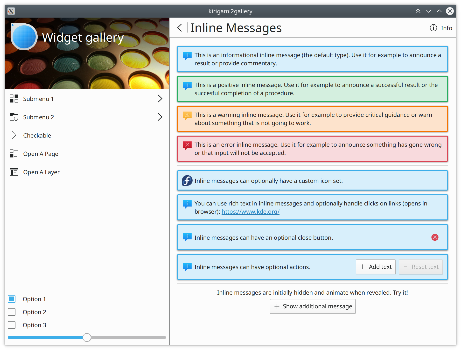
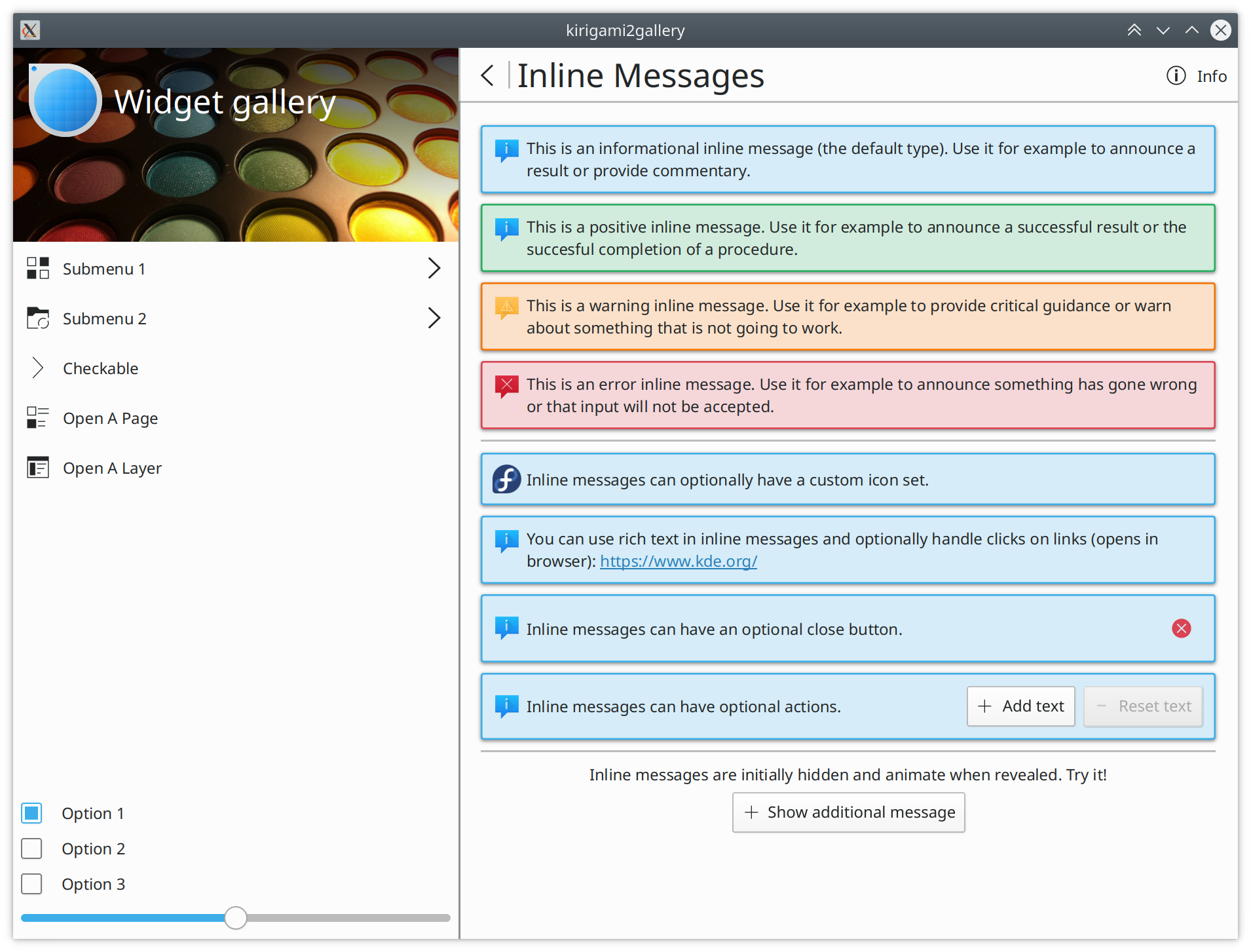
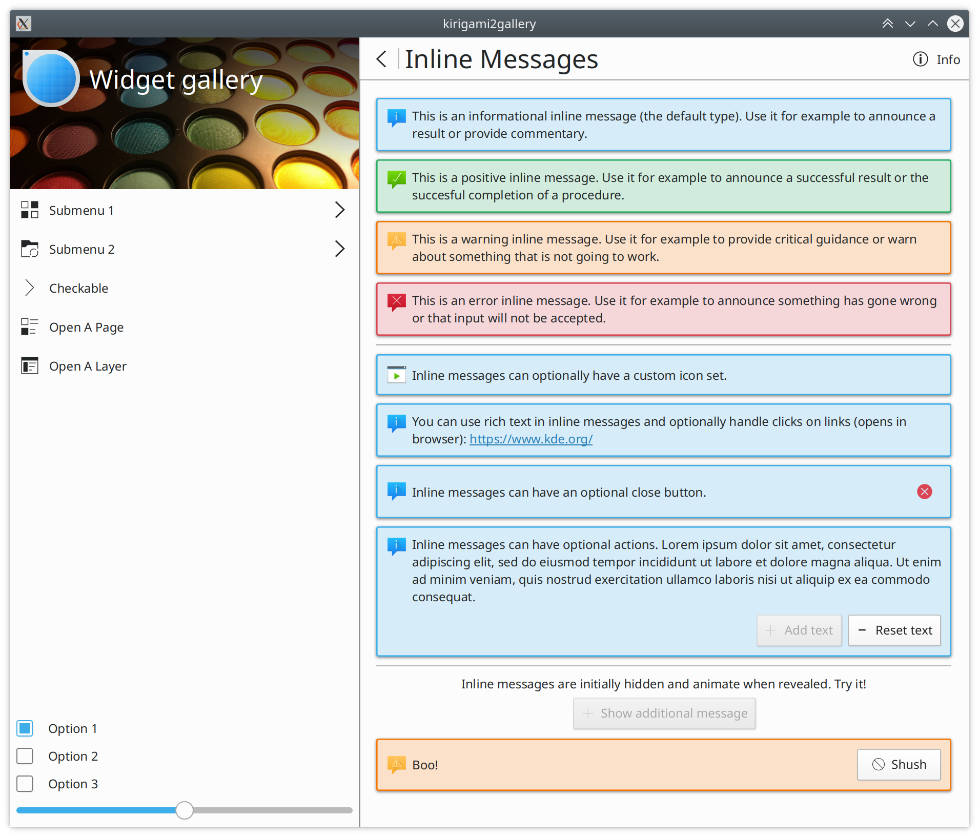
InlineMessage can be used to show various messages to the user,
without requiring the use of a dialog.

InlineMessage is analogous to KWidgetAddons' KMessageWidget and
provides nearly the same API:

  • Message type: Information (default), Positive, Warning or Error
  • Message text
  • Icon (optional)
  • Close button (optional)
  • Actions list (shown as buttons)
  • Signals for link hover and link activation
  • Animation state

It does not implement the 'wordWrap' property of KMessageWidget.
Instead, wrapping the message text is always wrapped.

Further, unlike in KMessageWidget, actions buttons are added from
left to right, not from right to left.

Additionally, it improves over KMessageWidget in several ways:

  • If no icon is manually set, it shows an appropriate icon for the message type by default.
  • Overflow handling for many messages (à la the Card component).
  • More compact layouting: Message and action buttons are shown on the same line if they can fit.

All properties are declared abstractly in the template and all
visuals are implemented in the control, so that the style can
optionally override the appearance fully.

This patch also adds an example page to the Gallery app which
illustrates the various message types and features in an
interactive manner.

Random notes:

  • I would have preferred to make the template API completely abstract and had 'showCloseButton' as 'closable' originally but then changed it for consistency with the property in OverlaySheet.

Diff Detail

Repository
R169 Kirigami
Branch
master
Lint
No Linters Available
Unit
No Unit Test Coverage
There are a very large number of changes, so older changes are hidden. Show Older Changes
hein added a comment.EditedMar 24 2018, 9:38 PM

This component is needed to complete task T7247 (and likely many other KCM ports).

hein added a comment.Mar 24 2018, 9:41 PM

Additional note: The missing icons in the Material Gallery screenshot are because the Gallery app build system seems to refuse to extract them from Breeze for unknown reasons (perhaps missing sizes).

hein updated this revision to Diff 30444.Mar 24 2018, 9:44 PM

Add more defaults to API documentation.

hein updated this revision to Diff 30445.Mar 24 2018, 9:47 PM

Don't use redundant default value in API documentation code example.

hein added a comment.Mar 24 2018, 10:10 PM

Quick hacks for alternate appearances based on VDG chat brainstorming:

On this last one the inside corners are not properly rounded because it's just a quick and dirty hack.

hein updated this revision to Diff 30446.Mar 24 2018, 10:11 PM

Get rid of an unnecessary extra Rectangle.

Big +1 on the version with the colored borders and background. That looks really classy IMHO.

hein added a comment.Mar 24 2018, 10:16 PM

I have no strong preference as far as the visuals are concerned. I would be OK with the rounded + colored version, too. It's also fairly close to KMessageWidget, which would make it quite easy to make KMessageWidget look similar (other than spacing). If this version achieves consensus, I would fix the inside border corners rounding properly. As the code changes for that would be very minor, I'll leave the code as-is for now for initial code review.

hein updated this revision to Diff 30458.Mar 25 2018, 12:26 AM

Remove unrelated files.

hein updated this revision to Diff 30594.Mar 26 2018, 7:04 AM
  • Switch to the rounded border + pale fill style most people seem to prefer. This is a proper implementation with better inside corners and the border width matching the seperator width. The radius is the same as for passive notifications.
  • Fix a Component.onCompleted being in the wrong scope.
hein added a comment.Mar 26 2018, 7:05 AM

After everyone I talked to universally preferring this option, the code in the latest diff now produces this:

I'm out of todos on this, so please review now!

Sweet

src/controls/InlineMessage.qml
365
388

Note that visible propagates recursively so when the component containing a default-visible message widget isn't shown this will still animate. But then I don't know if that's a thing and how to fix that..

src/controls/templates/InlineMessage.qml
101

Should this be a var property so you could also pass a QIcon or "QtQuick Controls Icon"?

114

KMessageWidget names it closeButtonVisible

128

contentItem.hasOwnProperty("animating")

src/enums.h
39

With Qt 5.8 this could become

namespace InlineMessageType
{
    Q_NAMESPACE
    enum Type {
...

with qmlRegisterUncreatableMetaObject
(purely informational comment)

42

Q_ENUM

(also informational, the code around it does the same, could be cleaned up eventually)

broulik added inline comments.Mar 26 2018, 7:34 AM
examples/gallerydata/contents/ui/gallery/InlineMessagesGallery.qml
46

Wrong class name

116

There's no start-here in Breeze, just start-here-kde which won't fall back to start-here (which is distro-branded for you apparently)

hein marked 5 inline comments as done.Mar 26 2018, 7:40 AM
hein added inline comments.
examples/gallerydata/contents/ui/gallery/InlineMessagesGallery.qml
46

Thanks, will fix.

116

I need something generic that's not tied to Breeze, hmm ... suggestions?

src/controls/InlineMessage.qml
365

This was copy-pasted from the Cards code (that's why Marco's copyright is in the header). Marco?

388

I'm not sure it's a problem it will animate when you unhide with a parent.

src/controls/templates/InlineMessage.qml
101

I wouldn't have any objections, but Kirigami.Icon.source is 'string' too, so it wouldn't work currently.

114

Yes, but as mentioned in the review description I named it showCloseButton for consistency with another Kirigami component.

128

Will do.

src/enums.h
39

Could be a nice follow-up, but it's good practice to emulate surrounding style in a patch.

42

See above.

hein updated this revision to Diff 30596.Mar 26 2018, 7:44 AM
hein marked 5 inline comments as done.
  • Correct gallery page heading (note to Marco: also wrong in one of the Cards gallery pages).
  • Use hasOwnProperty.
hein updated this revision to Diff 30599.Mar 26 2018, 7:51 AM

Use more generic icon as custom icon example.

hein marked an inline comment as done.Mar 26 2018, 7:51 AM
hein added inline comments.
examples/gallerydata/contents/ui/gallery/InlineMessagesGallery.qml
116

Replaced with system-run.

hein updated this revision to Diff 30601.Mar 26 2018, 7:56 AM

Use homebrew findIndex from D11707 to lower deps below Qt 5.9.

hein marked an inline comment as done.Mar 26 2018, 7:57 AM
hein added inline comments.
src/controls/InlineMessage.qml
365

Switched to homebrew implementation from your D11707.

hein updated this revision to Diff 30602.Mar 26 2018, 7:59 AM

Drop noisy debug from Kai's findIndex.

hein updated this revision to Diff 30603.Mar 26 2018, 8:07 AM
hein edited the summary of this revision. (Show Details)
hein removed subscribers: broulik, ngraham.

Minor fixes to commit message & mention more compact layout; sync summary.

Adding back subscribers, sorry, my arc invocation to do the above removed you.

Very nice!

src/controls/InlineMessage.qml
226–227

I don't think either of these two lines will work as you intend as you've not constrained the label height anywhere

hein updated this revision to Diff 30692.Mar 27 2018, 6:36 AM
hein marked an inline comment as done.

Fix wrong approach to aligning the text as pointed out by David.

src/controls/InlineMessage.qml
226–227

For some reason this did "work" in the gallery in the sense that the visual result of the QML is that it does what I wanted/expected it to do, but you're right this doesn't really make sense and I should just set the Layout.alignment for the thing like I do for the icon. It doesn't chance the outcome in the gallery, but I guess it would if someone sets an explicit height for an InlMsg. Correcting.

hein added a comment.Mar 27 2018, 6:54 AM

I've filed a bug against the Breeze icon theme to sort out the icon issues this new component poses: https://bugs.kde.org/show_bug.cgi?id=392391

This should not affect this review, though.

mart added inline comments.Mar 27 2018, 10:03 AM
examples/gallerydata/contents/ui/gallery/InlineMessagesGallery.qml
62

add some usage explanation here, like that should be added in the main layout of the ui you want to put it in, that is not visible by default, needing an explicit visible=true

a two rows synopsis of the ig would also be good here tough we have to wait for that i guess

src/controls/InlineMessage.qml
92

this would make opacity of contentitem 1.0 even when animationg to 0?

183

also a color: root.icon.color (no checks needed)

193

with qqc2 api, here would return either root.icon.source or if not set root.icon.name

277

i kindof feel we should make a private component out of that, for overflowable toolbars.. (or maybe even not private) but this is for the future, this is perfect for now

388

if you need to know if an item is visible by itself, not caring of parents visibility, use opacity instead, at least that's what qt docs say.

src/controls/templates/InlineMessage.qml
80

what is the use case, tooltips?

101

even if at the beginning not 100% supported, i would prefer it making api-compatible with qqc2 (even if i don't like that api that much)
there is a class in controls/private called ActionIconGroup which exports the ptoperties that qqc2 uses for icons, so icon.name,icon.source, icon.color
not all of those need to be supported (i prefer to ignore icon.size usially) but at least name,source and color should

128

what is the use case for exposing this property in the public api?

src/enums.h
39

please call this in a more generic way, like MessageSeverity, so can be used for other kinds of messages if needed, like passivenotification and inline dialogs

hein marked 4 inline comments as done.Mar 27 2018, 10:19 AM
hein added inline comments.
examples/gallerydata/contents/ui/gallery/InlineMessagesGallery.qml
62

Will do.

src/controls/templates/InlineMessage.qml
80

e.g. setting a status bar/status tooltip text with the URL, yup

101

Can you give me a code example of how to use this in the template code?

128

Consistency with OverlayDrawer.animating - it generally seems like a good idea to be able to know when something is fully visible/ready.

src/enums.h
39

"Severity" is actually less generic than "Type" and semantically wrong. While Warning->Error perhaps are a range, "Positive" isn't "more severe" than "Information". This is semantically an unordered enumeration (less specific) while "Severity" implies a scale (more specific).

mart added inline comments.Mar 27 2018, 10:30 AM
src/controls/templates/InlineMessage.qml
101

as Action.qml is doing:
this is how Action uses it:

property ActionIconGroup icon: ActionIconGroup {

    id: iconGroup
}

ActionIconGroup can be renamed/moved btw, but is not important

a retrocompatibility alias iconSource: iconGroup.source could be possible, tough for new classes not needed, if the source of icongroup becomes a var instead of a string, passing qicons should stay possible.

the usage would then be:

InlineMessage {

icon.name: "konsole"

}

again, i'm not sold on this, but if we can make it coherent qith qqc2 it becomes a bit easier for new developers

hein marked 5 inline comments as done.Mar 27 2018, 11:40 AM
hein added inline comments.
src/controls/InlineMessage.qml
92

No, because of enabled: !root.visible. implicitHeight is bound to an expression that's recomputed when visible has changed, and returns 0 when visible is false. That means by the time the Behavior would kick off in response to the implicitHeight property changing, it's already disabled. In other words, under the only condition when implicitHeights goes to 0, this Behavior is known to be disabled and the ScriptAction will not run.

hein updated this revision to Diff 30710.Mar 27 2018, 11:45 AM
hein marked an inline comment as done.
  • Use the new dialog-positive icon (thanks VDG!) for Kirigami.InlineMessageType.Positive.
  • Flesh out the Gallery example page info text and give it a nicer heading.
hein marked an inline comment as not done.Mar 27 2018, 11:51 AM
hein added a comment.Mar 27 2018, 11:55 AM

A screenshot including the new dialog-positive icon made by the VDG:

hein added inline comments.Mar 27 2018, 11:56 AM
src/enums.h
39

Hang on, I focused on disagreeing with Severity, but I understand now your goal was to drop Inline to make it more generically useful, sorry. How about MessageType?

hein updated this revision to Diff 30781.Mar 28 2018, 5:38 AM

Be opportunistic and rename InlineMessageType to MessageType.

hein updated this revision to Diff 30835.Mar 29 2018, 9:52 AM
  • Make icon a grouped property.
  • Support icon color tinting.
mart accepted this revision.Mar 29 2018, 9:54 AM
This revision is now accepted and ready to land.Mar 29 2018, 9:54 AM
This revision was automatically updated to reflect the committed changes.