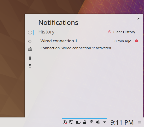
The Notifications plasmoid recently gained a Clear History button in D11261! This patch gives the button some text so it's a bit clearer, since otherwise it's just a little clear button potentially in a sea of other clear buttons when there are a lot of notifications, which is precisely when you'd want to push it.
Diff Detail
Diff Detail
- Repository
- R120 Plasma Workspace
- Branch
- clear-all-button-has-text (branched from master)
- Lint
No Linters Available - Unit
No Unit Test Coverage
Comment Actions
Can another icon be used in the clear history button? The current one indicates that something is denied/prohibited. It causes confusion.
Or just get rid of it. Also, "clear history" doesn't quite fit for notifications. I suggest to use "clear" or "clear all".
Comment Actions
Agreed! In the VDG room we discussed a broom, but unfortunately we don't have any such icon. If we got one, I'd be happy to use it. Until then, the only other option is a trash can (edit-delete-symbolic).
Comment Actions
In general, buttons need icons, especially buttons that don't look like buttons until you hover over them, like this one. While I agree that a better icon would be preferable, since we don't have one, let's maybe keep the discussion on the subject of this patch (the text) and investigate adding a more appropriate icon elsewhere.
Comment Actions
Sorry, but clear -1 from me for the reasons outlined in the Telegram channel.
It looks cluttered, and with the very limited space in plasmoids it becomes unpredictable with translations.
It removes the very alignment that broulik and I worked hard to achieve.
It is inconsistent with the klipper plasmoid, which had that exact functionality for years, so I think we can live with it until we fixed the actual problem, which is "we need a better, more clear icon".
Comment Actions
Either remove the icon or put it on the right, then I wouldn't really mind this change.
Comment Actions
putting it on the right would make it inconsistent with every single plasma and KDE button I am aware of, so I'd still mind.
Removing the icon would make it inconsistent with the klipper plasmoid.
I still think the proper solution is to have a proper, understandable icon which is used consistently across plasmoids, either of the three changes would do the exact opposite of that.
Comment Actions
 ) and klipper having a clear history functionality (see
  ) find a proper solution that works for both, e.g. an icon that is clear to understand, and then implement in both.
Okay, recommendation: due to all plasma buttons that have an icon having it on the left (see e.g.
Until then: leave the clear notification history as is.
Comment Actions
How about just "Clear" for the text? That should be short enough even in German, no? The word "history" is pretty redundant anyway.
And yeah, I agree that we need a better icon for these. For that, I've filed https://bugs.kde.org/show_bug.cgi?id=391855.
Comment Actions
Actually the oppposite, if you only do "clear" it might become unclear in a few languages. I think the text is fine, really. I'd just prefer to have no text at all, consistent with the klipper one.
And yeah, I agree that we need a better icon for these. For that, I've filed https://bugs.kde.org/show_bug.cgi?id=391855.
Wonderful, thank you. I still think a broom might do, it's what tango does, it doesn't depend on position of to-be-cleared icons and it is rather cultural independent. But that's something to discuss there.
I'm afraid that I am going to be very strict on "have a solution that is consistent with the rest", so I will reject all proposed changes that are not consistent across the board, which includes, right now, any kind of text. Sorry. For once I'd love to have a global solution and not partial solutions in some and not in other places.
As in: I see it as a valid problem, but I don't see adding this change here as a solution, so I stay with "no"
Once we have a proper, recognizable icon I think we can use that in the cases named and do not need text, hopefully.
Comment Actions
I agree that consistency is important! For that reason, I would propose adding text everywhere. Buttons without text are inherently ambiguous unless their icons are perfect (and even a broom icon doesn't quite get there IMHO, though it's better). I know designers hate excessive text, but users appreciate the clarity and obviousness of buttons with text.
Comment Actions
I'm willing to nod off (even though there I have no say in it there) a patch which adds it to all places ( e.g. the klipper I linked) if reasonably sure that it works across languages (so we don't have half of text in some languages, which is arguably worse than no text at all), but I'd like to give a clear, recognizable icon a try first.
We have lots of other icons in plasmoids (close notifications, mute, copy, menu, ...) that work well without text, some of them also destructive actions, so I'd like to give that a try first for the sake of space and not-clutterednes.
I will comment on the clear-all bug and hope that something great comes out of this, then we can re-evaluate this one here :)