Change mpris play/pause button color instead of removing it
ClosedPublic

Authored by mtijink on Feb 24 2018, 4:07 PM.

Details

Summary

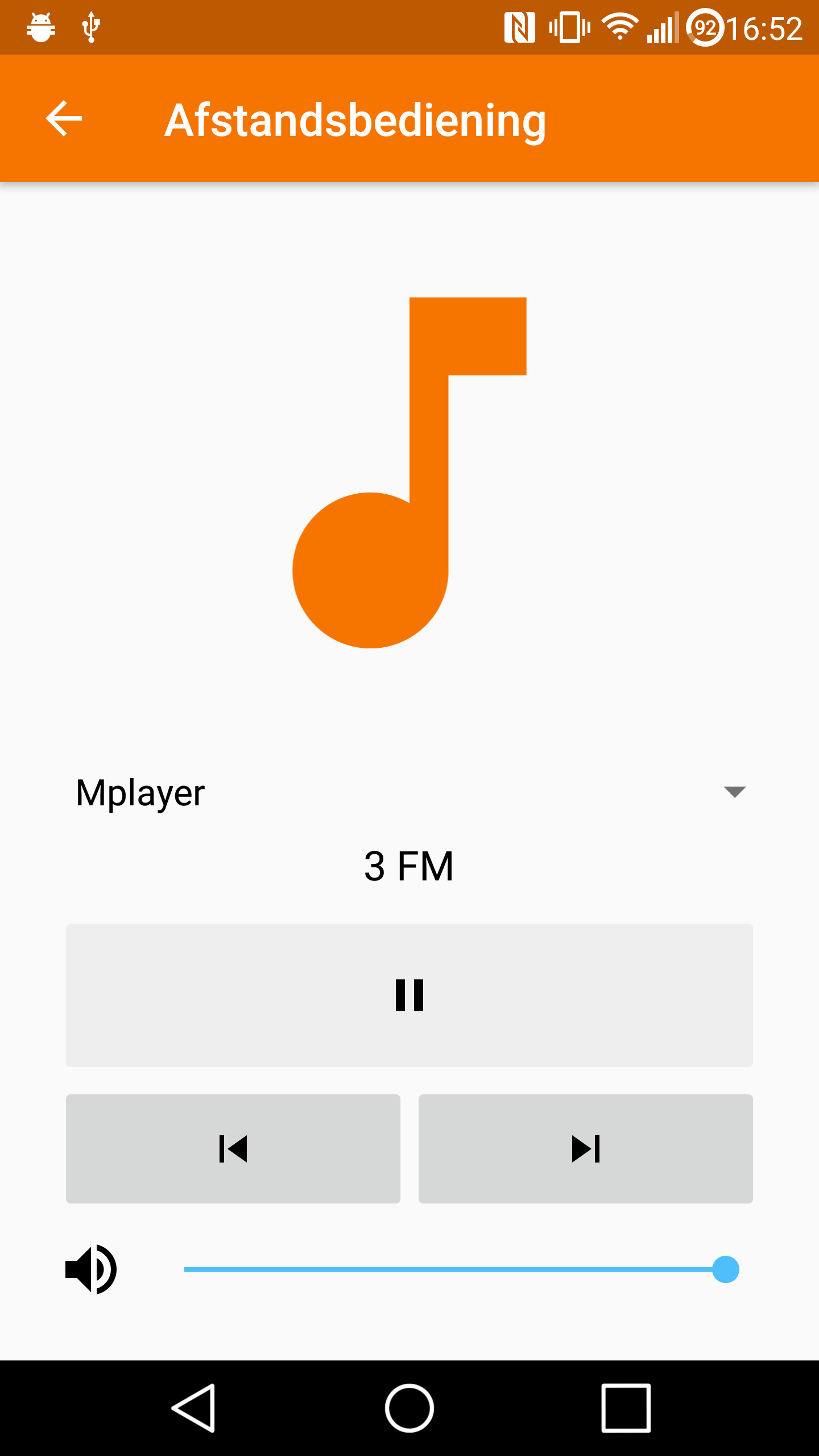
This prevents issues with buttons jumping around when canPlay/canPause is false, as some mpris players do not report consistent values.

Additionally, gives the play/pause button a bit more attention when enabled. What do you think?

When playing/pausing is enabled (i.e. nearly always):
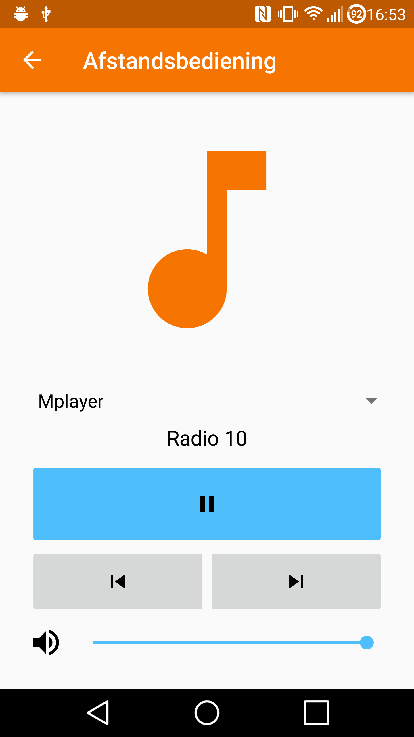
When disabled:

Diff Detail

Repository
R225 KDE Connect - Android application
Lint
Automatic diff as part of commit; lint not applicable.
Unit
Automatic diff as part of commit; unit tests not applicable.
mtijink requested review of this revision.Feb 24 2018, 4:07 PM
mtijink created this revision.
mtijink edited the summary of this revision. (Show Details)Feb 24 2018, 4:08 PM

Haha, funny, I was thinking about coloring the buttons right now, too. But I was thinking about orange instead of blue

Wouldn't this lead to another visual glitch like D9564?

Haha, funny, I was thinking about coloring the buttons right now, too. But I was thinking about orange instead of blue

The blue is our accent color, so I chose that. But I'm not entirely sure if it's a large improvement: maybe it attracts the attention too much.

Wouldn't this lead to another visual glitch like D9564?

I hope not, but I couldn't see the previous glitch either on my phone (but I could discover the cause using a dbus viewer). This way nothing jumps around, so it might be okay. Your video had only 1 frame where stuff was displaced. I guess you'll have to try it.

nicolasfella added a comment.EditedFeb 24 2018, 4:55 PM

There is still a glitch. Did you test with Plasma Browser Integration? If that's the only player where it occurs it would make more sense to patch it there. It works fine for me with Spotify and VLC

I did, but it won't appear on my phone.

I looked at the plasma browser integration and it appears quite easy to fix. They send three different signals: one for the change in play/pause, one for the change in canplay, one for the change in canpause. Actually, they shouldn't even touch canplay/canpause, so I'll send them a bug fix.

Here's how it would look in all-orange

albertvaka accepted this revision.Mar 4 2018, 10:17 AM
albertvaka added a subscriber: albertvaka.

I'm not sure we use the accent color anywhere else, so maybe it is blue by mistake :P

I would prefer orange than blue, actually, but I don't have a strong opinion on design choices because I'm terrible at it.

This revision is now accepted and ready to land.Mar 4 2018, 10:17 AM
This revision was automatically updated to reflect the committed changes.

I changed to color to orange, and also colored the other buttons.

I like the color, but I'm not sure about the disabling.

Right now, only the playPause button is disabled, but what about the other buttons?. If we go with this approach, we should disable all buttons instead of removing them. Why should the playPause button be any different?

IMHO we should remove buttons if the functionality is unavailable, disabled buttons might look a bit broken. The only place where it might make sense to disable a button is when either next or previous is unavailable (probably because we are at the beginning/end of a track list) to keep symmetry.

The reason for you to make this patch in the first place was because Plasma Browser Integration was causing glitches, but that was because it didn't comply to the specification and is fixed now.

That was the motivation, but I think it's better even without that problem.

My reasoning: I'd imagine, as a user, that I'll be very confused if there are "music controls" without any way to actually control it. If playing/pausing is shown as a disabled button, it's clear that you can't control the player at the moment.
Other buttons are generally available, or don't make a lot of sense in that context, so not showing them is okay.

If you think differently about this, please say so, otherwise we'll forget and it won't change anymore. Especially since the code's already in master (and already released by now).

If you think about use cases like D11250 then it would make sense to not have a play/pause button at all. But having it disabled is not a big issue either

I like the color, but I'm not sure about the disabling.

Right now, only the playPause button is disabled, but what about the other buttons?. If we go with this approach, we should disable all buttons instead of removing them. Why should the playPause button be any different?

IMHO we should remove buttons if the functionality is unavailable, disabled buttons might look a bit broken. The only place where it might make sense to disable a button is when either next or previous is unavailable (probably because we are at the beginning/end of a track list) to keep symmetry.

From my usage experience (though with developer testing mode, might not completely reflect normal usage):
not only for symmetry, but also because the Next/Previous buttons disappearing randomly also results in unwanted behaviour. E.g. if you quickly press a few times the Previous button to get to the first media item, once you reach the first item, the Previous button has disappeared and the space is taken by the Next button instead. But as one is still tapping a few more times, as one did not know in advance how much tapping is needed, one ends up switching between first and second media item (due to buttons moving under your finger), and by half the chance one ends up with the second, not the first :) (same with going to last).

So when it comes to Next/Previous buttons, I would propose to show them as pair always (if any shown), and the one currently not working (due to CanGo*=false) just shown as disabled.