Continuing work done in D10726.
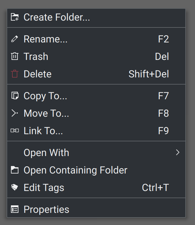
Context Menu Before:

Context Menu After:
Operations Menu Before:

Operations Menu After:
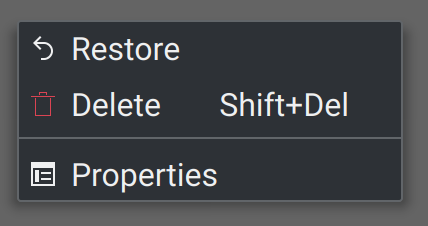
Trash Menu Before:

Trash Menu After:
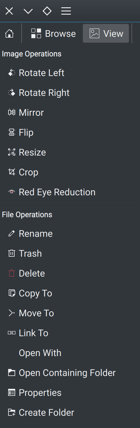
Main Menu Before:

Main Menu After:

Continuing work done in D10726.
Context Menu Before:
View various menus in Gwenview, perform menu actions to ensure functionality, such as cut/copy/paste/delete/redeye.
| No Linters Available |
| No Unit Test Coverage |
Thanks for continuing work on this. I want to check this in detail so we don't regress for non-default setups, so bear with me…
Meanwhile, you could read https://chris.beams.io/posts/git-commit (focus on #2 and #4).
Also, we should not land this on the stable branch with some of the icons changing shape. Please either rebase all on master, or split out those parts that look too different (e.g. forward/next buttons, possibly more).
Awesome patch; this is gonna look so good soon.
But @rkflx is right, we can't actually change icons (such as the back and forward button icons) in the stable branch. Let's do that in master.
Also make sure to test with Breeze light, Oxygen, and with non-HiDPI mode to make sure nothing's become ugly!
Thanks. The only issues I can see is using non-standard icon themes that may not have appropriate -symbolic icons, and also do not have appropriate fallback themes set. Not technically a KDE problem though... But this will become more of an issue going forward anyway as other apps update to HiDPI-compatible icons. So worst case, I think some downstream projects may need some bug reports.
OK, so this breaks Oxygen and some other non-default themes.
I installed KDE Neon Dev Unstable to get an idea as to what icon themes are "official" and default with KDE Plasma; only Breeze is included. Oxygen appears to have been released for KDE 4. Oxygen also appears to not be maintained very actively; the bug lists are pretty old, and contributions are minor and slow.
The -symbolic designation appears to be a standard, not just a Breeze-specific, as shown in Adwaita. According to this older repository (which was merged into Adwaita), -symbolic icons are supposed to fallback to standard icons if not available. So this leads me to my initial expectation that this will be a fix for the affected icon themes to implement; either create symbolic icons or links, or set up fallback properly.
So, I'd recommend moving forward with the -symbolic versions, and I can create some bug reports for Oxygen, and various popular Plasma-compatible icon themes.
Let me know your thoughts. :)
In what way does it break Oxygen? What's missing?
While it may be themes' business to display all the right icons, it would be somewhat unwelcome to regress things for those users for the benefit of Breeze users, especially considering that quite a few core KDE developers still use Oxygen icons!
You might want to talk to @andreaska; he can knock out icon issues like nobody's business. If you give him some bug reports, I bet he can have Oxygen fixed up in a flash.
Yup. Newly adding link only for Breeze because Oxygen misses it is okay, but removing icons which used to work before is not something we should attempt.
Of course we could fix Oxygen and then try again, but I understand there are also lots of other popular themes out there. I already downloaded some, did not have a chance to test yet though.
Another thing that crossed my mind: Here and in D10726#211725 we are essentially saying that for HiDPI support we should use -symbolic icons, but is that actually true?
When investigating the KMenuEdit HiDPI fix, cooking something up via QIcon::fromTheme was trivial, but it did not work right in every case: Akregator's icon (check it out in Cuttlefish) looks different for bigger sizes, and I could not find a way to display the small size (monochrome), but scaled up. It would always display the bigger version (coloured). Same issue as in D6313.
Using -symbolic sounds like a workaround. It will still use the incorrect version, but nobody will see it because by definition all sizes look the same. Can we find a way to fix QIcon::fromTheme, or does it mean fixing KIconLoader in D6313?
I appreciate some icons look better when scaled up in terms of line weight, but I wonder whether we should fix the non-symbolic version for better scaling instead?
One obvious thing I noticed was all of the image ops icons revert to an image of... an image.
Fair enough, I will submit some bug reports to Oxygen and the popular other themes and link them here. We can pause this diff until some of the themes are updated.
After playing around with a couple of icon themes, to me it looks like that -symbolic is about what the name says: Less colours, simpler but bolder shapes, flat look. Breeze is the exception here really, because even the non-symbolic versions are essentially already quite symbolic and only for some larger sizes icons gain in colour and detail. The different line weights for HiDPI might be more of an issue wrt. to available sizes!?
This means switching to symbolic icons is a question of aesthetics, and unless there's a coordinated effort among all QWidgets based apps part of "KDE Applications" it's probably not wise to change things too much. IOW filing bug reports against lots of themes could be done as a form of general improvement of those, but not with the purpose of Gwenview switching afterwards.
Still I think we can change some icons for the better right now. I'll make a list in a bit, so @acrouthamel gets a patch out of it ;)
Good point, it may just be better to stick with non-symbolic, and I can start a conversation with the Breeze team about line weights. I don't like how in some situations we basically have to use a symbolic icon, to prevent color icons from showing through; but then the line weights don't match. Maybe it's more of dealing with some Breeze inconsistencies in the end.
You're right in that forcing symbolic icons, would force themes into a certain aesthetic then, which may not be desired.
Still I think we can change some icons for the better right now. I'll make a list in a bit, so @acrouthamel gets a patch out of it ;)
LOL :)
The more I look at it, the more I think @rkflx is correct. (BAH!) :)
I re-read that GitHub README I linked to and I believe the proper interpretation is that the -symbolic icons are to be called where necessary, in areas that require flat icons such as notifications. It does mention possibly menus, but not as a requirement. This also does look like a GNOME 3 initiated change after finding R266:19aab3aa24a49860d48c08e5f763fa1abcf08ef1.
So I'll relent on the -symbolic changes, and we may want to change the prior commit where some -symbolic icons were chosen, to their related brethren, in the interests of menu consistency.
I could then follow up with Breeze on any inconsistencies we notice, and any tips from them on ensuring the correct scaled icons show.
As far as I understand that's in order to align to the pixel grid, because otherwise antialiasing would result in blurriness. Even though SVGs are scalable, there's manual work to be done to make them look pixel-perfect like raster based icon sets. The problem is that this breaks down as soon as any fractional scaling is involved. I believe there are more tricks involved when choosing a size and scaling it up for a given icon request from the application, so my explanation is probably too simple. Nevertheless, in reality there are obviously still some quirks.
The more I think about it, the less I tend to believe that the purpose of Breeze's coloured icons is all that well-defined. On the one hand, it tries to "enhance" a single icon for larger sizes with more colours and details (e.g. user-trash). On the other hand, it tries to provide consistency across sizes (e.g. user-trash-symbolic). Where it fails is how those enhancements are rolled out in a consistent way. Here we have innocent Dolphin, trying to display a trash icon like it did years before Breeze:

Oops, suddenly this looks inconsistent, because the colour-enhancing modification was only done for a single icon, but left out for the others! That's not what Dolphin wanted, and neither should it know about those changes to Breeze.
Next, look at Dolphin's sidebar:

Here it makes total sense to have the enhanced version. However, it's only a single icon in a dedicated spot, so it's very easy to use a custom icon here, e.g. -big-fat-colourful.
Now, some might argue that this is KIconLoader's job, or we should provide @2x versions. I'd argue against it, and instead suggest to not change icons at all when scaling up (except for pixel grid and other rendering enhancements). This would have the following benefits:
Is Breeze the only icon set which does this enhancement thing for larger sizes (except for rendering optimizations)? If so, why are we making life so hard for ourselves?
Therefore my proposal: Make size about effective rendering size (e.g. app wants 16px virtual size: Breeze provides 16px SVG for 1x, 32px SVG for 2x, and so on, possibly in-between sizes via going to the step above/below), and provide changes in colour or shape only via -options (e.g. -colourful, -genuine-symbolic) with explicit opt-in from application code.
@ngraham Please tell me where I'm wrong and which glaring mistake I made, so I can go back to work on my review queue…
@acrouthamel Let's abandon this Diff for now and open two new Diffs instead (let me know if I should just do this myself):
For the stable branch:
For master:
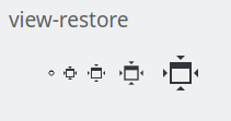
Unfortunately I could not resolve the blurriness for the fullscreen icon you see in the top bar when trying to leave fullscreen mode, e.g. view-restore (at 1x scaling). I think this might be a problem of the icon itself, specifically one of the sizes (#4):
Organizing a fix (file a bug, fix it yourself, bug people) would be awesome ;)
@rkflx I agree, thank you for the detailed analysis. The longer I looked at this with you the deeper into the rabbit hole we got; sorry for taking your time. This certainly brings up some good questions and issues for Breeze to work out, as it will only get worse as more people buy newer computers with HiDPI. I'll take your comments and my own thoughts and write up some discussions on it.
Sounds good, I'll get them set up and submit them (I need the practice!).
Nice work here, everyone. This kind of high-quality review process is what leads to high-quality code and high-quality software.
More thoughts on the matter (but no time to take any action…):
https://community.kde.org/Frameworks/Epics/Contributions_to_Qt5 is quite interesting, as it mentions our QPA:
DONE Extend QPA theme plugin to use KIconLoader within QIcon::fromTheme()
Also, regarding "Why do we have this colour-changing behaviour?": This seems quite useful for our filedialog or Dolphin's main view, where the user has a zoom slider to increase icon size. In those cases it makes sense to provide enhanced versions for larger sizes. For all other cases, i.e. when the developer chooses a static size which cannot be changed in the app itself (or only in Systemsettings) and therefore is only determined by the scaling factor, the different versions interfere and are probably not wanted. I'd argue that Breeze should cater for the latter case, while currently it is optimized for the former, less general really, case. I guess that's also why we have most problems with folder related icons.
QPAs are Qt's way of specializing aspects of behaviour and look for different platforms like Gtk, Plasma, Windows, macOS, XCB, Wayland etc. For example, issue QT_QPA_PLATFORMTHEME=gtk2 gwenview and test the Open dialog.
This means that if you use an application which calls QIcon::fromTheme(), i.e. a Qt function, it will apparently defer to KIconLoader when running on Plasma, i.e. not a native Qt function.
AFAIK there's no single "KDE" QPA, but various integration points, e.g. window system, icons, file dialogs, button layouts etc.
https://doc.qt.io/qt-5/qpa.html
https://doc.qt.io/qt-5/qdialogbuttonbox.html#details
https://phabricator.kde.org/source/plasma-integration/
https://blog.martin-graesslin.com/blog/2015/08/a-qt-platform-abstraction-plugin-for-kwin/