This is a WIP that I've been using on my personal branch for awhile. Figured I'd try cleaning it up and toss the diff up here.
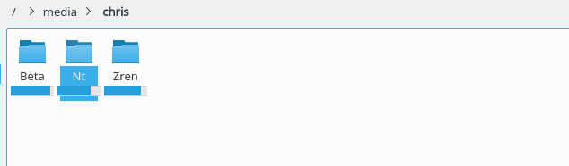
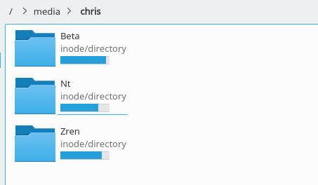
This creates a simple rectangular progress bar overtop the "size" column/text. When there's less than 5% space left, it will use a bright red fill.
TODO
- Need m_spaceInfoObserver(0), => m_spaceInfoObserver(nullptr),
- Probably need m_progressBar(), => m_progressBar(nullptr), too unless that's calling an 0 param constructor there. Hmm.
- I don't know how to properly reuse mountpointobserver.cpp, mountpointobservercache.cpp, and spaceinfoobserver.cpp. They're in dolphinstatic_SRCS and I need them in dolphinprivate_LIB_SRCS before kstandarditem.cpp is built. Do I need to have the statusbar link to the dolphinprivate_LIB_SRCS versions?
- Colors are hardcoded. Red definitely isn't changeable, but the "outline" could be 20% from bgColor to textColor or something. The bg could be 10%. The "space filled color" could be the highlightColor. The red "you've only got <5% left" fill color is probably better to hard code though.
painter.fillRect(rect, QColor::fromRgb(230, 230, 230)); // Background
painter.setPen(QColor::fromRgb(208, 208, 208));
painter.drawRect(rect); // Outline
const QRect fillRect(rect.x(), rect.y(), rect.width() * ratio, rect.height());
if (ratio < 0.95) { // Fill
painter.fillRect(fillRect, QColor::fromRgb(38, 160, 218));
} else {
painter.fillRect(fillRect, QColor::fromRgb(218, 38, 38));
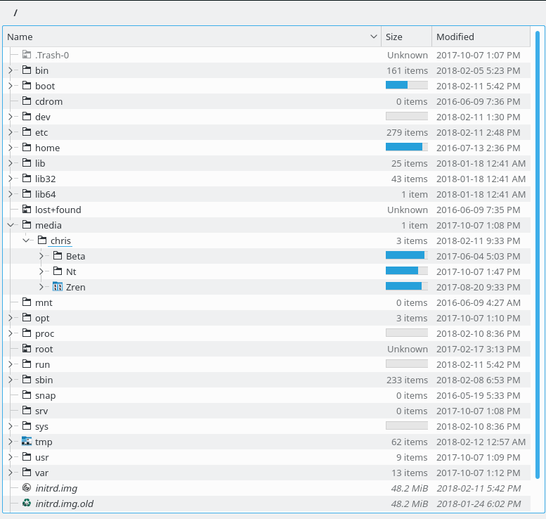
}View: Details
View: Compact
View: Icons