Increase default size of all fonts by 1 pt
Closed, WontfixPublic

Description

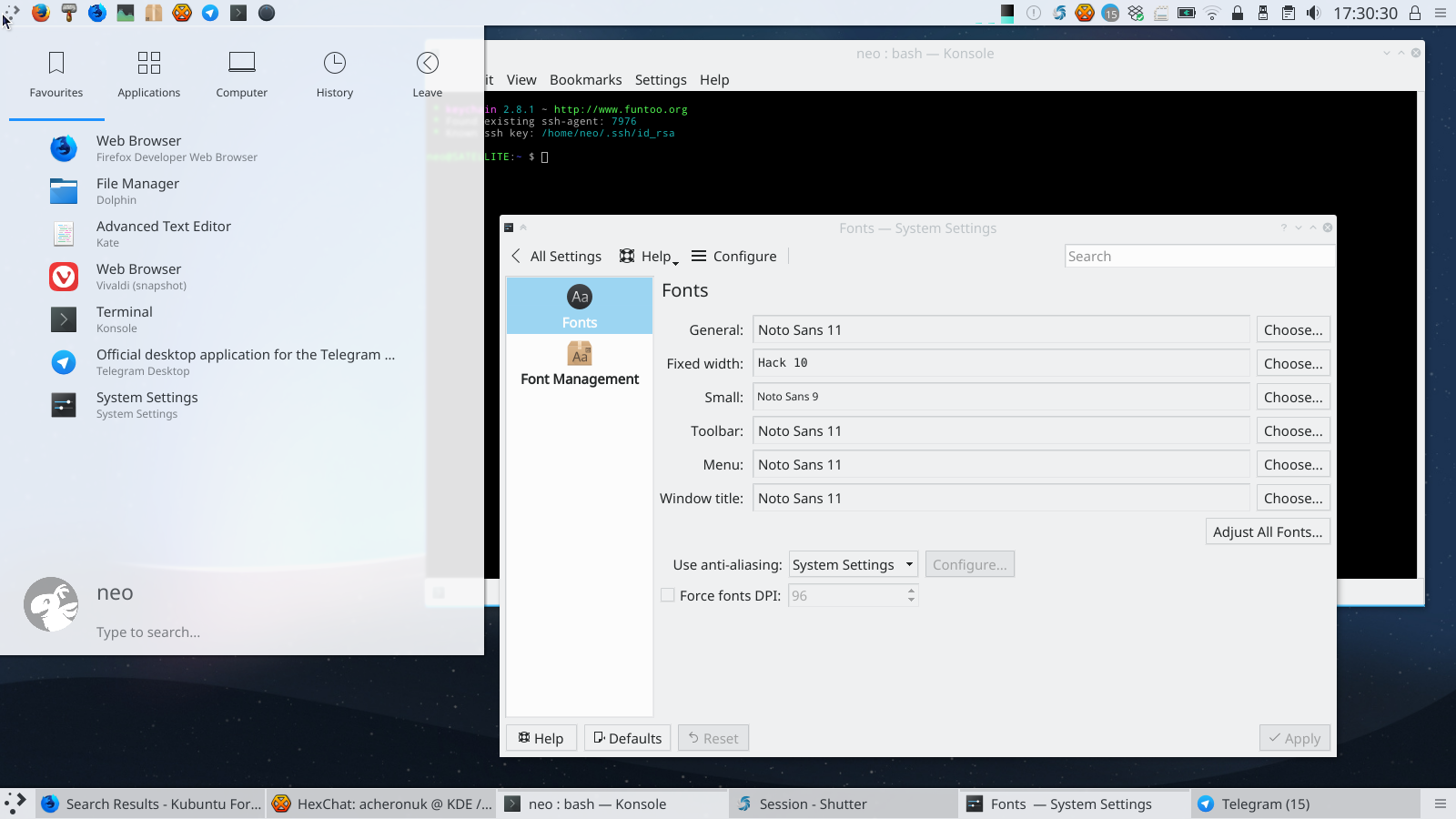
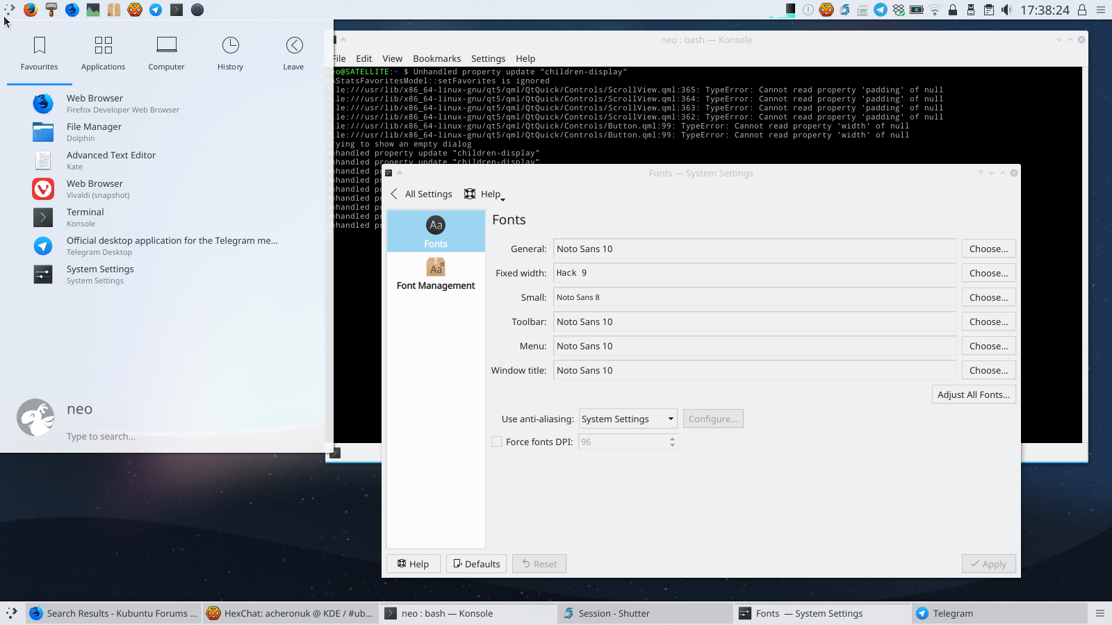
The default font for KDE is Noto Sans 10 pt. 10 pt is really small and the font is fairly wispy at that size. Increasing to 11 pt offers a vast increase in usability and reduction in eyestrain.

To keep the relative size differences, every other font should likewise be increased by 1 pt.

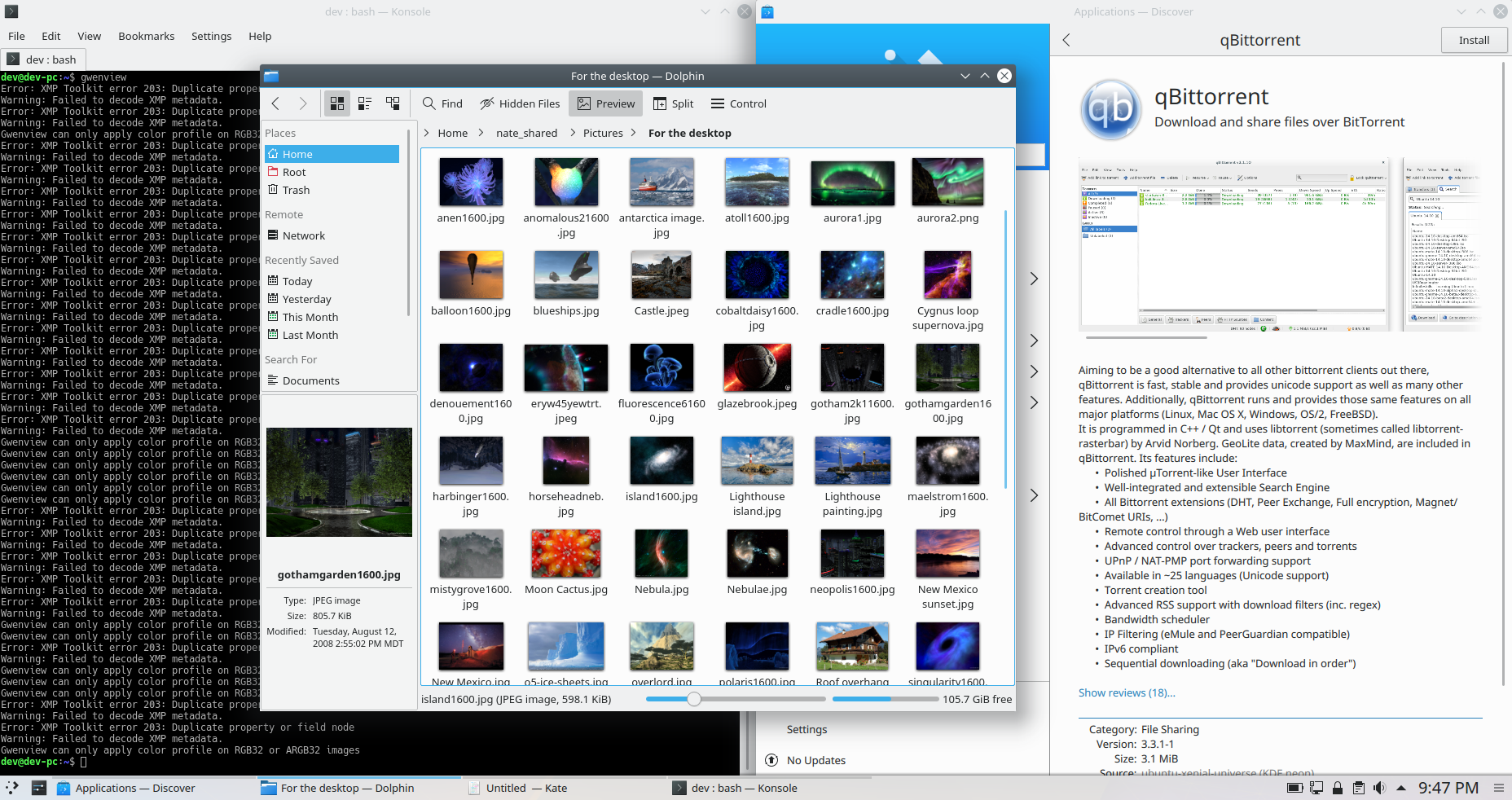
This looks really, really good:


(That Discover's sidebar becomes so huge is a bug that we are working on fixing: https://bugs.kde.org/show_bug.cgi?id=385992)

Compare that to the default settings:

ngraham created this task.Feb 2 2018, 4:20 AM
ngraham renamed this task from Increase default size of some fonts to Increase default size of all fonts by 1 pt.Feb 2 2018, 4:49 AM
ngraham updated the task description. (Show Details)

The side-by-side is quite dramatic.

+1 - Let's do it!

I prefer the default -1

But what would the majority of our users prefer? That's the real question here. We're not making this for ourselves but rather for them. I think that especially given Ubuntu's focus on accessibility to all kinds of people, making the fonts more readable to people with all different eyesight characteristics would be a benefit.

rikmills added a comment.EditedFeb 2 2018, 8:53 PM

I think the current are already bordering on the large side. I tend to take it down 1pt rather than bump it up. I have tried a test in a stock install with a +1 pt size bump, and it took some of the fonts from already borderline oversize, to looking quite out of place. Panel and kicker/kickoff in particular.

IMO this would be a retrograde step. Sorry.

At the moment the default is a nice balance. Users wanting it larger for eyesight etc are free to bump it a bit, but we don't have things like stupidly large kicker that brings, and making small displays feel cramped. Users like me can go the other way and take it down a notch. I think most just leave it as it is, as it's a good balance.

I prefer the default -1

me too: -1

@ngraham

We're not making this for ourselves but rather for them.

Well, I am. And I also think we should. Does anybody know precisely what the majority of our users want? If we aren't our own target group, what do we know about it? The most precise description of a target user I've found, is on the dolphin page. IMO that's us.

ach added a subscriber: ach.Feb 3 2018, 2:23 PM

From my experience 50 % increase font size, 50 % keep it. Depends on who many young and older people you see using KDE.

+0.5 from my side

Maybe the solution is not tweaking the default, but make it easier to change the default?
IMHO a basic setup needs 3 (or 2) settings

[Proportional Font] [ Monospaced Font] [Base size]+/-

So pressing once [+] would increate every font size +1 etc ..

Maybe even

[ FontsDuo ] [Base size]

would be enough.

FontsDuo = a name for a prop. + mono font, E.G., 'Ubuntu' or 'Noto' or ... 'Noto &Hack' ;-) ]

Plus Point if below the settings are example Widgets that show how it would look like. Similar how the theming is visualised.

That's of course material for a different Task.

Let me add a personal view here:
I am "old" (close to 60). I have bad eyesight (+3.4). Still, I don't read menus and such, I scan for patterns. The more I can scan at once the better - this is where font size comes into play. And I nearly always trade a slight blur for overview.
When I actually have to read something it is within an application and there is always Ctrl+Mousewheel at hand. That said, I'm not really objecting to a higher font size as it is easy to configure anyway. However, I also see no reason to do it.

ach added a comment.Feb 3 2018, 4:57 PM

Reminds me ...

When I pass the offices, I see again and again people with their head way to near to the display. The fonts are too small for them (also for people ~ 30). They sit in an unhealthy position. They stress their eyes. I always try to educate them to increase the font size.

A bigger font would help those 'ignorants' to not ruin there eyes and backs. A smaller default fonts hurts, a bigger one is just unpleasant for the people preferring smaller fonts.

Most people at work and in the family don't care changing settings. They use what's the default, complain and then get tip to try another program else. Strange but true :-(

@ach has it right. Most people don't and won't change defaults. Good defaults are especially important in a work environment where people are even less likely to customize their machines, or even may be presented from doing it.

I work for a software company many of whose customers deploy Linux desktops internally--mostly Ubuntu and RHEL. The default font size for both of these distros is 11pt, which is vastly more readable than 10pt. If we get these people to switch to Kubuntu, the users will experience a font readability regression.

Now consider that many will be using low-quality, low-resolution displays. This is true in the developing world too.

I have just tried this on a very standard laptop 1600x900 display, which may many will have. Even 10pt is quite large. 11pt just looks stupid.

-10

Could you share a screenshot?

ach added a comment.Feb 3 2018, 5:26 PM

We have to be careful when comparing screenshots

a) JPGs etc are pixel based and their physical size (im mm) can be quite different for many displays.

b) is qt/kde really using pt (2.54cm/72) or pixels for font size?

c) match dpi settings with real physical dpi of the screen?

A good way to check is to use okular or libreoffice with A4 or Letter (use 100%) and compare the displayed size with a physical sheet of A4/Letter paper. If both are the same size, great.

Kickoff takes up a ridiculous proportion of the screen as it scales up. Panel font size looks comical. Other fonts are disproportionally large.

It looks like a very unfunny joke.

Whereas with the sane current defaults:

I find myself squinting in your "sane defaults" screenshot--especially at the text in Kickoff. It's more compact, but much less readable IMHO.

It also doesn't help that your screenshots show sub-par font anti-aliasing, a casualty of lacking T7618: Turn on Slight RGB font hinting by default. With proper sub-pixel anti-aliasing, the smaller size might look better. But then again, so would the larger one!

rikmills added a comment.EditedFeb 3 2018, 5:48 PM

I don't even faintly squint at that, and I don't think most people would either.

I am unchanged on my big 'nuh nuh' to this change.

I'm going to +1 Nate's change.

  • On my 13" HiDPI XPS 13, I have to set fonts to 12 to prevent squinting.
  • On my 15" Retina MacBook Pro, the default is 12.
  • Microsoft Windows uses a default font size of 11. It looks great on my 24" monitors.
  • Microsoft Office uses a default font size of 11.
  • LibreOffice uses a default font size of 12.

10 is too small; set it to 11, a happy medium between the two camps.

Default system font sizes on other platforms, for comparison:

  • macOS: 12pt (hardcoded and unchangeable, boo)
  • Ubuntu Unity: 11pt
  • GNOME: 11pt
  • Windows: 9pt: far too small and too light and wispy; not something to emulate

I'm currently on the fence with this change. On one hand it does make it look a bit better on rendering but on the other Kickoff does looks a bit odd in size with 11 vs 10. So the other options in the panel will look a bit off as well. This is nothing that the user can't change if needed.

If the problem is Kickoff (and Kickoff has other problems too unfortunately) then we might consider switching to Kicker: T7979: Use kicker by default for Application Launcher : Wait until 18.10; re-test

This is nothing that the user can't change if needed.

The profile of the user who can change this easily is probably the kind of advanced user like Rik, who doesn't need the change in the first place because of better eyesight and a preference for a more compact UI. In other words, I think it makes more sense to make it the default for more average users who will benefit most from it, and let advanced users change it because they easily can.

Here's another recent example of a normal user wanting this change but not being able to find it: https://www.reddit.com/r/kde/comments/82li6m/larger_font_default/

tsimonq2 closed this task as Wontfix.Mar 20 2018, 9:39 PM
tsimonq2 added a subscriber: tsimonq2.

I'm closing this on the premise that @rikmills has raised some concerns that need to be addressed before this goes any further.

Feel free to reopen once things are in better shape.

[spam comment removed by sysadmin]

[spam comment removed by sysadmin]