a welcome page that is shown if no images are open
Closed, ResolvedPublic

Description

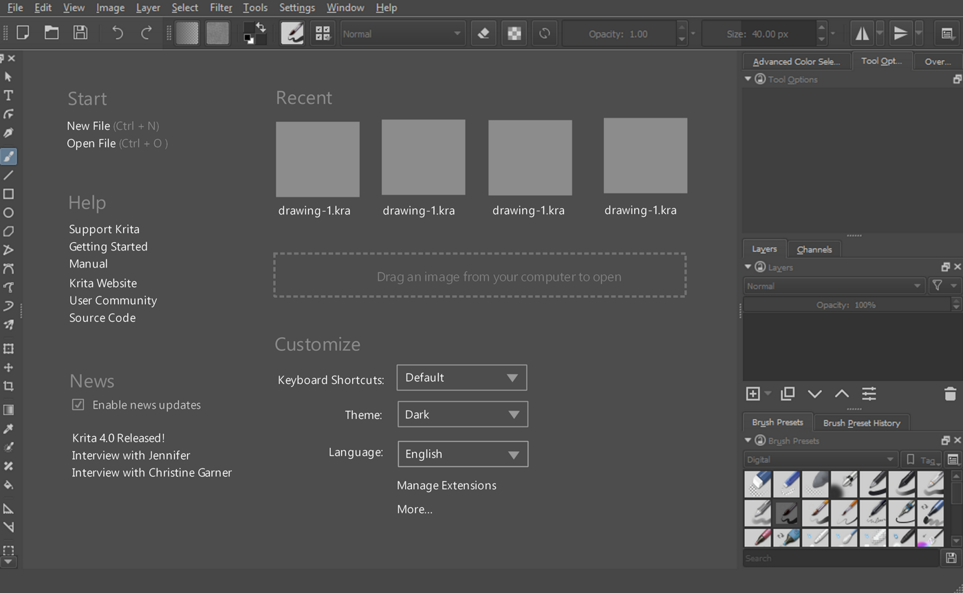
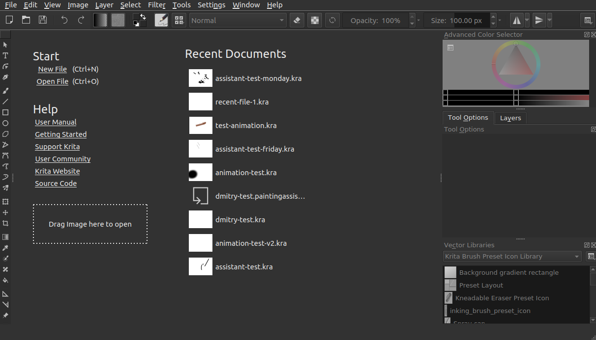
Currently, after the splash is clicked away, users see an empty window. Apparently, many do not know that they have to open or create an image. We could show a welcome page instead of the blank mdi area instead, like the gemini welcome page (which still works and is accessible from the touch docker).

Technology choices:

We can implement this using:

  • QML: we already have some of this functionality, but it's not translated yet.
  • HTML + readonly QTextEdit: the subset of html might make it harder to create something attractive
  • HTML + QWebEngine: QWebEngine can do eveything, but it is a very heavy dependency
  • QLabels in a layout: this is nice and simple
  • Custom widget: of course this is possible

Things that we might want to show:

  • A big fat empty image icon with a plus sign, to create new images
  • A big fat folder icon to open the file dialog
  • Thumbnails for recent documents

But maybe also:

  • Recent news from krita.org (note: this will hammer the website and make people paranoid about krita phoning home, the QML based gemini start screen does this already, though)
  • Links to help, tutorials, donation page etc, like the splash does
  • Links to share.krita.org and other resources
  • Thumbnails of "inspirational" images
  • Workspace selection
  • Some settings...

Applications with intro screens are:

  • Android and iOS painting apps
  • Corel Painter
  • ... ?

Photoshop doesn't, Gimp has the Wilber icon as a gentle hint that the backdrop is a drop area.

See also https://forum.kde.org/viewtopic.php?f=288&t=138151 (though that was meant as a replacement for the splash)

rempt created this task.Jan 18 2018, 3:24 PM
rempt updated the task description. (Show Details)
rempt updated the task description. (Show Details)Jan 18 2018, 3:30 PM
rempt updated the task description. (Show Details)Jan 18 2018, 3:34 PM

Here's the old 2.6 start screen:

I think for the flow of this... we can potentially remove the splash screen staying visible once Krita is loaded. I think if we move the stuff like recent document to this new area, there is no need to keep the splash screen visible after Krita loads. One less popup that appears as I see it.

If we start adding stuff this area, we need to make sure people can still drag a document from their desktop into the empty area in Krita to load an image. I don't think we want to lose that functionality

In terms of what is in it...Boud shared one example of what Painter does...
http://i1-news.softpedia-static.com/images/news2/corel-painter-2016-review-488904-4.jpg

This probably has way too much in it, but it should give an idea. Maybe there are other applications that aren't painting programs that accomplish this idea well. I don't know if we should put images in this area. Its main purpose is to help direct people on what to do and a bit of information possibly.

That is all I got so far

woltherav added a subscriber: woltherav.EditedJan 18 2018, 3:41 PM

We could also just call up the new image dialog when someone clicks on the MDI area when there's no image open.

EDIT: pushed a commit that does just that, but we can still think for other ways, of course.

One use case quiralta came up with is that he just wants to create a canvas and get sketching. Right now you have to see the New document dialog, then hit create before being able to do this.

  • One potential thing we could add to this would be a "Start Sketching" link, or something like that. It would automatically create a custom document at a specific size without bringing up the new image dialog.

Another idea... Not sure if this is possible, but could we potentially hide the toolbox if there are no documents open. Right now some people start playing around with those tools and don't realize that they won't actually do anything.

One of the settings that was mentioned on IRC was to potentially see and change the shortcut configuration here. It is a bit hard to find and know about from where it is now

I think it would be neat to look through our support tickets and see if we can add links to commonly asked questions. The goal would be to add a few links, or section, to minimize questions a lot of beginners have like not having pressure sensitivity or why Krita "lags".

arvindpinto added a subscriber: arvindpinto.EditedFeb 25 2018, 6:58 PM

I was thinking we could just make a sort of widget like thing which has the following options

  1. "Create New File" (Alias for File->New)
  2. "Open" (Alias for File->Open)
  3. A read only scrollable list with recent files (we should decide between double clicking to open a recent file or using an "Open" button next to the recent files list)

Instead of hiding the toolbar maybe disabling them may be a good idea. I like the FAQ idea

Attached a mockup to start off further conversation. This moves all the current startup screen stuff, so we probably don't need that if we do this.

This also might be a good time to discuss an opt-in for receiving news updates and release announcements. If people click yes, we can list out the recent news. We already get the most recent news posts from krita.org, so this wouldn't be too difficult. We might be able to grab it from the RSS feed here: https://krita.org/en/feed/

rempt added a comment.Mar 22 2018, 3:05 PM

About the rss feed news: we already have code for that, the only thing is that we need to coordinate with sysdmins because it would give a lot of load. If we fetch stuff anyway, I wonder whether we also should have a featured image or something like that?

I like the various things in the mockup. Thumbnails for the last couple of images should be easy to do as well.

I wonder how far we can go with making the welcome page a bit more snazzy. This is nice and understated, which is good, but maybe making it look more like the website would be good as well?

I was wondering if we could just make the splash screen modal. In the sense that the root Krita window is hidden till a person makes a choice. We could expand on the existing post splash screen instead of filling the blank space. Something like blenders startup screen but with the choice to open a recent file, and other options Scott had made a mockup of.

https://upload.wikimedia.org/wikipedia/commons/thumb/c/c6/Blender_2.60_Startup.png/800px-Blender_2.60_Startup.png

We could make the startup splash more like a horizontal rectangle as that is the typical shape someone looks for in a window.

For some reason I am not for filling up the blank space with controls. I think the canvas backdrop should be clean like it is now. For long time Krita users they like the blank background it is a reminder that they have not yet made the choice whether to open an existing or create a new file.

With the latest stable built krita I noticed the window after the splash just immediately disappears instead of being clicked away on Linux. It does not appear to be by design but is it by design?

rempt added a comment.Mar 22 2018, 7:13 PM

No, making the splash modal and forcing the user to click it away is an excellent method to make people angry. And it wouldn't help with the real problem: that people do no longer know what a blank window is for. People don't realize they need to create or open an image, so they do need the hint.

@arvindpinto To re-iterate the main problem we are solving based off the ticket's description. The blank area is confusing quite a few people. People start clicking on it thinking they can paint right away when they cannot. Nothing happens and they just get frustrated wondering why Krita won't work.

Here is a recent youtube video of someone getting frustrated with this issue: https://www.youtube.com/watch?v=F2gclyzN3_0&t=0s

Wolthera did a quick fix for 4.0 of making clicking go to the create a new document screen, but we are thinking of a more robust solution that could eliminate the start screen and eliminate the "pop up".

@rempt @woltherav

I attached a revision for the startup screen. It now has news as well as thumbnails for a few recently opened items. I also added an opt-in checkbox to use the internet to get the news.

@rempt - you mention making it look more like a website. What type of appearance were you thinking of. My main concern with making it too pretty is it will be distracting from the rest of the UI and people might think they have to start using the application differently. this wasn't mentioned but it would be nice if we didn't have any scrolling like a website. If we add any more content than what I have in this mockup, we probably want to go to a tabs approach or some other way to hide part of the content. I just don't want this to get too crazy for what it is.

Ok. I think it may be difficult for users when Krita is their first and only application they begin digital painting in because as far as I know both Photoshop and GIMP behave this way(showing an empty window). I agree that adding these options to the blank backdrop may be less disruptive then a startup window which asks a person to open an existing file or create a new file before the entire Krita interface is available to them.

Some apps example Inkscape open with a blank A4 canvas by default. That may not be ideal because then it is an extra step to close this canvas and create a new one with desired dimensions.

I watched that video. It looks like the menu floats in a different place in a Mac and does not reside inside the window. So when the author of the video clicks randomly the menu simply does not appear. This is why for desktop environments with disconnected menu bars e.g. Unity I can see how not knowing what to do and not being able to figure it out is an issue. I think a startup window apart from the splash will solve this issue too.

Another idea could be to give users a getting started wizard the first time they run Krita. But that is easier done on a website than in an app and may not be feasible -- something which explains the main components of krita.

@scottpetrovic @rempt Do you think making this a separate window before Krita shows the rest of itself is a good idea?

scottpetrovic added a comment.EditedMar 23 2018, 6:08 PM

@arvindpinto - we tried making it a window at the start before with a forced decision and that seems to make people angry with a forced decision since it messed up shortcuts and dragging options

As far as I know newer versions of photoshop have added the information to the blank area because of a similar issue.

rempt added a comment.Mar 23 2018, 6:21 PM

Yeah... And let's be clear: this is not about people who haven't used a painting application before. Every application iOS or Android works like this. Corel Painter works like this. So, we don't need to discuss whether or not to do this; we need to find a good solution that keeps the middle ground between flashy but gaudy and understated but noticable.

another idea that might be out of scope. I see a lot of people clicking on the toolbox, toolbar , or dockers on the right when nothing is open. The only buttons that appear to really do anything though are the new and open buttons on the toolbar. Would it be possible to hide those if the welcome screen is on? That could also potentially give us more space to put other things in that area.

I really like that mockup! Some thoughts:

  1. Make Open and New document more look like big and clickable buttons. Maybe with borders and small icons next to them.
  2. Button for news update when auto update disabled. Like, if user don't want krita to check news at every launch they can disable it and just press "check news" when they want.
  3. How about add some (favorite?) templates to startup screen?
  4. Customize section: imo it's better to have "configure krita", "manage resources" and "switch language" here. Theme and hotkey schemes isn't that important.
  5. Make it not some "welcome screen" but rather replace "background image" with this useful menu.

another idea that might be out of scope. I see a lot of people clicking on the toolbox, toolbar , or dockers on the right when nothing is open. The only buttons that appear to really do anything though are the new and open buttons on the toolbar. Would it be possible to hide those if the welcome screen is on? That could also potentially give us more space to put other things in that area.

Hide Open\New buttons or everything else? Anyway I think it's not a good idea to change how program looks after some actions, it might be confusing.

Also one thing I'd like to add. When this feature will be added I think new users will understand they need to create or open file to try all the things. So maybe disable that locking for most dockers and buttons? I really hate that I need to create a file just to check my brush settings or tool options (usually this happens when I answer questions about krita).

arvindpinto added a comment.EditedMar 24 2018, 6:06 AM

@scottpetrovic I think the menu bar is also a bit dangerous for click and learn people. It may be a good idea to disable the 'View->Show canvas only' and 'View-> Full screen mode' options on startup/when there is no loaded image file so people don't accidentally click them. It may lead to a "I cannot get out of krita" hiccup later. I don't think you should change how the toolbars are displayed on startup because it may make people who are following older Krita tutorials also uncomfortable.

rempt added a comment.Mar 24 2018, 2:05 PM

another idea that might be out of scope. I see a lot of people clicking on the toolbox, toolbar , or dockers on the right when nothing is open. The only buttons that appear to really do anything though are the new and open buttons on the toolbar. Would it be possible to hide those if the welcome screen is on? That could also potentially give us more space to put other things in that area.

Don't forget window/workspace and settings. Anyway, I wouldn't do that -- hiding parts of the gui and only showing them on creating a document might be very confusing. I also suspect it would lead to lots support queries.

After talking with @rempt a bit, we will go with the last design for now and see what type of feedback we have. The purpose of this is so people don't get confused with now canvas which this solves. Let's see what type of feedback we have after this first attempt. We can always modify things and changes things later.

The next step is to decide what technology to use. @rempt is hinting at using QML since it is used in other areas of the application.

rempt added a comment.Mar 29 2018, 9:01 AM

I created rempt/T7782-welcome-page which has a basic widget stack in KisMainWindow that shows a qml-based hello page when no document is open.

I have started my own branch working on this a bit. Here is what I have so far.

Maybe it is just me...but it feels a bit cluttered. Maybe there are too many recent documents? Maybe the thumbnails are too big? I like the idea of this, but something about it seems 'busy'.

Any feedback is welcome

scottpetrovic added a comment.EditedJun 29 2018, 4:06 PM

I talked with raghukamath about this over IRC a bit. I am going to try the following.

  1. increase the spacing a bit for the links to make it easier to press with your finger (touch)
  2. make the text color less white so it blends in with the background color (strong contrast is giving it too much attentions)
  3. reduce the amount of recent documents to 5
  4. maybe work on centering the sections better
  5. change text to "drag image on the window"
  6. Add icons and make bigger with New and Open options
  7. remove splash screen items since they are duplicated now

I did those changes...then made a few tweaks to positioning and such after further discussion on IRC

A few things left.

  1. update colors on theme change
  2. created a dotted outline around entire area is a file is over welcome area
  3. Fix title not being updated when new document is created (only happens on Tabs view)
  4. hide the existing links on splash page since it is duplicated now
  5. Question: should we have a toggle in the settings to make this off/on?
  1. ...Question: should we have a toggle in the settings to make this off/on?

Do you mean the whole welcome page? if so I think it would defeat its purpose, after all, the prevention of an empty space is what this is for, I thinking that users less experienced with Krita may accidentally toggle it off and then think something wrong had happened. I'm trying to think of the oposite, but I don't see much use for that space to be empty (if a switch would exist).

For the links, you may want to keep them in the "about" splash too, as the ones in the welcome page are going to only be visible when there is no open document (I think?) thus people may need them for easy access while a document is already opened.

By the way, the layout looks much better now and prioritizes on the wide side, which should accommodate most basic screens and workspaces I'm thinking.

I did quite a few of the changes that I listed earlier. Theme changing works, content is centered like @ivanyossi mentioned, the whole empty area gets a dotted line around it when you have some draggable over the area.

I am starting to work on what we want to do with the splash screen

@rjquiralta The purpose of this project is about people not realizing they need a document open to work. It is not about empty space so that shouldn't be a concern. Right now we give people the option to hide the splash screen on startup. The splash screen will always disappear once Krita is loaded with this change, so that option won't be needed any longer.

Are you thinking that people don't currently use the "hide splash screen on startup" functionality? It sounded like some people didn't want to see those extra options. Maybe that was more about being a popup though than the extra options. I did a quick search and other application's seem to give this option for their welcome screens to be hidden if configured. Maybe another artist can chime in. I could go either way.

The checkbox to hide it would be quite hard to do accidentally. It would only be in the Settings > Configure Krita area so there is little chance a new user would check it.

I agree that the links in the About dialog should stay.

@scottpetrovic I only meant the "about" dialog, indeed I don't see the opening splash image needing any other information (as it is now is fine).

I guess if the checkbox for showing the welcome page isn't easy to mistake, shouldn't be any concerns then.

I still don't see why anyone would rather an empty/interactive-less screen, but that's just me, thus hopefully you get more input, may save you some code. :)

I just submitted a code review for it.

https://phabricator.kde.org/D13861

After looking at it now, I might make the text a bit lighter. I was playing around with the balance, but I think I might have overdone it.

@rjquiralta - for now I just removed all the "hide on startup" stuff that exists now in 4.1. Since it isn't a popup it might be fine. It wouldn't be too hard to add that feature later on if someone really wants it.

I really like the interface. Is it possible to centre it within the blank space.

scottpetrovic closed this task as Resolved.Jul 17 2018, 12:11 PM

These changes have been pushed out to master. Closing this ticket.

@arvindpinto - yes, the contents are centered in the blank space