Ok! A few months back we overhauled parts of the Animation Timeline Docker UI, incorporating all of the functionality of the old, now defunct Animation Docker while putting frequently used widgets out front. The goals were to reduce the screen space footprint of the animation tools, to reduce clutter and improve clarity, and to improve and streamline aspects of the animation workflow as much as possible. There is still quite a bit of work that can be done in this regard, but that's for another thread.
OLD:

NEW:
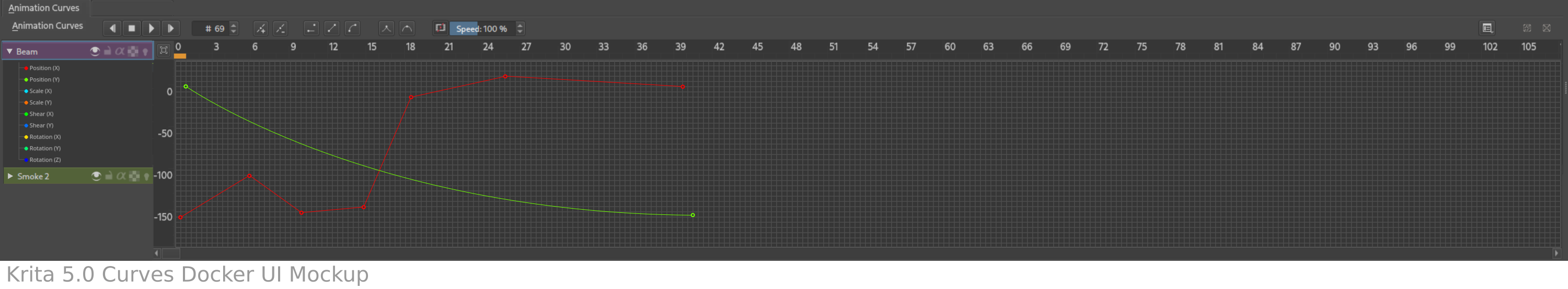
Animation Curves Docker
https://docs.krita.org/en/reference_manual/dockers/animation_curve.html
Another piece of our animation workflow, and one that will become increasingly important as we add more features, is the Animation Curves Docker. Our first step here should be to try to bring this docker in line with the changes that we've made to the timeline and to fill in the functionality gaps caused by removing the Animation Docker. Off the top of my head, here's what I think we need to do:
1.) Replace the current toolbar with a KisUtilityTitlebar. [ @kaoninjaratzu is going to give this a shot. :) ]
Just like the timeline, we can save a little bit of vertical space by mixing the titlebar and toolbar. The KisUtilityTitlebar that we made for the timeline should do the trick here. We should be able to mimic something along the lines of the KisTimelineTitlebar subclass. (See /plugins/dockers/animation/timeline_docker.h and .cpp for an example.)
Because we no longer have a standalone Animation Docker, there will inevitably be some overlap between the timeline's titlebar and the curves' titlebar: both will need to have instances the new KisTransportControls, a frame counter spinbox, and possibly more. I *think* we've designed many of these pieces such that they won't cause too many issues being used in this context, but we'll see! :)
2.) Improve the curves viewport navigation.
One of this frustrating things about navigating the Animation Curves Docker right now is basic control of the view. Right now there are a couple of buttons and handles on the upper left side that can be used to zoom the view on the X and Y direction, as well as a button that (I think) is supposed to fit the view to the extent of all visible curves. But it's still a bit clunky.
I'm hoping that we can reuse another piece of gear that we made for the Timeline here; the KisZoomableScrollbar. With a couple of zoomable bars, as well as a few convenience buttons, we should be able to make everything a bit smoother and easier to navigate. I hope.
3.) Improve the curves viewport readability.
It would be nice to make the curves a bit easier to read, including by having a nice grid in the background so animators can properly see how their curves align with values. I haven't looked into this yet, so I don't know what that involves.
4.) Improving the look and feel of channels section (left side).
The left side needs a bit of love too.
It probably needs a more limited range of horizontal sizes, because there's very little reason to expand it larger than the content of the curves view itself. We probably want more ability to control the channels with buttons or right click menus. Maybe some little icons for different types of curves would be nice. There's probably more.
That's all I can really think of for now, everyone please feel free to comment with ideas or other thoughts and I can add them to the notes. :)