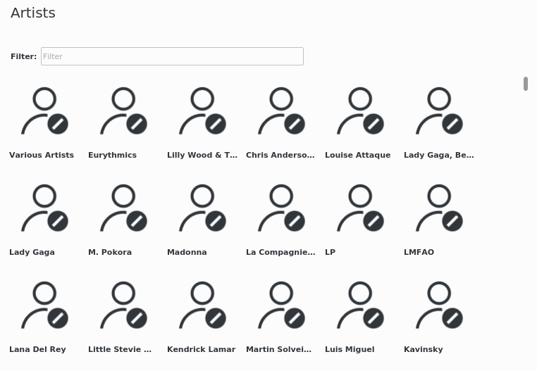
remove extra margins in all artists view
squeeze a bit of space in both views
ensure more consistency in layout between both views
if possible use a light font for the artist in all albums view
| astippich | |
| andreaska |
| Elisa |
remove extra margins in all artists view
squeeze a bit of space in both views
ensure more consistency in layout between both views
if possible use a light font for the artist in all albums view
to me looks better
| Automatic diff as part of commit; lint not applicable. |
| Automatic diff as part of commit; unit tests not applicable. |
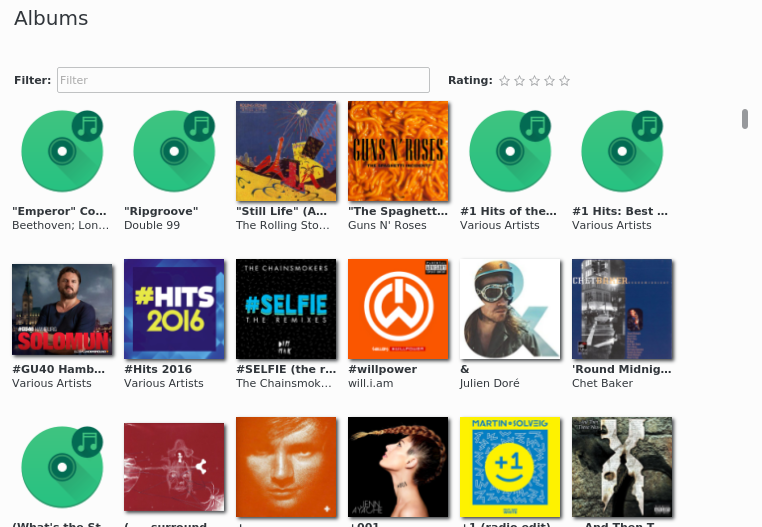
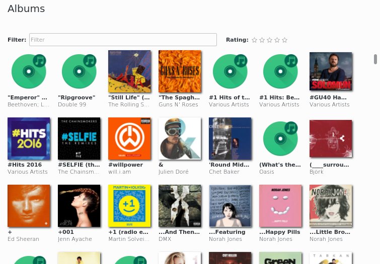
Album View
I would add a bit more margin in the album view.
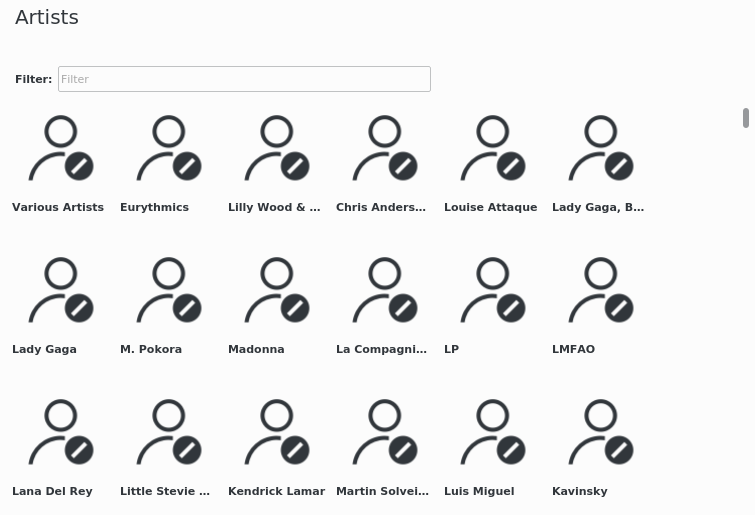
Artist View
as there are no artists covers I would change the layout of the artist
Option 1: https://community.kde.org/File:Bangarang_Music_Mockup_-_Albums.png use the album covers
Option 2: Use Album View with Group by Artist (like in Dolphin a group item and the albums)
Option 3: Download the Artist cover from the internet (need code work and didn't bring that much
I would prefer Option 2
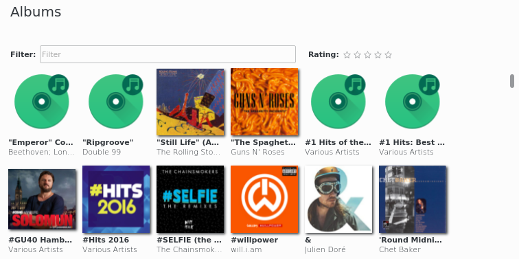
I will do but there was a "big" margin at bottom and at the same time right and left margins are too small. I will tune them again.
Artist View
as there are no artists covers I would change the layout of the artist
Option 1: https://community.kde.org/File:Bangarang_Music_Mockup_-_Albums.png use the album covers
Option 2: Use Album View with Group by Artist (like in Dolphin a group item and the albums)
Option 3: Download the Artist cover from the internet (need code work and didn't bring that much
I would prefer Option 2
Option 2 is really a different development that may need also to have a look at what facilities are provided in KF5 frameworks to do that (i believe there is a generic model coupled with the KCategorizedView). I would be happy to add a task for that in the workboard.
Option 1 need a lot of thought to really be elegant in all cases (1 album, 3 albums, a lot of albums, ...).
I prefer option 3 over option 1 but as you said, this also needs some work.