Improve display of technical app info
ClosedPublic

Authored by ngraham on Dec 29 2017, 3:28 AM.

Details

Summary

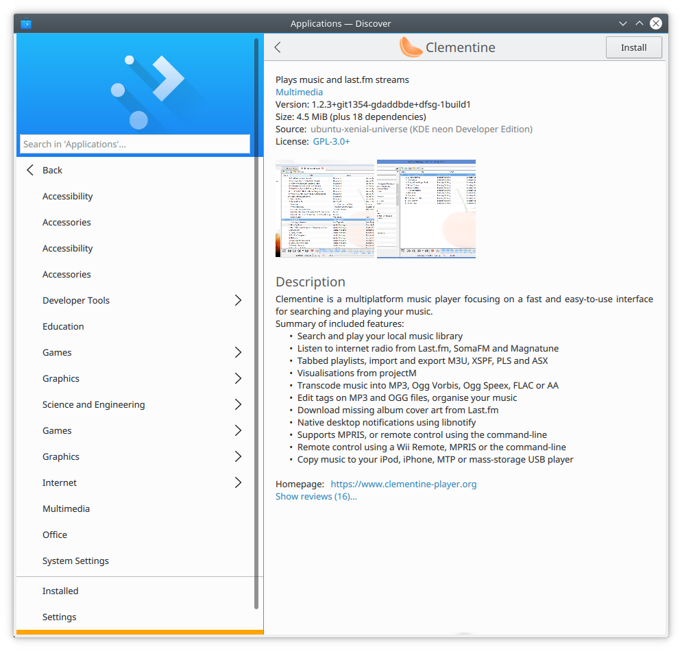
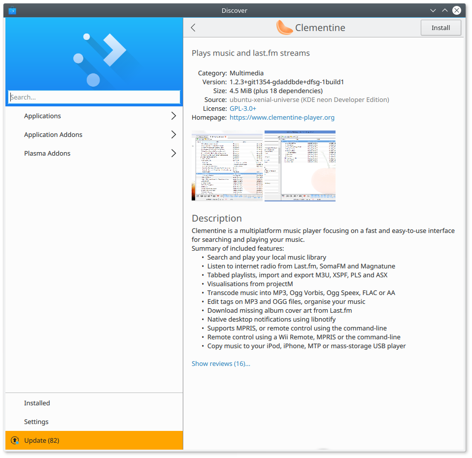
Improve display of app info in the following ways

  • Display the app's caption in bold and apart from the other pieces to make it stand out more
  • Group the pieces of info in a recognizable section
  • Right-justify all the labels to make everything easier to parse
  • Don't display the category with a link color since it's not a link
Test Plan

Tested in KDE Neon. Before:

After:

(Ignore the duplicated categories in the sidebar; that's an unrelated issue tracked by https://bugs.kde.org/show_bug.cgi?id=388313)

Diff Detail

Repository
R134 Discover Software Store
Lint
Automatic diff as part of commit; lint not applicable.
Unit
Automatic diff as part of commit; unit tests not applicable.
ngraham created this revision.Dec 29 2017, 3:28 AM
Restricted Application added a project: Plasma. · View Herald TranscriptDec 29 2017, 3:28 AM
Restricted Application added a subscriber: plasma-devel. · View Herald Transcript
ngraham requested review of this revision.Dec 29 2017, 3:28 AM
ngraham edited the test plan for this revision. (Show Details)Dec 29 2017, 3:28 AM
ngraham edited the test plan for this revision. (Show Details)Dec 29 2017, 3:33 AM
ngraham edited the summary of this revision. (Show Details)

"After" definitely looks better :)

discover/qml/ApplicationPage.qml
152

Why do you put a Text inside a label? Why not use font.bold property of Label itself?

158–159

Does Layout.fillWidth have an effect here? Shouldn't it be inside of QQC2.Label block?

180

Translation is probably not needed here now

ngraham updated this revision to Diff 24456.Dec 29 2017, 3:00 PM
  • Merge branch 'master' of git.kde.org:discover
  • Address review comments
ngraham marked 2 inline comments as done.Dec 29 2017, 3:00 PM
ngraham added inline comments.
discover/qml/ApplicationPage.qml
152

This was actually the only way I could get it to work. Doing this:

QQC2.Label {
            Layout.fillWidth: true
            text: appInfo.application.comment
            font.bold: true
            wrapMode: Text.WordWrap
            elide: Text.ElideRight
            maximumLineCount: 1
            bottomPadding: 20
        }

...had no effect, and did not make the text bold.

januz added a subscriber: januz.Dec 29 2017, 3:27 PM

+1 Definitely an improvement. What do you think about grouping the homepage with the rest of the info at the top?

Good idea, I'll do that too.

apol added a comment.Dec 29 2017, 3:45 PM

We used to have exactly this same layout for that section few releases ago, let's not keep doing the same changes over and over.

Also I'm not a big fan of the bold. Maybe it would make sense to make the font slightly bigger?

I could do a bigger font instead of bold, sure.

As for going around in circles: sorry, I wasn't around a few releases ago, so I didn't know what it looked like back then. But folks do seem to think this is nicer than the status quo...

ngraham updated this revision to Diff 24470.Dec 29 2017, 5:56 PM
ngraham marked 2 inline comments as done.
  • Use a larger font instead of bold for the caption
  • Put the homepage on top, too
ngraham edited the test plan for this revision. (Show Details)Dec 29 2017, 5:57 PM

I don't spot any obvious problems in QML any more. And I like newer version more than previous...

This layout makes more sense to me as well overall. The only thing that I find a bit strange is that the summary now looks a bit like a headline, especially given that the application name is in the toolbar instead of the content area. I'm wondering if we should move the name and icon into the content area.

apol accepted this revision.Dec 30 2017, 11:51 AM
This revision is now accepted and ready to land.Dec 30 2017, 11:51 AM

We already had everything in the main content area before we had a real toolbar on top, at which point the icon and app name were moved there. I'll land this, and then we can continue iterating as necessary.

This revision was automatically updated to reflect the committed changes.