Make password dialog have error-handling built in.
BUG: 385985
BUG: 385445
This will show the error directly in the dialog and refuse to close
until the mount was successful (or user presses cancel).
| ivan |
| Plasma |
Make password dialog have error-handling built in.
BUG: 385985
BUG: 385445
This will show the error directly in the dialog and refuse to close
until the mount was successful (or user presses cancel).

| Lint Skipped |
| Unit Tests Skipped |
Hmmmmmm, api.kde.org certainly fooled me. Seems there are two classes with the same name in different packages!
Either way, one has a bug, not sure which was linked in.
Still, it apart from the incorrect commit message, I stand by the patch as it makes error handling much smoother from a users-perspective and it fixes a focusing bug.
Please clarify. If D8791 gets accepted, which issues remain that would justify a custom dialog?
| kded/ui/mountdialog.cpp | ||
|---|---|---|
| 34 | Is the leasing space intended? | |
| 34 | "leading" :) | |
| kded/ui/mountdialog.h | ||
| 3 | Add full name. | |
| 27 | #include "ui_mountdialog.h" | |
| 39 | override | |
| kded/ui/mountdialog.ui | ||
| 15 | Adjust or remove windowTitle. | |
| 48 | Please use KPasswordLineEdit | |
Updated to fix the issues.
The leading space was intended, indeed. It makes things look a bit nicer.
I also clarified the description, and as to the question if its still valuable.
The main change is that the original code was intended to not close the password dialog (as Ivan stated on bugs.kde) when an error occurred, but it does and people got confused when nothing happened. This patch make the intended behaviour actually work.
It may be nice to make the errors from the backends more legible and understandable to end-users, but I think that is a separate issue.
Almost mergeable - I just have a few nit-picks:
We should also add an 'in progress' state, but that can be a separate patch
Welcome back :)
Replace the text in the 'error' label with 'Failed to open: %1'
Ah, that is an improvement indeed. Will do.
Replace the two labels with a single one
Let me explain why I separated them, then you can decide if it was a good call or you still want to have it in one label.
The patch I created has one text and one label which we hard-code and translate. It is important that this text is used to set the width of the dialog.
The second label is essentially user-provided. The actual vault name. I set that label to have its width ignored, as such if the user sets a 1000 char name, this will not grow the window width.
As such, your suggestion combined with a very wide vault name would end up making the dialog bigger, potentially even making the Ok button invisible (out of screen).
Why don't you set up the preferred size for the dialogue, and allow the label to be multi-line?
For some reason, this looks really strange to me. Maybe we could ask @colomar and @jensreuterberg for advice?
Why don't you set up the preferred size for the dialogue, and allow the label to be multi-line?
My laptop is 260 DPI, all the places where preferred size is used are really not usable for this display. I'm thinking the same goes for people with a non-standard font size.
I'm not hard set on any specific solution, at all, I just choose this solution because its the most correct one. It follows the security mindset of never trusting user input. A vault name is user input.
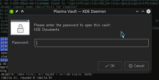
Hi @abetts , we need a nice dialogue that shows the password entry for unlocking a vault. You have the current proposal screenshot above.
To me, it looks misaligned (the second line).
You have the rationale @cryptodude had for keeping it in a separate line instead of putting everything in a single sentence in his comment above.
I've pushed this patch with a few changes (don't want to wait the last moment before the string freeze).
Changes are: