Background color for sidebar headers
ClosedPublic

Authored by progwolff on Oct 13 2017, 2:27 PM.

Details

Summary

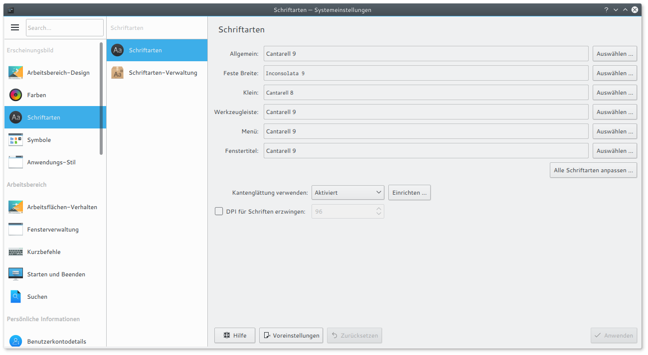
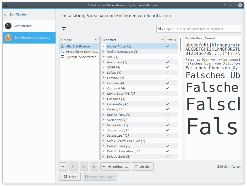
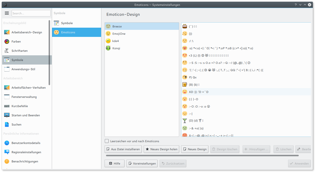
kcm modules have backgroundColor as main background color.
The new systemsettings sidebar design has viewBackgroundColor as main background color.
Through this, the kcm modules look a little misplaced to me.

With this patch, the sidebar's headers have backgroundColor as their background color, matching the background
color of kcm modules. Thus, kcm modules look a little better embedded.

This might conflict other's tastes or even conflict VDG guidelines I am not aware of. So let me know what you
think.

Diff Detail

Repository
R124 System Settings
Lint
Automatic diff as part of commit; lint not applicable.
Unit
Automatic diff as part of commit; unit tests not applicable.
progwolff created this revision.Oct 13 2017, 2:27 PM
Restricted Application added a project: Plasma. · View Herald TranscriptOct 13 2017, 2:27 PM
Restricted Application added a subscriber: plasma-devel. · View Herald Transcript

Before:

After:

progwolff planned changes to this revision.Oct 13 2017, 3:45 PM

Need to rebase, sorry...

I like it, FWIW.

Me too.

Perhaps the header in subnav ("Schriftarten") needs to be darker then to increase contrast.

I think it is intended that the headings have low contrast.
The user knows that "Schriftarten" is selected, as it is highlighted in the primary column.

In the second column it is rather unimportant to have it there at all. So, giving it a solid black would be too much in my opinion. And an additional shade would be one shade too many in the palette.
Any other opinions?

That begs the question: why even have headers, if they're unimportant, deliberately low-contrast, and duplicate existing status information shown elsewhere?

They are important in the primary column to structure the list items.
Yet, the list items are more important than the headings, so it is a good idea to have the headings in lower contrast, so that they create less visual attention.

The heading in the second column in not as important as the ones in the primary column, but it still is a nice little reminder.
Therefore I think that the heading in the second column should remain, just to have a little hint on what this column is about.

Giving the secondary heading a solid black color would however give it a more important role than the headings in the primary column. This is what I want to avoid.

On second thought, the secondary heading acts like a button for small screens.
This means, now that the background is the same as buttonBackground, it will look like a disabled button.

I will change the text color to solid black.

progwolff updated this revision to Diff 20687.Oct 13 2017, 5:52 PM
  • change opacity of secondary heading
progwolff updated this revision to Diff 20688.Oct 13 2017, 6:50 PM
  • normal font weight
mart added a comment.Oct 15 2017, 4:30 PM

ok for the top toolbar to be darker.

the headers in the listviews should stay like they are now tugh

sidebar/package/contents/ui/SubCategoryPage.qml
77 ↗(On Diff #20688)

it's still supposed to have bold font

progwolff updated this revision to Diff 20799.EditedOct 15 2017, 4:44 PM
  • revert changes to SubCategoryPage

progwolff updated this revision to Diff 20801.Oct 15 2017, 4:45 PM
  • also revert newline
mart accepted this revision.Oct 17 2017, 5:46 PM
This revision is now accepted and ready to land.Oct 17 2017, 5:46 PM
This revision was automatically updated to reflect the committed changes.