QtCurve alternative style for named menu section headers
ClosedPublic

Authored by rjvbb on Apr 3 2017, 8:54 AM.

Details

Reviewers
yuyichao
Summary

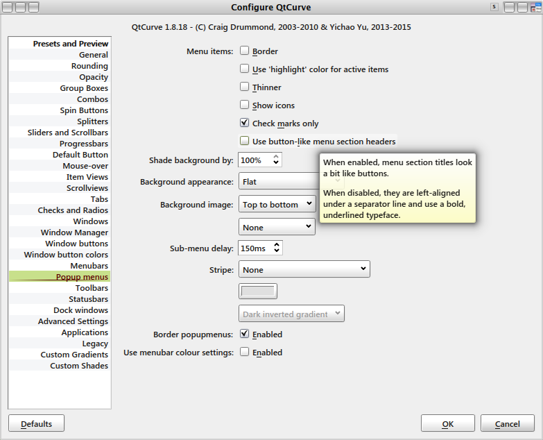
This patch introduces an optional new/modern look for named menu section headers to the Qt4 and Qt5 style plugins.

The context:
I have been tinkering with (minimal changes to) Qt's Cocoa backends to enable full support of named menu sections ("texted separators") on Mac, so that QMenu::addSection() can be used more reliably for menu organisation. Native menubar menus are the limiting factor there; the other menus adopt a slightly elaborated version of the solution that works in native menus. The resulting look is inspired by Google Chrome's solution as used e.g. in its history menu but also borrows from Fusion's design.

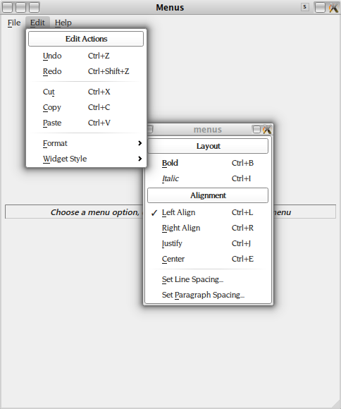
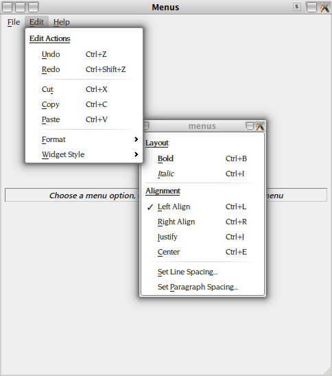
Initially I planned to propose a hardwired implementation of that menu section header design in QtCurve on Mac so that menus there (not attached to the native menubar) look more like how they could look with the native "macintosh" style. Then I noticed I prefer the new look over the old "button-like" look which I always found somewhat confusing, and realised others might too.

The current design uses left-aligned text, underlined and rendered in bold, with an overlying separator that is also left-aligned. Alignment is done w.r.t. the check/icon position, and of course flips when switching to a right-to-left rendering mode. On Mac there is also a tiny amount of letter-spacing contraction to increase visual impact (this doesn't work well with the Freetype engine IMHO).

Test Plan

Tested on both Mac (Cocoa and X11) and Linux (X11).

I have zero experience with GTk2 coding but if that UI toolkit also has texted separators we should probably implement them.

It would be interesting to have some kind of usability study (or results from such a study) that show to what extent named menu sections are a good idea, and how they could/should be rendered.

For instance, I am not convinced by Breeze's design using centred text above a separator. That looks jarring to me, not helping readability at all.

Diff Detail

Lint
Lint Skipped
Unit
Unit Tests Skipped
rjvbb created this revision.EditedApr 3 2017, 8:54 AM

Some screenshots showing old vs. new and the addition to the config page.
(The use of teared-off submenus is only to ensure they stay open during the screenshotting.)

rjvbb added a comment.Apr 3 2017, 9:02 AM

I have been unable to figure out whether it's indeed impossible to detect if a menu item is the 1st or last in a menu when calculating its content size (CT_MenuItem). Is it?
Idem for drawing (CE_MenuItem): is there anything other than the content rect co-ordinates to distinguish the first item?

rjvbb retitled this revision from QtCurve alternative style for named menu section headers (WIP) to QtCurve alternative style for named menu section headers.Apr 21 2017, 3:38 PM
yuyichao accepted this revision.Apr 21 2017, 3:53 PM

Assuming the coordinate calculations are correct (which I can never get right without seeing the result) this LGTM.

There was a previous issue on scaled display but I guess this should be fine since this doesn't touch texture drawing.

This revision is now accepted and ready to land.Apr 21 2017, 3:53 PM
rjvbb added a comment.Apr 21 2017, 8:55 PM

Assuming the coordinate calculations are correct (which I can never get right without seeing the result) this LGTM.

They can't be completely wrong as I have now used the new mode for a while and didn't notice anything off.

There was a previous issue on scaled display but I guess this should be fine since this doesn't touch texture drawing.

Indeed. I did test a reasonable number of larger menu fonts and the layout works fine (at least with the single glyph-based tickmark which I implemented earlier).