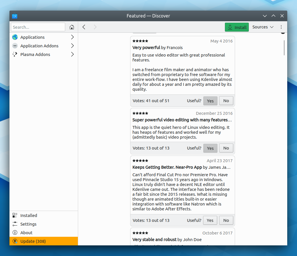
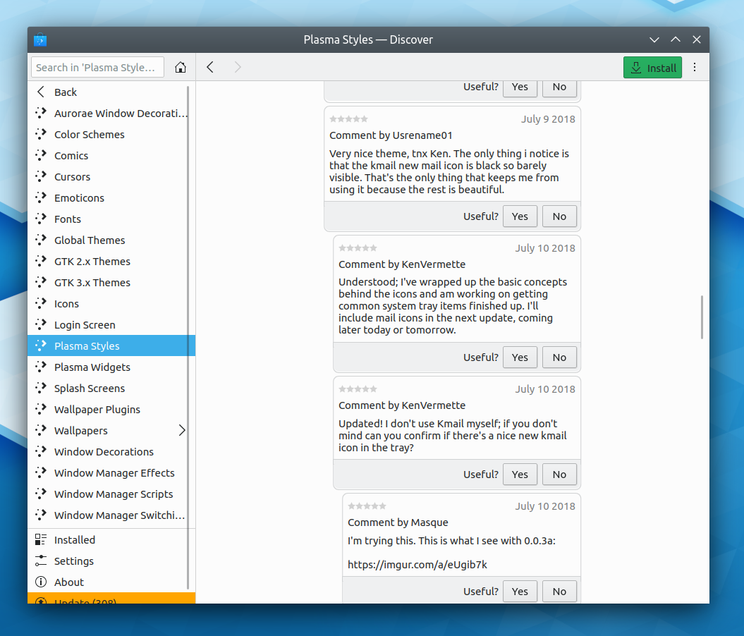
Implement mockups provided by VDG to improve visual appeal of reviews UI. Layout is a bit cramped due to https://bugs.kde.org/show_bug.cgi?id=415677.
Details
Details
- Reviewers
apol - Group Reviewers
VDG Discover Software Store - Commits
- R134:f41f25e895a9: Polish the reviews UI and presentation

Diff Detail
Diff Detail
- Repository
- R134 Discover Software Store
- Branch
- polish-review-reviewing (branched from master)
- Lint
No Linters Available - Unit
No Unit Test Coverage - Build Status
Buildable 19702 Build 19720: arc lint + arc unit
Comment Actions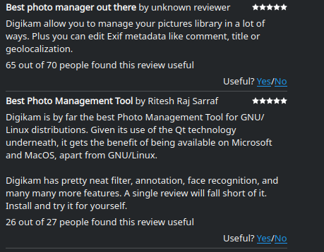
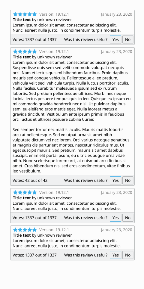
I don't find this better than the current form:
I know you can't control the color, but the yellow thumbs up/down emojis are harder to see against the white background than Yes/No text. They also stick out as not looking like real buttons. The Yes/No text at least looks like links that send the intended message to wherever.
Comment Actions
I find that the current one takes up too much vertical space and the top line of text blends too much into the review itself. I feel like those issues should be addressed somehow. Maybe this isn't the right way, so suggestions would be appreciated.
Comment Actions
I don't think it takes up too much vertical space and I think it uses horizontal space inefficiently.
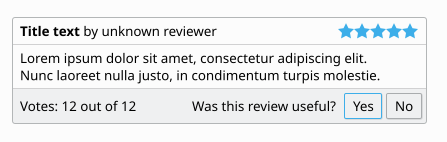
Here's a suggestion for a way to improve the UI:
Comment Actions
Another thing to consider is whether or not the review section in Discover should be kept consistent with the reviews/comments in the new GHNS UI.
Comment Actions
I'm not convinced about using emoji in place of icons. Are we sure about that?
I like ndavis's suggestion, but as a delegate, having so many lines could look cluttered.
Should we consider using cards?

Comment Actions
I'll do the change to show the top positive and top negative reviews on the app page in a separate patch once this lands.
| discover/qml/ReviewDelegate.qml | ||
|---|---|---|
| 142 ↗ | (On Diff #71284) | checked: usefulChoice === ReviewsModel.No |