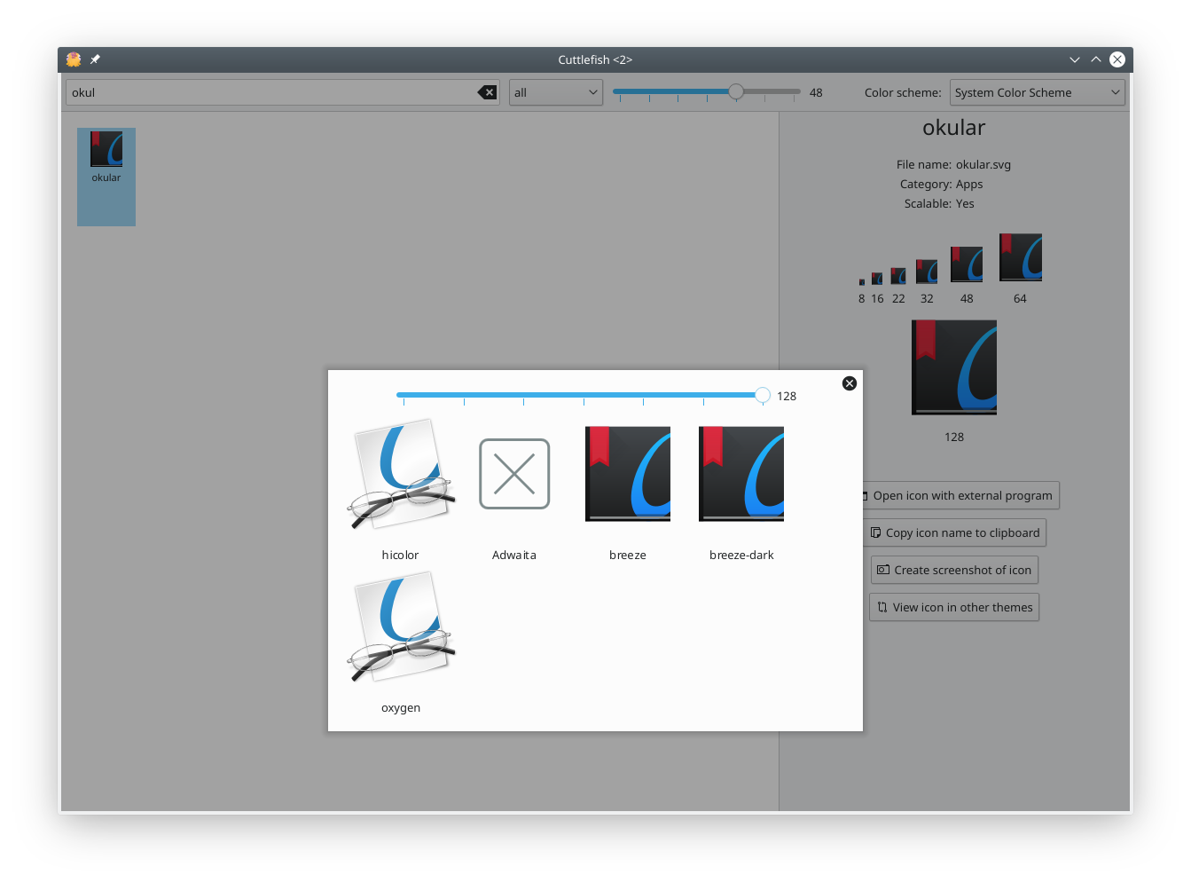
The icon in different installed themes is shown in an overlay sheet.
Details
Details
- Reviewers
ngraham - Group Reviewers
Plasma VDG - Commits
- R118:66d7bc83fc1e: [Cuttlefish] Compare an icon in different themes
Diff Detail
Diff Detail
- Repository
- R118 Plasma SDK
- Branch
- comparison (branched from master)
- Lint
No Linters Available - Unit
No Unit Test Coverage - Build Status
Buildable 17203 Build 17221: arc lint + arc unit
Comment Actions
LGTM. Can the overlay be spawned in the vertical center of the window as well or is that defined in Kirigami itself? Also what happens when there are a lot of themes, does the overlay remain the same size and just get a scrollbar?
Comment Actions
I didn't look into sizing positioning the overlay yet. But a scrollbar appears if the content doesn't fit into the available size.
Comment Actions
Thanks for accepting this so quickly! Does anyone have any comments on the code? I would like to improve my qml and any suggestion/best practice is welcome.
Comment Actions
The QML is generally fine! Since you specifically requested it, I added nitpicky minor comments below. :) I don't consider them blockers, but feel free to take a look anyway!
| cuttlefish/package/contents/ui/Comparison.qml | ||
|---|---|---|
| 2 | 2.4 | |
| 4 | 1.3 | |
| 66 | indentation | |
| 70 | height: width | |
| 71 | Rather than creating a complicated additional item for the "no icon" case, I would just do source: modelData.iconPath ? modelData.iconPath : "paint-none". If you don't like the paint-none icon, we can adjust it. | |
| cuttlefish/package/contents/ui/Comparison.qml | ||
|---|---|---|
| 71 | That's what I did first acutally but I didn't like that for two reasons. First it would scale with the other icons and when you are looking at paint-none you couldn't distinguish it anymore. | |
| cuttlefish/package/contents/ui/Comparison.qml | ||
|---|---|---|
| 71 | In that case what about just setting color: Kirigami.Theme.disabledTextColor when there's no icon? That should serve to distinguish the actual paint-none icon from the use of that icon to denote "no icon available" I don't think having it scale is a huge deal. | |
| cuttlefish/package/contents/ui/Comparison.qml | ||
|---|---|---|
| 67 | Now you don't need this wrapper anymore; just use Kirigami.Icon directly and set Layout.preferredWidth and Layout.preferredHeight on it. | |
| cuttlefish/package/contents/ui/Comparison.qml | ||
|---|---|---|
| 67 | I use it for centering the icon in the middle of the 128x128 free space for the icon. Qt.AlignCenter is not enough for that. In the first version of the diff I tried make up for that with setting of top and bottom margins depending on the text height and icon size but that was to complicated and also didn't produce the correct result I think. | |
| cuttlefish/package/contents/ui/Comparison.qml | ||
|---|---|---|
| 67 | There is no Qt.AlignCenter (though there should be IMO); I think you need to do Qt.AlignHCenter | Qt.AligtVCenter | |
| cuttlefish/package/contents/ui/Comparison.qml | ||
|---|---|---|
| 67 | ||