Make notification icons use outline style
ClosedPublic

Authored by ndavis on Sep 1 2019, 10:40 AM.

Details

Summary

They didn't quite fit in with the filled style

Test Plan

Old:

New:

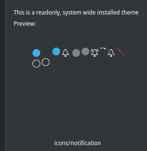
Testing stylesheets in Plasma Theme Explorer:

Diff Detail

Repository
R242 Plasma Framework (Library)
Lint
Automatic diff as part of commit; lint not applicable.
Unit
Automatic diff as part of commit; unit tests not applicable.
ndavis created this revision.Sep 1 2019, 10:40 AM
Restricted Application added a project: Frameworks. · View Herald TranscriptSep 1 2019, 10:40 AM
Restricted Application added a subscriber: kde-frameworks-devel. · View Herald Transcript
ndavis requested review of this revision.Sep 1 2019, 10:40 AM
ndavis edited the test plan for this revision. (Show Details)Sep 1 2019, 10:43 AM
ndavis edited the test plan for this revision. (Show Details)
ndavis edited the test plan for this revision. (Show Details)Sep 1 2019, 10:47 AM
filipf added a subscriber: filipf.Sep 1 2019, 10:53 AM

+1, looks good, thanks for centering the clapper as well

I kinda like the off-center clapper, but I understand how it might drive OCD people mildly insane. :) However the full-color icon theme notification preferences icon has an off-center clapper, so I think if we're going to make that change here, we need to do it there too.

Having said this, a centered clapper looks a bit odd to me. I wonder... so we even need it at all? The bell is still plenty recognizable as a bell without it. Maybe experiment with removing it entirely?

I'd have to remake the whole bell shape so that the icon doesn't look weirdly short.

Maybe leave the clapper alone for now then? +1 on making it outline style at least.

ndavis added a comment.Sep 2 2019, 1:31 AM

I could use a modified version of the KAlarm systray icon

ngraham accepted this revision.Sep 3 2019, 2:01 PM
This revision is now accepted and ready to land.Sep 3 2019, 2:01 PM
This revision was automatically updated to reflect the committed changes.