FictionBook 2 icons from Okular (design by Vladimir Prohorenkov, my implementation).
Details
Details

Diff Detail
Diff Detail
- Repository
- R266 Breeze Icons
- Branch
- master
- Lint
No Linters Available - Unit
No Unit Test Coverage - Build Status
Buildable 15422 Build 15440: arc lint + arc unit
Comment Actions
Interesting design! However having that triangular part jutting out of the side is pretty unusual, and not seen in any other MimeType icons. Maybe move that shape fully inside and copy the visual style of existing book-style icons, such as application-pdf application-epub+zip . Generally they have a sort of book-like appearance with a line on the left side for the book's spine.
Comment Actions
Better, thanks! Any chance you could make the gray background color a bit different? Maybe lighter, or some other color? That particular gray isn't a very attractive color IMO. It's very brutalist. :)
Comment Actions
Haha that pink might be a bit too un-brutalist. :) Orange-on-pink isn't exactly the best color combination. A blue background of some sort might be nicer with the orange polygon.
Comment Actions
Reduce the size of the SVGs by optimizing them with one of these tools: https://community.kde.org/Guidelines_and_HOWTOs/Icon_Workflow_Tips#SVG_optimization
Comment Actions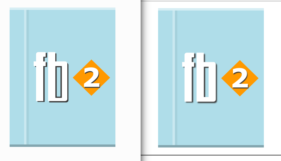


Upon closer inspection, I found a few issues that need to be fixed.
Blur can't be used because the Qt SVG renderer doesn't support it. You'll have to use linear or radial gradients for shadows instead.
Left: Qt, Right: Inkscape
The 16 and 22 px icons are using the wrong style. These are more similar to other mimetype icons of those sizes:
The "fb 2" is not always easy to read. I suggest aligning the characters to the grid. For the 32px version, you could just copy in the 16px version from my attached archives since the alignment is already done.
Breeze Dark icons are also missing.
Comment Actions
Realign 32px versions, replace 16px and 22px with icons proposed by Noah Davis, add dark versions
Comment Actions
Much better. There is only one thing left that I think should be done for 32 and 64 px. Rather than having a black "fb" for Breeze and and a white "fb" for Breeze Dark, use either white for both with a drop shadow under the "fb" or just black for both and no drop shadow. I only used different colors on the 16 and 22 px icons because they don't have a background.