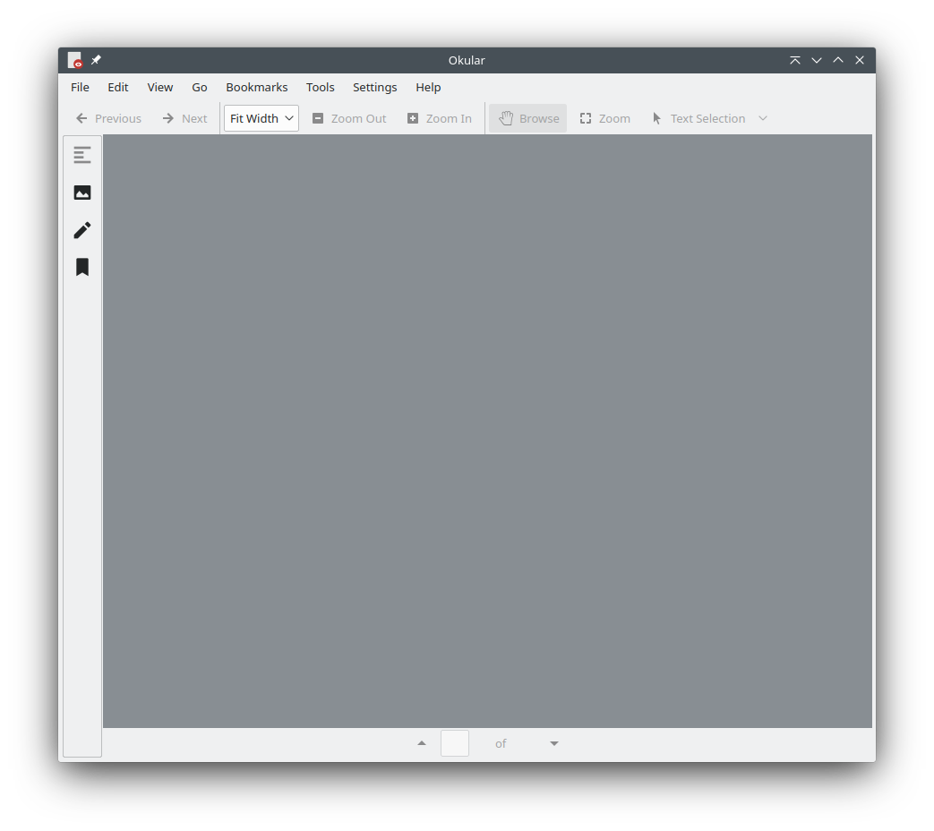
This patch reduces the default size of the sidebar icons from 48px "Large" to 32px "Normal" and hides the text underneath the icons by default.
This is a minor code change but makes a noticeable visual difference, looking cleaner and taking up considerably less space.
Before changes
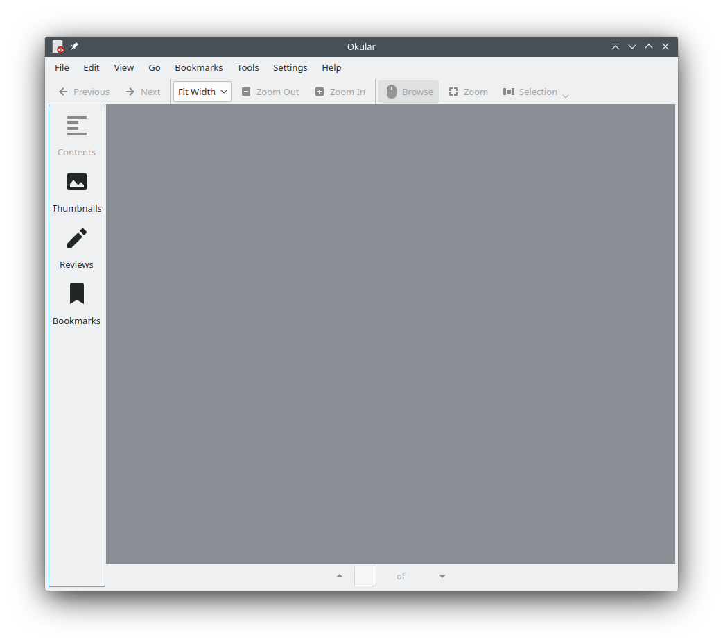
After changes