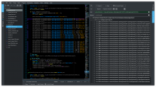
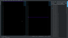
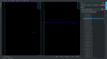
When the find and replace toolview is in the left or right sidebars, move the combo boxes on their own rows so they have more space.
This patch changes the position of the combo boxes when the toolview width is smaller than its height.
The goal is to be able to see a large string in the find and/or replace combo boxes within a moderately narrow toolview.
Details
- Reviewers
sars ngraham - Group Reviewers
Kate VDG - Commits
- R40:bf86ce051814: Enlarge the find and replace add-on combo boxes
Original suggestion, widgets are not grouped:
2nd suggestion, buttons are small:
3rd suggestion:
toolview height Vs combobox width:
before, 22 result lines, the combobox needs to be expanded
after, 20 result lines, the combobox is large
Diff Detail
- Lint
Lint Skipped - Unit
Unit Tests Skipped
Nice first patch!
For visual changes like this, please tag VDG and provide before and after screenshots in the Test Plan section. Thanks!
Thanks!
I'm not sure how much sense this change makes, because currently each row has controls related to its own combobox, and if you move the comboboxes to their own rows, the logical grouping gets broken. If the current UI is not sufficient, I think it needs a larger redesign, not just moving the comboboxes to their own rows. For example, the scope chooser and search options could be on their own row maybe.
You are right, the "Search" and "Next" buttons should be grouped with the search combo box and the same applies for "Replace" and "Replace Checked". On the other hand, I think it would be nice to have large find and replace combo boxes. Thus, we don't want to eat too much space with other widgets in the same row.
I suggest the following :
- add icons and help tooltips to the "Replace" and "Replace Checked" buttons
- when the view is narrow, move the search combo box along with the "Search" and "Next" buttons on their own row; remove the button texts; remove the "Find" label. The same applies for the replace group.
- when the view is large, restore the original view
This way, the buttons are grouped logically, the combo boxes are large and someone who use it for the first time knows how to use the buttons even if there is no text in the buttons.
I will add the resulting screenshots in the test plan.
What do you think?
I dunno, I'm having a hard time thinking of icons that could communicate "replace" and "replace checked" in this context. But maybe it would work. Give it a shot and see! :)
What if we put the search combo on one row and the search and next buttons on the next row together with the search places combo.
Then the next row would be the replace combo with the replace buttons and tool buttons on the next?
I added a screenshot based on the last comment. Buttons are grouped depending on their relation to "find" (including the show search options button) or to replace/result (including Expand result and Add Tab).
All buttons have the auto raise option set to false. I do not know the precise meaning of this option, I made this change to have a consistent view.
Indeed, the Replace and Replaced Checked button icons do not fit that well, we can remove these icons.
Also, the "find" label may be changed to "Search" since the button is labeled "Search".
This is the patch corresponding to the third suggestion screenshot.
I also modified the search.ui file in order to change some QPushButton to QToolButton. This way, all "icon only" buttons have the same look and it allows to hide the other buttons text (this was used in the second suggestion).
Sorry for the late review.
I like this last layout! :)
I'm not totally convinced about the QPushButton to QToolButton change. The idea is that the "options" behave more like check-boxes and that the other "real-looking" buttons execute an action when clicked.
Is it intended that there is a double space between the next button and search place combo?
With the minor fixes to the tool-tips and maybe a revert of the button types I would be ready to commit this.
| addons/search/search.ui | ||
|---|---|---|
| 290 | This should be "Replace one at a time" if we actually need it. | |
| 296 | This icon does not really show what the button does... I think it is better to not set an icon if it does not help to identify the action. | |
| 313 | We probably do not need a tool-tip that is exactly the same as the text on the button | |
| 316 | I think it is quite hard to get an icon that shows "Replace checked" graphically. The Oxygen version does not look like a check list... I think that an icon on this button also eats a bit too much space as it is right now... | |
I am a bit concerned about the height increase. As most people have 16:9/10 screens, screen height is always sparse.
I agree about reverting the search.ui changes. I made these changes when trying the 2nd layout but they do not make any sense now. Fixed.
The double space was unintentional and it is fixed.
Ok, I see, for the search stuff at the left/right, it makes sense, thought I normaly keep it at the bottom.
Ok. Note that the layout is still the one you currently use when toolview is at the bottom (when toolview.width >= toolview.height)
:=) I see, I should have properly read the description.
Then I will not bitch anymore here .P
Looks good for me, too, was just ignorant.
Hmm, munging the layout that's provided by the UI file in QWidgets code doesn't sit that well with me (especially grid layout code, which is already quite difficult to read). Is there no other way?
@ngraham Unfortunately there is no way with UI files to dynamically modify the layout depending on the size of the container, so munging the layout in C++ is the best way I know so far :)
@mickaelbo Thanks for the improvement! (You could remove the spaces at the end of some lines before committing)
Thanks for taking care of this!
Both to the submitter of the patch and all reviewers.


