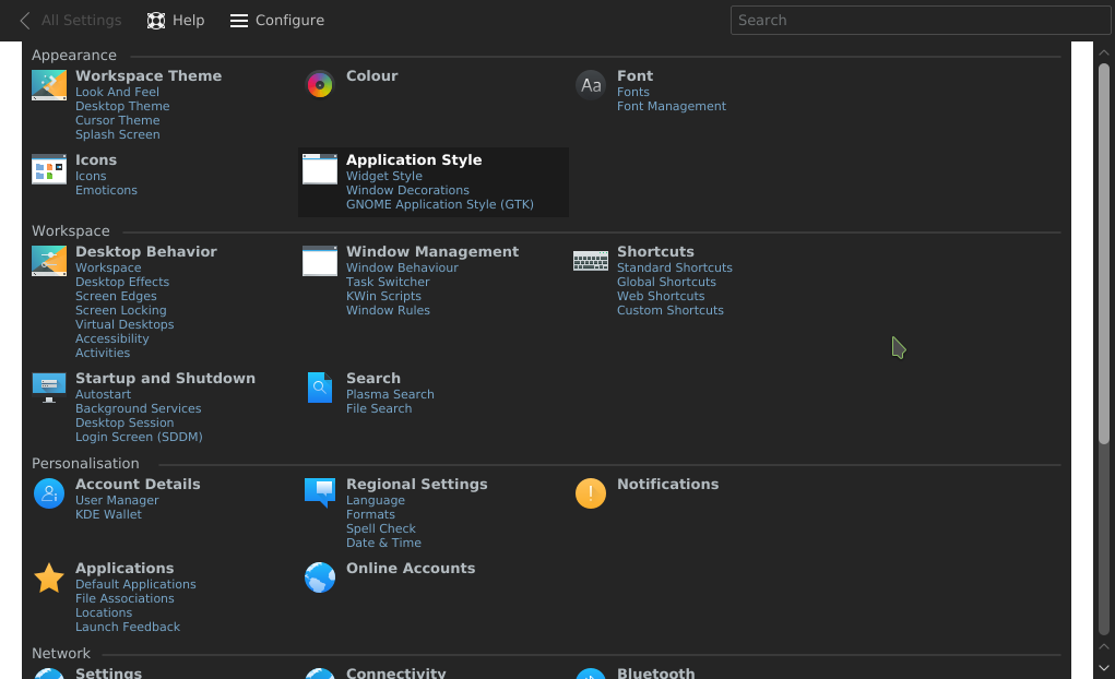
Based on VDG design
Icon mode lists all submodules which can be accessed directly
This removes the need for tooltips and a layer of navigation
| Plasma |
Based on VDG design
Icon mode lists all submodules which can be accessed directly
This removes the need for tooltips and a layer of navigation
Ran it and clicked on things..
| No Linters Available |
| No Unit Test Coverage |
code seems ok, seems some pixel measures here and there, that i guess are ok.
can you add a screenshot as well?
| icons/CategorizedView.cpp | ||
|---|---|---|
| 30 | does this give problemswith different dpis? (i guess with the scaling of the painter approach that qwidget does should be fine?) | |
There is a problem with the dark colour scheme - the view now has white borders on the sides:
The second thing, I think that the items would benefit from more padding.
The third is that the items that do not have 'subitems' look unaligned.
There is one strange thing regarding the behaviour - the sub-item links.
The first problem is that it is not obvious what is clickable and what is not - the only hint is a slight change in the background (at least with my colour scheme) on hover.
The item itself has an arrow cursor while the sub-items have the 'URL' hand, while the hover-highlight highlights the whole item in both cases.
It is not obvious what will be opened when something has been clicked. Maybe a better approach would be to always open the item's KCM, but to preselect the sub-item that has been clicked on in it (instead of only showing the sub-item configuration without the ability to switch to another subitem without going back).
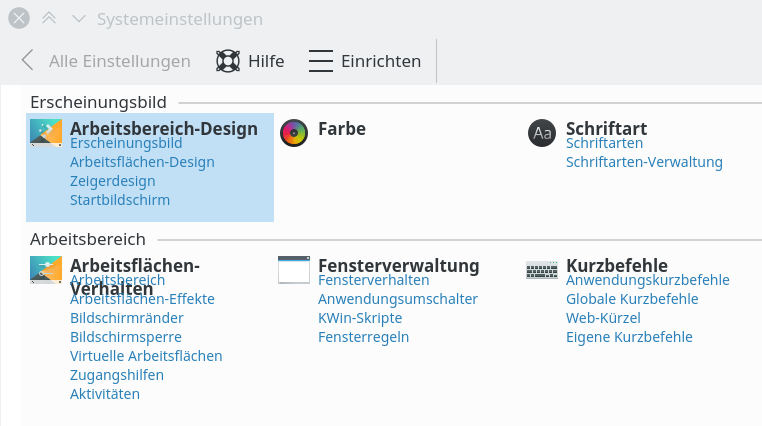
For example, when one clicks 'Workspace Theme' item, it shows the sub-items 'Look and Feel', 'Desktop theme' ... on the left allowing the user to switch to different sub-items.
When one clicks the 'Desktop theme' sub-item link, it opens only the desktop theme configuration without other 'Workspace Theme' sub-items on the left. Instead, IMO, it should open the whole 'Workspace Theme' configuration, but preselect the 'Desktop theme' sub-configuration.
This way, the behaviour of both will be similar enough not to be annoying when somebody miss-clicks a sub-item.
The last one - when closing the SySett, this is written a few dozen times:
User of KWidgetItemDelegate should not delete widgets created by createItemWidgets!
There is one strange thing regarding the behaviour - the sub-item links.
The first problem is that it is not obvious what is clickable and what is not - the only hint is a slight change in the background (at least with my colour scheme) on hover.
Is that different to how it was before?
The item itself has an arrow cursor while the sub-items have the 'URL' hand, while the hover-highlight highlights the whole item in both cases.
Oh, right, that's not good. I'd make it all use the hand cursor, then.
It is not obvious what will be opened when something has been clicked. Maybe a better approach would be to always open the item's KCM, but to preselect the sub-item that has been clicked on in it (instead of only showing the sub-item configuration without the ability to switch to another subitem without going back).
Oh, I thought that was already the case, at least that's how I'd imagined it. Looks like our design specification was not detailed enough here.
So yes, please, make it behave like Ivan said!
For example, when one clicks 'Workspace Theme' item, it shows the sub-items 'Look and Feel', 'Desktop theme' ... on the left allowing the user to switch to different sub-items.
When one clicks the 'Desktop theme' sub-item link, it opens only the desktop theme configuration without other 'Workspace Theme' sub-items on the left. Instead, IMO, it should open the whole 'Workspace Theme' configuration, but preselect the 'Desktop theme' sub-configuration.
This way, the behaviour of both will be similar enough not to be annoying when somebody miss-clicks a sub-item.
Yes, absolutely!
Is that different to how it was before?
Before, we had the icon and the text - and the whole are was one-clickable thing.
Having different sub-areas with bigger differences in behaviour, and not having them visually separated is a problem (the thing you commented on below - I don't think that the subtle background change is a problem per-se, just in the above case).
Oh, right, that's not good. I'd make it all use the hand cursor, then.
We should probably make some guidelines for mouse cursors (or do we already have those?). Namely, if the hand-cursor is applicable to sys settings, it would probably also be for files in dolphin etc.
(I like the idea of marking something as click-to-produce-an-action through the mouse cursor - I'm not a fan of the hand cursor as far as the visuals are concerned, but it is kinda the standard for these things nowadays - even in phabricator)
Pretty! Having the sub-categories shown by default and being able to navigate to them directly is a significant improvement over the old layout.
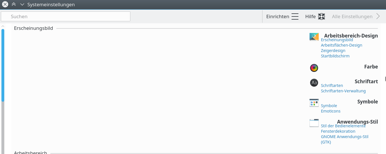
The layout layout doesn't handle different font sizes very well, I run at 125 dpi with 1x device pixel ratio which causes the headings to touch the links and when it wraps it overlaps.

It doesn't work at all with Right-to-Left languages.
Unfortunately it's quite difficult to get the links to underline on hover (I tried) but it's pretty inconvenient that tapping outside of links but still in the QLabel eats the mouse event, so I can essentially only click either the icon or the headnig to enter the main category. Clicking where the mouse is in the screenshot does nothing:
Also, what's up with the slightly gray background which doesn't stretch all the way to the corners?

Finally, as others have already noted it usually crashes on quit and clicking a sub-category brings up just this category with no way of switching to the its siblings other than going back to the overview.
Ping.
I just noticed, the search is also broken, ie. the delegates don't visually indicate that they're disabled when no result was shown (a spotlight kind of highlight would be nice, though ;)