Improve contrast of preferences-system-time
ClosedPublic

Authored by trickyricky26 on Jan 21 2019, 5:04 PM.

Details

Summary

BUG: 390800

FIXED-IN: 5.55

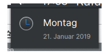
Add outline to the preferences-system-time icon to improve contrast with the Breeze-dark desktop theme.

The outline is a bit small in the context menu, but that's due to this 32px icon being used at 16px size. Perhaps an action icon like clock should be used there instead.

Test Plan

preferences-system-time:

Contrast with tooltip:

Contrast in context menu:

Diff Detail

Repository
R266 Breeze Icons
Lint
Automatic diff as part of commit; lint not applicable.
Unit
Automatic diff as part of commit; unit tests not applicable.
trickyricky26 created this revision.Jan 21 2019, 5:04 PM
Restricted Application added a project: Frameworks. · View Herald TranscriptJan 21 2019, 5:04 PM
Restricted Application added a subscriber: kde-frameworks-devel. · View Herald Transcript
trickyricky26 requested review of this revision.Jan 21 2019, 5:04 PM
trickyricky26 edited the summary of this revision. (Show Details)Jan 21 2019, 5:09 PM
trickyricky26 edited the test plan for this revision. (Show Details)
trickyricky26 added a reviewer: VDG.
ngraham accepted this revision.Jan 21 2019, 5:11 PM
ngraham added a subscriber: ngraham.

Looks good to me! Other VDG folks, shall we land this?

This revision is now accepted and ready to land.Jan 21 2019, 5:11 PM
ndavis requested changes to this revision.EditedJan 21 2019, 5:44 PM
ndavis added a subscriber: ndavis.

Make the outline a solid circle behind the clock part instead of just an outline. The reason for this is that the edges between the outline and the clock look worse if the outline isn't a solid circle in the background. Notice how the left side has rougher edges:


In general, it's a good idea to not make 2 shapes meet exactly at the edges due to issues with how SVGs are displayed. This isn't an Inkscape only issue either. It doesn't always need to be done that way, but it's especially necessary with shapes that have round edges. With straight edges, there will sometimes appear to be a thin gap between shapes even though there shouldn't be.

I think it might be a good idea to make it look more like a clock, but I'm not going to object to keeping the current look.

This revision now requires changes to proceed.Jan 21 2019, 5:44 PM
  • Make the outline a solid circle behind the black on to avoid weird aliasing issues
ndavis accepted this revision.Jan 21 2019, 5:53 PM
This revision is now accepted and ready to land.Jan 21 2019, 5:53 PM
ngraham accepted this revision.Jan 21 2019, 6:09 PM
This revision was automatically updated to reflect the committed changes.