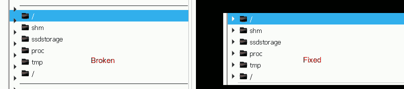
Fixes a typo in the CSS files which resulted in GTK treeviews being unusable. See picture.
| broulik | |
| ngraham |
| Breeze | |
| VDG |
Fixes a typo in the CSS files which resulted in GTK treeviews being unusable. See picture.
| Automatic diff as part of commit; lint not applicable. |
| Automatic diff as part of commit; unit tests not applicable. |
I noticed there's a bunch more places where seperator is used, e.g. in gtk-3.18 and dark, I guess these should be fixed as well?
Yeah definitely, but... I'm not familiar with this Phabricator and KDE dev process as it's my first time here - doesn't this patch address those bunch of other places also, or are you talking about some non-Breeze stuff? :)
Thanks, can you provide us with your real name and email address so we can land this with proper authorship information?
On the subject of GTK theme fixes, we also have a very large and ambitious patch: D15786: share common values for both Breeze and Breeze-dark GTK themes. Is there anyone around who's familiar enough with this code who could provide even a rudimentary review? @jackg?
Name is in my profile as usual: ohelin (Firstname Lastname), email is: <firstname>.<lastname>@iki.fi
About that other patch: it's actually not _that_ large, if you handle it not as a diff to the original file, but as a diff to the new common file. So, saving the left diff from the old CSS file and comparing it to the new common CSS file like this:
diff -y --suppress-common-lines Breeze-dark-gtk_gtk-3.20_gtk.css Breeze-gtk_gtk-3.20_common.css
it's easy to see there's only a few dozen lines which actually need checking manually. All the other lines are identical except for the obvious, the use of color variables. Here's for example a few output lines from the above command when the changes are trivial:
border-color: #616569;				      |	  border-color: @borders;
background-color: #232629;				      |	  background-color: @theme_base_color;
  color: #eff0f1;					      |	    color: @theme_fg_color;
  border-color: #616569;				      |	    border-color: @borders;
  background-color: #232629; }			      |	    background-color: @theme_base_color; }
border: 1px solid #3daee9;				      |	  border: 1px solid @theme_selected_bg_color;
background-color: #3daee9;				      |	  background-color: @theme_selected_bg_color;
So it's pretty safe to say it's fine as long as the colors are mapped correctly.
And here are the actually differing parts - we should check out the corresponding lines from the CSS files and see what's been done:
  border-color: #31363b;				      |	  border-color: @theme_bg_color;
    padding: 0px 3px;					      |	    padding: 0px 0px;
    background-color: #31363b;				      |	    background-color: transparent;
    color: #eff0f1;					      |	    color: transparent;
      background-color: #31363b;			      |	      background-color: @theme_bg_color;
      color: #3daee9; }					      |	      color: transparent; }
      background-color: #31363b;			      |	      background-color: @theme_bg_color;
      color: #3daee9; }					      |	      color: transparent; }
      background-color: #31363b;			      |	      background-color: @theme_bg_color;
      color: rgba(216, 218, 221, 0.35); }		      |	      color: transparent; }
      color: #eff0f1; }					      |	      color: @theme_fg_color; }
        color: rgba(216, 218, 221, 0.35); }		      |	        color: @insensitive_fg_color; }
      min-width: 4px;					      |	      min-width: 6px;
      margin: 2px;					      |	      border-radius: 8px;
      border: none;					      |	      background-color: alpha(@scrollbar_overlay_color, 0.8);
      border-radius: 2px;				      <
      background-color: #adafb2; }			      <
        background-color: #adafb2; }			      |	        background-color: @scrollbar_overlay_color; }
    scrollbar.overlay-indicator:not(.dragging):not(.hovering) <
      min-width: 4px;					      <
      min-height: 4px;					      <
      border: none;					      <
      background: none;					      <
      box-shadow: none; }				      <
							      >	      scrollbar:hover trough{
							      >	    background:linear-gradient(transparent 0,transparent 5px,
    min-width: 14px;					      |	      transition-duration:0.1s;
							      >	    min-width: 6px;
    border: 0px solid transparent;			      |	    border: 0px solid @theme_bg_color;
    background-color: #6a6e72;				      |	    background-color: @theme_bg_color;
    box-shadow: inset 0px 0px 0px 2px #31363b; }	      |	    background-clip: padding-box;
							      >	    box-shadow: inset 0px 0px 0px 5px @theme_bg_color;}
    min-width: 10px;					      |	    transition-duration:0.1s;
							      >	    min-width: 6px;
    border: 2px solid transparent;			      |	    border: 5px solid transparent;
    background-color: #adafb2; }			      |	    background-color: @theme_selected_bg_color; }
      background-color: #3daee9; }			      |	      background-color: @decoration_hover; }
    scrollbar slider:active {				      |	    scrollbar:backdrop slider:backdrop {
      background-color: #3daee9; }			      |	      background-color: @scrollbar_backdrop_color; }
    scrollbar slider:disabled {				      <
      background-color: rgba(157, 159, 163, 0.35); }	      <
    scrollbar slider:backdrop {				      <
      background-color: #adafb2; }			      <
      background-color: rgba(157, 159, 163, 0.35); }	      |	      background-color: @scrollbar_backdrop_color; }
    min-height: 10px; }					      |	    min-height: 6px; }
  scrollbar.vertical button.down {			      <
    -gtk-icon-source: -gtk-icontheme("pan-down-symbolic"); }  <
  scrollbar.vertical button.up {			      <
    -gtk-icon-source: -gtk-icontheme("pan-up-symbolic"); }    <
  scrollbar.horizontal button.down {			      <
    -gtk-icon-source: -gtk-icontheme("pan-end-symbolic"); }   <
  scrollbar.horizontal button.up {			      <
    -gtk-icon-source: -gtk-icontheme("pan-start-symbolic"); } <
  background-color: #31363b; }				      |	  background-color: @theme_bg_color; }
For the light theme the diff against the new common CSS file is trivial with only three different lines - the contents have been just basically moved.
Is this OK for a rudimentary review? Feel free to quote this to the other page - I guess it should be there anyway, but since you asked here... :)
Thanks, that's very helpful. Could you comment there too? Also, it would be even better if you could apply the patch and give it a spin. Here's the documentation: https://community.kde.org/Infrastructure/Phabricator#How_to_review_someone_else.27s_patch
As for this patch, I'll land it for you now.
I tried that first, but it didn't apply cleanly, so I was lazy and did it for 5.14 onwards. Thanks for kicking my butt on this; I'll go backport it to 5.12 too.