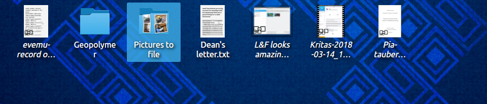
Slightly decrease the side margins within Folder View delegates, to give titles a tiny bit more room. This very slightly improves things for people who have desktop files with multi-line titles.
CCBUG: 379432
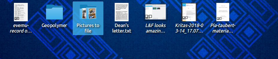
Slightly decrease the side margins within Folder View delegates, to give titles a tiny bit more room. This very slightly improves things for people who have desktop files with multi-line titles.
CCBUG: 379432
Before, normal-sized icons:
After, normal-sized icons:
Before: small icons:

After, small icons:

| Automatic diff as part of commit; lint not applicable. |
| Automatic diff as part of commit; unit tests not applicable. |
The grid spacing has been reduced multiple times on user requests. I'm not going to accept a patch that makes it wider, or changes the default number of lines. But I think a patch that makes the text label wider within the delegate could work.
This patch does that too, so I've removed the other changes.
However, if we have users clamoring for diametrically-opposed things, maybe it's time to consider making the grid spacing configurable? macOS had the exact same problem for more than a decade and Apple eventually relented and added a slider. They're famously allergic to unnecessary configurability, so if even they bowed to user feedback and did this, it might be appropriate for us to investigate doing likewise.
What's the objection to increasing the default max number of lines, out of curiosity?
Folder View always reserves enough vertical space to fit the configured number of lines to keep an evenly-spaced grid. The default number of lines should therefore strike a happy medium between conserving vertical space to fit more rows and catering to the odd longer file name. 3 would optimize for most file names being so long that even with ellision they're not readable at two lines, which I don't feel is warranted.
As for making it configurable - maybe. Not sure. I'm not there yet, because on my end, the user complaints have stopped with 4.10 when we prominently followed feedback and made the delegates and grid tighter. Before that we got tickets about it more regularly, which has mostly ceased, and the release itself was met with lots of positive feedback. I therefore feel that we've been doing quite well at iterating towards what makes most people happy. I'm sure it's always possible to find individual opinions that buck the trend, but I have to integrate the feedback channels somehow.
I don't feel like 3 lines is excessively long or uncommon. Here's a screenshot of a random folder viewed in Dolphin on my personal machine, for example:
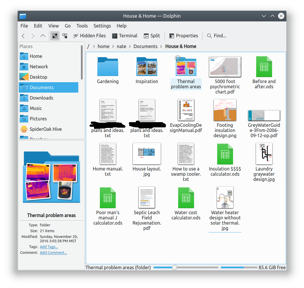
Many of the files have names that seem perfectly normal and reasonable to me in terms of length, yet require 3 or even 4 lines. In Dolphin, this is fine, there's no problem. If I put them on the desktop, they become borderline unreadable until I increase the number of lines. This isn't a problem for you and me; we're expert users who find and tweak settings. But most normal users won't, and will assume that their Desktop is just broken.
As is, we need to balance against two use cases:
Since these people's needs are mutually exclusive, we'll always upset one group unless we let them self-serve with a config option, or somehow cleverly improve the UI to obviate the problem. The latter case would seem ideal, but I'm drawing a blank right now.
As for making it configurable - maybe. Not sure. I'm not there yet, because on my end, the user complaints have stopped
FWIW we have at least three bug reports complaining that titles don't get enough room:
Well, either way, we can continue the discussion elsewhere, and I'll land this minimal patch. Thanks, Eike.