Before
After

| hpereiradacosta |
| Breeze | |
| VDG |
Before
After
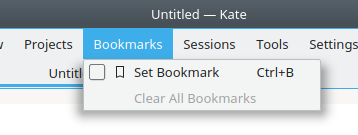
| No Linters Available |
| No Unit Test Coverage |
the diff appears more complex than it actually is because of unrelated changes. Please keep the changes to the minimum, this will help reviewing.
| kstyle/breeze.h | ||
|---|---|---|
| 70 | This change is unrelated with the centering. Should be another patch. | |
| kstyle/breezestyle.cpp | ||
| 4660 | this change is unrelated. Please revert. | |
| 4701 | why was this chunk of code moved ? This is unrelated to the change. | |
| 4744 | please dont rename variables just for the safe of it, and keep checkboxrect. | |
Also, code breaks in the following configurations:
(see the incorrect centering of the radio button)
this is because you have to rely on maxIconWidth, even if the current item has no icon, when computing the checkbox space.
This will maintain the same alignment for the full menu.
| kstyle/breezestyle.cpp | ||
|---|---|---|
| 4701 | To keep it consistent:
Could you please let it stay here? | |
this is because you have to rely on maxIconWidth, even if the current item has no icon, when computing the checkbox space.
I've came up with something like this
if( showIcon && menuItemOption->maxIconWidth > 0 )
{
    int dx = (iconRect.left() - Metrics::CheckBox_Size) / 2;
    checkBoxRect.moveLeft( dx );
} else {
    int dx = (textRect.left() - Metrics::CheckBox_Size) / 2;
    checkBoxRect.moveLeft( dx );
}
so, it centers properly checkboxes in menu items with and without icons
(it can be simplified with a ternary operator)
is it a good approach?
Ok. So, the patch works, but ... there is something fishy here. In principle it should not be needed. Right ?
Ifcheckboxes have a fixed size, and if margins would be equal to spacing, and if the math are correct, having something laied out as: margin + checkbox + spacing + icon + spacing + text would be automatically centered, no ?
Idem without icon. (and if there is double spacing, then it is a bug).
At least this is how the code is supposed to work. If not, it should be fixed, rather than circomvoluting the issue with some centering.
(note that the padding on the icons is disconnected to this: not all icons have padding, especially if you change icon theme, so you cannot do anything but rely on the icon size.
Bottom line, I would like to investigate the current code (which _should_ work), rather than accepting this patch.
Or do I miss something ?
The reason why I would rather fix the current code than introducing some centering, is because centering would automatically hide deeper problems, and because it makes the metrics (margin, icon width, spacing), not reflect what the code do. Which then introduces confusion and make the code not maintainable.
In principle it should not be needed. Right ?
Yes.
Ifcheckboxes have a fixed size, and if margins would be equal to spacing, and if the math are correct, having something laied out as: margin + checkbox + spacing + icon + spacing + text would be automatically centered, no ?
Well, in theory, yes, it would be centered. But, humans often perceive something to be centered when it's not actually centered, for example, in typography, letters like "O" or "S" are often put below a baseline. So, maybe, checkboxes should be even a little bit closer to icons/text.
Edit
To make things clear: I'm not telling "checkboxes should be closer to icons.
At a given moment, here's how things laid out:
margin + checkbox_size + spacing + 1 + [2 + PM_SmallIconSize + 2] + spacing + 1 + text
Also, why is there the number 1?
The reason why I would rather fix the current code than introducing some centering, is because centering would automatically hide deeper problems, and because it makes the metrics (margin, icon width, spacing), not reflect what the code do. Which then introduces confusion and make the code not maintainable.
Agreed.
Yes. That's what needs fixing. I know there are subtleties with rect.left + rect.width() vs rect.right(). You can easily loose or gain a +1 there.
Also, fonts might not start exactly at the rect depending on hinting, which letter is drawn etc.
But anyway. This can be investigated, if only by actually drawing the relevant rect and see where space is lost, misaligned, etc.

Side note: This patch tries to center every checkbox between the left border and blue rect(and it also ignores margins.....)

Why are there only 2 pixels?
After playing a bit with margin values I've found 5 to be reasonable.
Why are there only 2 pixels?
Because the darker pixel, around the menu is also part of the menu, not the shadow. (meaning, there is a one pixel frame that is rendered in the margin).
After playing a bit with margin values I've found 5 to be reasonable.
So 5 does makes sense: there is 1 for the frame, and then 4, that matches the spacing. Right ?
So 5 does makes sense: there is 1 for the frame, and then 4, that matches the spacing. Right ?
Yes, I guess so.
Hello,
I do not think this revision should be abbandonned just yet.
The part that takes care of removing double spaces when icon is not present (when no icon is present in the menu), should go in.
The part about increasing the side margins to make the checkboxes centered, should still be discussed: It is not clear to me that margins and spacing between items should be identical, and for instance see how the positioning appears off with respect to the bottom of the menu, when checkboxes is present on the last item of the menu.
One solution to fix this would be to also increase the bottom margins, but then in turn that makes the item selection funny. (asymetric top bottom). Unless of course one either
Bottom line: this is a can of worms.
At the minimum, bugs (double spacing) should be fixed.
Well, I could rework this patch to fix double spacing.
Centering of check boxes would involve some changes in margins, which should be another diff, right?
positioning appears off with respect to the bottom of the menu, when checkboxes is present on the last item of the menu.
Hmm, I don't see it. Could you please show where positioning is off?
Here: if you look at the last checkbox (folders first). The distance to the left edge is larger to that of the bottom edge, while before they were identical.
This is because margin width and margin height are different.
which in turn is needed for centering.
So this really depends on what we want to align with what ...
Here: if you look at the last checkbox (folders first). The distance to the left edge is larger to that of the bottom edge, while before they were identical.
Oh, I haven't noticed that before. To me, that's still fine.
So this really depends on what we want to align with what ...
I'd propose to align check boxes between the left edge and icon/text. (or leave it as it is right now)
ok. I agree.
See comments below: if you can split this patch in two (first bug fix, then margin width increase, then both can go.
Thanks for the good work !
| kstyle/breezestyle.cpp | ||
|---|---|---|
| 4771 | If I understand right, this is the double spacing bug fix. | |
| kstyle/breezestyle.cpp | ||
|---|---|---|
| 4771 |
Yes. | |