BUG: 384357
Here's a candidate for a virtualbox icon.
Should be completely in line with breeze specs.

| ngraham | |
| andreaska |
| Breeze | |
| VDG |
BUG: 384357
Here's a candidate for a virtualbox icon.
Should be completely in line with breeze specs.
| Lint Skipped |
| Unit Tests Skipped |
Lovely icon! A vast improvement over the current one. However, I'm not sure the diff came out right. For an icon like this, probably the sanest approach is to make your new icon, then replace the old icon with the new one in the breeze-icons source repo, and then run git diff --or even better, use arcanist to generate the diff!
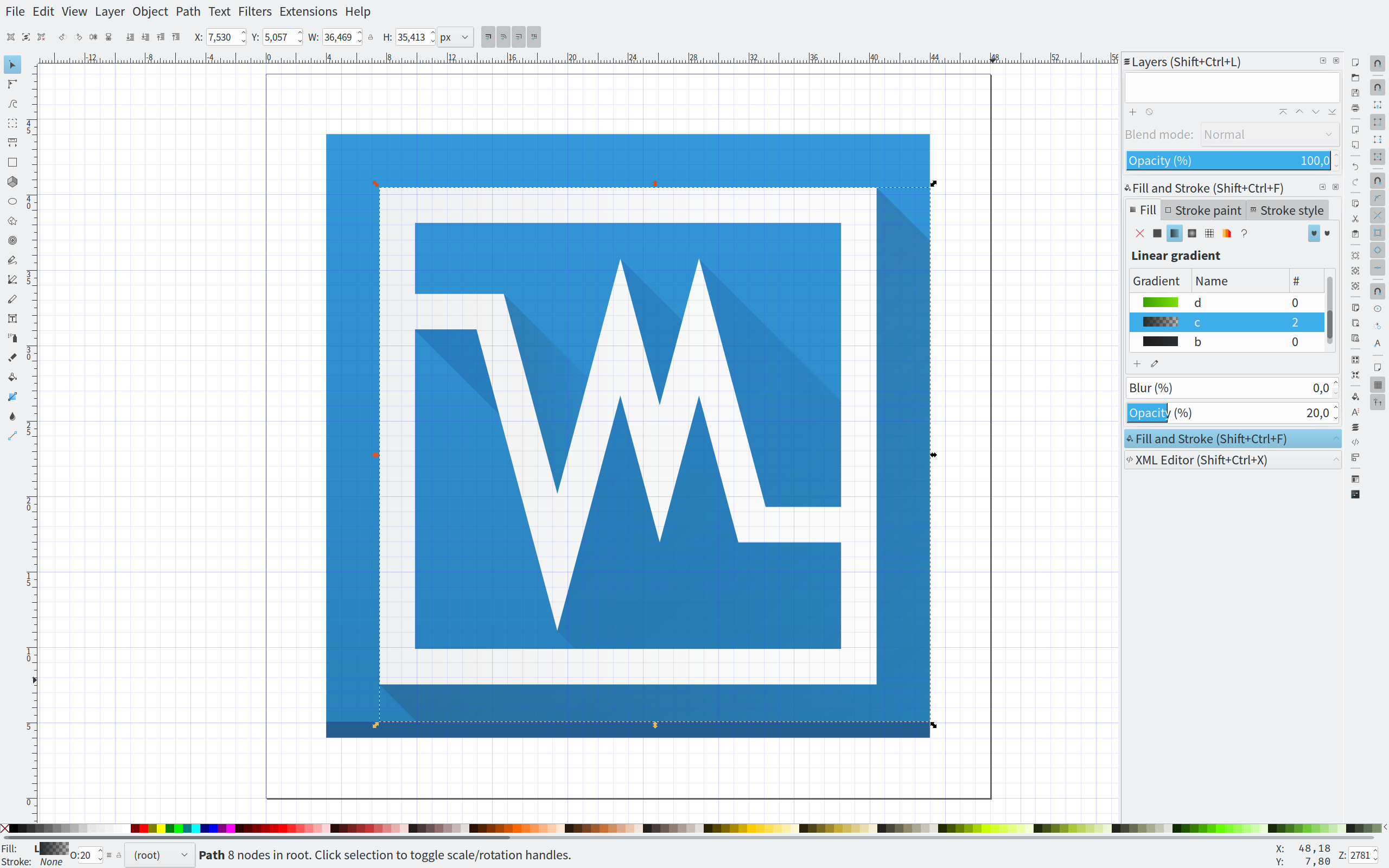
I realize this is one face of Oracle's cube logo, but I can't help but see the big "VM" and think VMware. I associate VirtualBox with the box shape. Am I the only one?
The design itself is quite nice to look at.
This is a breeze-ification of VirtualBox's own icon. If you remove the existing Breeze icon, then it reverts to the one specified by the developers, which is basically the same as this but a bit rounder and less flat. So IMHO this icon is doing exactly what it's supposed to be doing: being a Breeze version of the original without radically departing from the design, as the current Breeze icon does.
Hmm, something's not right here. I applied the patch, and the dark diagonal shadows are missing. Also, arc complained that the base commit was not in the repo, so I suspect the diff was still not generated correctly
At this point probably the sanest thing to do is as follows:
Then after this, we'll get you set up with arc so it's easy. :)
Also, in actual use, I have to say that I'm not a fan of the huge white border. I think it would look better without that.
The border made making shadows a bit tricky, so with that in mind I'll remove them.
As for the diff, I'll do as you said. I'll get arc up and running tomorrow/friday.
Giving it another try with the virtualbox icon.
I dont think layers ought to matter, right?
Then that's a likely culprit.
I'll remove the layers and go at it one last time before bed.
Getting there! This diff applies better and renders as intended. I have just one more nitpick: It's not exactly the same size as other perfectly square icons, like yakuake.svg and utilities-system-monitor.svg It would be nice to have it match that size so that everything looks perfectly aligned when you have a row of square icons.
Yep, I saw that as well, and it also didnt have a bottom shadowed line.
Now it does :)
Lovely. Looks great, works great! Big thumbs-up from me. As with the emacs icon, I'll leave this open for a while just in case anyone else has comments or suggestions.
Also, as with D10211: Suggestion for emacs icon we need an email address to associate with your name before we land the patch. Thanks!
One final request: if you attach a nice screenshot of the icon in use, perhaps on your Task Manager/Dock like you did with the Emacs icon, I'll include it in this coming weekend's weekly round-up for our Usability & Productivity initiative.
Even better, if your screenshot shows the new Emacs and Virtualbox icons, then I can highlight them both!