IDEA: Make warning messages wider. Place top/bottom
Open, WishlistPublic

Description

With the new implementation of our warning dialog messages, I wanted to see if there is a possibility to make them feel more seamless to the rest of the UI by stretching them to the size of their containers. These elements would be static. (Also, thinking that they can be minimized after some time).

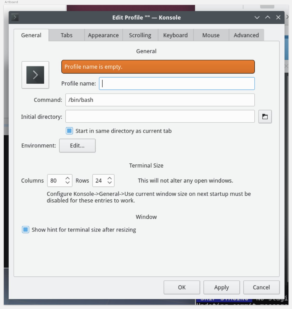
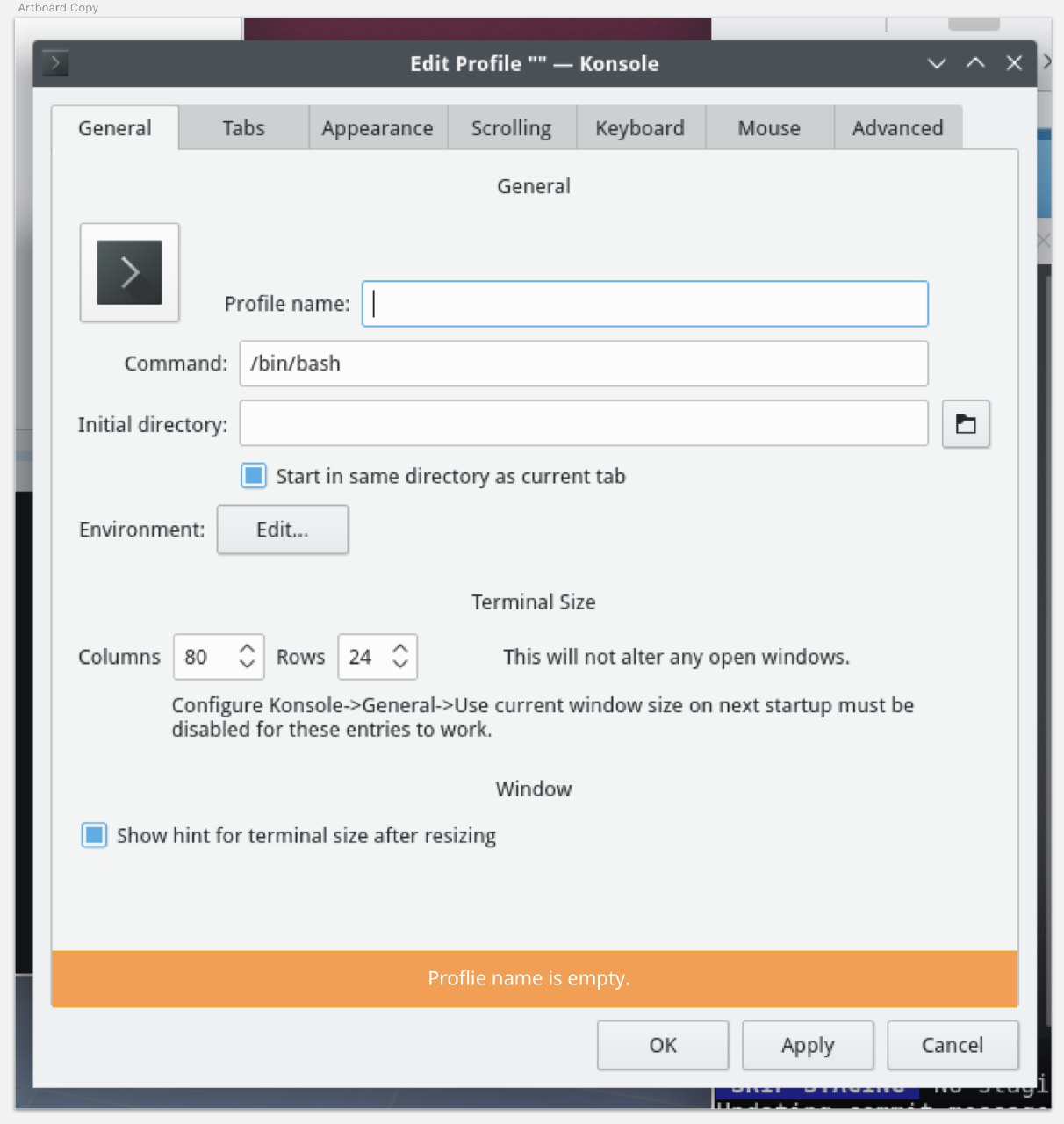
In this example, the message is at the bottom. Some have suggested using this at the top, I am OK with that.

abetts created this task.May 14 2018, 2:34 PM
abetts triaged this task as Wishlist priority.

Technically, one issue is that the same widget is used for messages that span the full window width as well as small inline messages (e.g. the "Continuing search from top" message in Kate when using the search). The latter case doesn't really work without a border.

But trying it out is easy; getting rid of the margin, the border color, and the rounded edges to match your mockup is relatively trivial and yields the following:

I'm not sure I think this is a huge visual or usability improvement over the visual redesign I just landed in D12508: Make KMessageWidget match Kirigami inlineMessage's style.

I've got a semi-related task open at T8569: Redesign Policy Kit Authorization dialog.

We had some debate about wording and layout during a patch, so I created this task. It's not gotten much love yet, but maybe soon!

Technically, one issue is that the same widget is used for messages that span the full window width as well as small inline messages (e.g. the "Continuing search from top" message in Kate when using the search). The latter case doesn't really work without a border.

But trying it out is easy; getting rid of the margin, the border color, and the rounded edges to match your mockup is relatively trivial and yields the following:

I'm not sure I think this is a huge visual or usability improvement over the visual redesign I just landed in D12508: Make KMessageWidget match Kirigami inlineMessage's style.

Not bad at all!

ngraham added a comment.EditedJul 7 2018, 8:26 PM

There are three use cases for these kinds of inline messages:

  • An error, warning, or informational message regarding user input for a specific control (e.g. the Konsole example you started out with)
  • A transient or semi-transient message showing either general program status or the result of a command (e.g. number of results in a Kate search, URL of a shared image in Spectacle)

For the first one, I think what we ideally need is a new UI widget that looks visually connected to the thing it's showing status for (e,g, a pop-over that appears next to or underneath it, with a little arrow pointing back to it).

For the second one, that's where potentially we could benefit from having the message always appear in the same place, but if I think about it, for the most part we already do: they're at the top part of the window, underneath the toolbar or menubar, but above the content area. This is done in Dolphin, Konsole, Kate, and Okular, for example. There are only rare exceptions from this (e.g. Spectacle's message appears at the bottom of the window, not at the top; Kate's number of search results and "search wrapped" messages appear in the bottom-right corner of the window)

If we want to make top-positioning an official recommendation, I wouldn't necessarily object, but it would need to be in the HIG. And visually, we would need to differentiate the inline style of messages (rounded corners, colored borders on all four sides) from the more global or app-specific ones (no corners, since they'd span the full width of the window, colored border only on the bottom, or not at all).

If we want to make top-positioning an official recommendation, I wouldn't necessarily object, but it would need to be in the HIG. And visually, we would need to differentiate the inline style of messages (rounded corners, colored borders on all four sides) from the more global or app-specific ones (no corners, since they'd span the full width of the window, colored border only on the bottom, or not at all).

I don't think this would be too much of a problem. It would look pretty good on mobile as well.